
Spot Toyota: Design and Development of a Mobile Application for Toyota’s Promotion Actions to the Young Audience
Volume 5, Issue 3, Page No 469-477, 2020
Author’s Name: Nuno Martins1,a), Joel Enes2
View Affiliations
1Polytechnic Institute of Cavado and Ave / ID+, 4750-810 Barcelos, Portugal
2Polytechnic Institute of Cavado and Ave, 4750-810 Barcelos, Portugal
a)Author to whom correspondence should be addressed. E-mail: nunomartins.com@gmail.com
Adv. Sci. Technol. Eng. Syst. J. 5(3), 469-477 (2020); ![]() DOI: 10.25046/aj050358
DOI: 10.25046/aj050358
Keywords: Mobile App, UI & UX Design, Digital Design, Communication Design, Toyota

Export Citations
This project aims to demonstrate the importance that digital media can have to the development of loyalty programs, namely in creating empathy and proximity relationships between brands and their target audience: young people. This study consisted of the creation of a digital platform for Toyota Portugal, named Spot Toyota, to communicate actions promoted by the car brand, especially during music festivals. With the support of advertising agency Caetsu, this mobile application was developed to bring the brand closer to a younger audience – festival fans – with potential interest in two Toyota fleet car models: Aygo and C-HR. Through strategies typical of loyalty programs, such as the awarding of vouchers or coupons, the accumulation of points or winning prizes, a system was produced with the main focus on attracting users to the platform in a continuity perspective. The working process of this investigation resulted in the design of a smartphone application, based not only on the analysis of other examples present in the market but also on the understanding of crucial subjects such as loyalty programs, UX and UI design, application of personas models, creation of wireframes and workflows, and development of usability tests.
Received: 21 April 2020, Accepted: 29 May 2020, Published Online: 20 June 2020
1. Introduction
This project arose from a proposal, from the Portuguese advertising agency Caetsu, to develop a digital application (app) for the Toyota car brand.
This app, entitled “Spot Toyota”, was originally created in July 2018, by an internal department of Toyota Portugal. The main purpose of the app was to create connections of proximity and empathy between the Toyota brand and the younger audience (often at music festivals). Thus, it was intended that this app worked as a loyalty product and not as a direct way of promoting or selling cars.
The study initially focused on searching mobile applications in the automotive sector. However, since no considerable supply was found in this sector, other platforms such as Cartão Continente, MB Way, McDonald’s and Galp EvoDrive, designed under the same assumptions as Spot Toyota, were taken into account. In addition to the consumer-perceived value, other key concepts for research were also analysed, such as loyalty programs, usability, UX and UI design.
After understanding the problem, the work moved on to the platform design phase. In this sense, essential methods and guidelines were put into practice in the process of designing the mobile application. Realizing the value that this solution could provide to the market was one of the first steps. Then, the project advanced to the creation of persona models in order to understand the pattern of the platform users.
Subsequently, the phase of developing information architecture began, which would be fundamental to the creation of the app wireframes and workflows. In this step, the screen sketches were conceived, distributing the graphic elements according to the importance and hierarchy of the selected information. To the design, were observed the user actions in the intended tasks accomplishment.
The platform creation evolved to the interface design phase.
Following the brand guidelines, the design of the screens began with a more considered and rigorous focus on visual issues, the graphic elements distribution, the interface communication, the color selection, shape, and information. This process aimed to create a credible product and offer the best user experience. Finally, the phase of usability tests was initiated, the main purpose of which was to detect problems in the interface and develop alternatives to improve its performance.
2. General and specific objectives
The main objective of this project arose from a real need on the part of Toyota Portugal to create a digital platform that would help the brand get closer to one of its target segments, the young audience. In this sense, this platform was created for an audience potentially interested in two models of Toyota’s fleet in the Portuguese market: Toyota Aygo and Toyota C-HR.
Consideration was given to developing a mobile application (app) as a privileged channel to communicate for the brand’s actions with the defined target, in order to capture a maximum of leads; to support lead conversions in effective customers; and to retain both customers (buyers) and fans of the brand (not necessarily buyers, but individuals capable of influencing their close circle).
As a result of the introduction and implementation of RGPD (General Data Protection Regulations), Toyota was forced to efface the contact data the company used to communicate brand information and actions. The app to be developed, thereby, in addition to trying to regain lost contacts, would mainly serve to establish and consolidate a regular empathy with the public.
The goal was not only to develop a conceptual study of a mobile app through good design practices, but also to build a tangible product, with added value, that could be implemented and be a reference in this automotive market [1].
To achieve the general objective (sustainable development of an app), a set of specific objectives was addressed:
- Identifying, understanding and systematizing the goals proposed by Toyota for the app: Through the meetings held with Caetsu, the company responsible for monitoring the project, a detailed analysis of the work context was prepared. For the app development, it became necessary to understand and systematize all the raw information, transforming it into raw material to start the project.
- Listing the added-value offers that Toyota can make through the app (discounts, points, coupons, among others): As the mobile app had well-defined objectives, it was essential to understand the type of functionalities and specific offers that it would have to contemplate. In order for the brand to be successful in approaching its target audience, the app would have to be perceived as an offering of added value to its users. From this point of view, the focus shifted to examining loyalty program techniques, such as discounts, points and coupons, and designing attractive means to encourage the use of the app.
- Designing an app that contains relevant and useful information and functionalities for the user, with an appealing and intuitive interface, culminating in a high degree of usability satisfaction.
3. Methodologies
In an initial phase, an in-depth inquiry of the problem was carried out through relevant data collection and analysis.
A firststage of information gathering was carried out in a meeting with the Caetsu team, the agency responsible for monitoring the Toyota project, in which the main objectives, needs and expectations concerning the app were discussed. Correspondingly, schemes and mental maps, which defined the essential factors to conceive the platform’s contents, were produced. It became crucial to understand the typology of mobile application offerings in the automotive sector, but above all, other applications built on the same assumptions as Spot Toyota. Analysing these examples, we were able to understand the range of features they offer as a reference for the work to be developed in the app under study. Having said that, it was essential to understand what is a loyalty program, how it works, and how the app could use these strategies to bring the user closer to the platform.
In a second phase, and after this analysis of the state of the art, the work was developed with special focus on interface design, experience and usability heuristics.
In the first stage of this second phase, the personas study began, which focused on the construction of profiles based on real users. Mirroring the target, the personas represented the various types of users that can use the developed app. Then, the project proceeded to the information architecture phase. The content present in the app was mapped, as well as the paths and links between the various stages of interaction within the platform. This work would lead to the construction of the app wireframes and workflows. The project sketches were drawn using basic representations to facilitate the perception and thinking of the interface division. In this follow-up, the workflows were fundamental to organize the wireframes, and to perceive step by step (in an illustrated way) the user’s navigation intentions.
Later, the project evolved to the graphical construction of the interface. Respecting the Toyota brand identity standards, the screens design began. The work focused on information hierarchy, readability, color and contrast. On this step, there was a rigorous focus on visual issues in order to create a credible product and offer the best possible user experience.
Finally, based on user feedback, the usability testing phase was carried out. Through methods to test and observe user behavior, it was possible to detect interface problems and develop enhanced alternatives. These improvements meant a better user’s perception, and easier and faster navigation within the contents.
After this process of app development, data collection, review and feedback from users, started the implementation of the programming language, a task that was assigned to the Caetsu team. Once finished, the app became available on the marketplaces to be installed and used according to the defined purposes.
4. State of the Art
4.1. Loyalty programs
Loyalty programs, in general, are sales techniques that guarantee consumers benefits from their purchasing behavior, while allowing sellers and service providers to build a long-term relationship with the customer [2]. These consumer benefits can take the form of discounts, cash, bonuses or even access to special services such as in the case of magazines and newspapers that offer exclusive content for loyal readers.
With the development and investment of the technology industry in the smartphone and mobile applications market, a favorable environment was created for the growth and evolution of loyalty programs. Mobile applications provide a highly segmented channel for two-way communication, becoming powerful drivers of customer loyalty.
“Mobile applications are the main channel for most, and it is clear that they present themselves to businesses as an unprecedented opportunity to interact directly with customers. They are easily accessible through an icon on the main screen; they do not require URL’s and currently provide the best experience on mobile devices.” [3]
Spot Toyota, despite not presenting itself as a service aimed at converting sales or with the objective of becoming exclusively a loyalty program, sought important guidelines and tools for creating empathy with its users in these marketing techniques. It was in this context that it became essential to leverage all the advantages of a mobile application (app) to boost and develop direct communication channels with the defined target audience. For instance, with a mobile application, the process of sending individual and segmented messages, known as “push notifications”[1] is simpler. With a great distance between the company and the user, this conversation mode can make a difference in terms of gaining customer loyalty.
With people spending much of their time on smartphones and applications, companies have the opportunity to increase their customer loyalty by offering a personalized application experience and making the customer feel valued [3].
4.2. Apps in the automotive sector
After an analysis focused on the offer of mobile applications in the automotive industry, especially in the Portuguese market and in Google Play (Android) and App Store (iOS), it was understood that mobile applications can be divided into three major typologies: Lifestyle; Remote Control; and Utilities.
Some brands that can be considered in the Premium segment, such as Volvo, BMW and Mercedes, make a digital magazine available to their customers in a mobile application format. With a refined and high-quality graphic presentation, they approach a well-defined target, giving access to exclusive news about the brand, and offering a wide range of information about services and accessories, inspirational articles, films, photography and links to explore their vehicles universe.
In the second typology, it is possible to include an entire range of applications aimed at controlling the car digital system itself. In these cases, after pairing the smartphone with the vehicle, certain levels of control access are given to the system: it is possible to access and monitor the GPS and select options on the music player, among some functionalities. An example in this regard is the Volkswagen Media Control app.
At the last typology, we can inscribe the automotive industry applications with a great presence in stores, distributed by countries or markets. This is the class of applications for car daily control, in which it is possible to: monitor the vehicle condition; manage duration, distance and consumption of trips; and record the entire maintenance plan, miles and guarantees.
Although applications with the purpose of increasing loyalty and offering value to attract new customers are recurrent in the digital market, we may declare can be in that the automotive sector has not yet adopted this strategy, addressing all its offer to existing vehicle owners. Given the potentially disruptive advantages granted by modern-day technology, such approach can be considered a misuse.
4.3. Reference Apps in the area of loyalty
In the universe of mobile applications, there is a wide range of examples to observe. However, this part of the research has not focused on the automotive sector because, as we have seen before, there has not been much supply in this area so far. Therefore, the approach focused on other business sectors in Portugal with models that could serve as guidance examples for Spot Toyota.
The “Cartão Continente” app, belonging to one of the major Portuguese hypermarkets’ chains, has more than 500K installations in Google Play (Google Applications Store) and it is a reference app in consumer loyalty. In a clear graphic approach and adequately mirroring the brand identity, it offers a set of tools that capture the user’s interest and promote its use. It makes available numerous discount coupons and offers when buying products and services. Similarly, the “Galp EvoDrive” app, from a fuel supplier, is identified by the constant providing of discount coupons to users in order to attract them to the shops. A relevant feature of this application is the possibility of sharing discount codes between users. This way, the brand benefits through P2P (person-to-person) advertising and invites further usage of the app.
With a graphic interface based on a colorful chromatic palette, which can be assumed to be dedicated to the young audience, the McDonald’s app stands out. It also makes use of loyalty tools, such as discount coupons on certain products and the accumulation of points for purchases made.
In the services context, “Via Verde”, from a company that provides an electronic toll collection system, presents another type of benefit to consumers. In this case, the attribution of points and discounts is not made through what the brand sells, but through advantages in its entire network of travel and hotel partners.
As another example within this particular selection of reference mobile applications, is “MB Way”, an app that offers a product with interesting tools for attracting users. Although it is designed mainly to facilitate money transfers, it uses playful interfaces (gamification), creating an environment for the users to engage with recreational features and game dynamics, both individually and in connection with other users. According to Cook [4], when customers are driven to participate, or to act in some way, they are more likely to feel that they will be rewarded for their action, thereby reinforcing the interaction. The “MB Way” is comprehensive when it comes to loyalty techniques, however, certain usability issues are evident in terms of the clarity of perception regarding all possible interactions.
Regarding the interfaces of the applications presented, it is possible to observe a careful and contained use of the most expressive and complex graphic elements, creating a simplified and intuitive language. Mostly designed on clear backgrounds, the interfaces show concern towards clarity in terms of comprehending all features and interactions. Due to the large volume of information and the fact that the success of these applications depends on guarantying a good user experience, it can be considered that all these platforms are designed with special focus on usability and accessibility issues. As Norman [5] states, “Good design requires good communication, especially from the machine to the person, indicating what are the possible actions, what is happening and what is about to happen”.
With these examples, we understood how the strategies and functionalities that these applications use to enhance the loyalty of their users are put into practice. We can consider that the component of discount coupons and accumulation of points became a common and transversal practice in almost all applications analysed, highlighting the importance of rewarding the user for using the app. In accordance, Spot Toyota used these proven models in the market as benchmarks to design its own features set.
5. App development
This project was developed from an already existing product that was still basic, with a strong need for development.
After discussing with Caetsu and Toyota Portugal managers what was intended for the app, a first prototype was developed. The prototype contemplated all the functionalities and needs discussed in the first meeting between the research team and the Caetsu and Toyota Portugal managers.
Although it was developed on a poorly sustained basis, with a lack of definition of workflows and critical paths, the first prototype was fundamental for the second meeting with Caetsu and Toyota. It was the basis for discussion towards defining the design and functionalities of the final project.
The prototype presentation contributed to a more objective discussion about the app’s problems and to the suggestion of new improvement ideas, namely: the design of a graphic interface with lesser red tone; the change of the typographic font to the official Toyota font (the Toyota Text Font); a greater presence of the Toyota Spot logo on the various screens; the redesign of some tab bar icons as well as some buttons.
After this second meeting, the entire app structure design was started. After collecting all the first prototype inputs, the final workflows were designed, the personas created, the use cases studied and the functionalities to contain were listed. Then, the redesign phase of the wireframes has started, based on the corrections discussed.
To improve and understand the interaction with the platform, usability tests using real users were developed. With the collection of their feedback, it was possible to apply the necessary adjustments and changes to evaluate and verify the user experience and interface design, thus solving most usability problems encountered [6-10].
It is important to note that all changes and decisions made during this whole process were constantly communicated to those responsible for monitoring the project, with the final validation, as well as the definition of other necessary corrections or changes [11,12].
5.1. Personas
When creating a digital product such as an app or a website, it is essential to know who will use it. In this sense, and to anticipate the problems that may arise from its use, it is necessary to understand the user and his needs [13].
The Personas are fictional characters, created based on a market analysis. They represent the various types of users who can have a similar comportment when using the service or product developed.
This process of idealization leads us to understand the needs, experiences, behaviors and goals of users [14]. Personas simplify the design process, in the perspective that all processes are developed on the basis of ensuring the best user experience for the identified target audience [15].
All this survey of the user’s characteristics, needs and objectives is translated into relevant information, which helps us to calculate the route the user takes on the platform.
Through the development of the personas, we try to create empathy with the target users and correspond to their needs, which are tested in prototypes. The creation of these profiles is based on real users, i.e. all the conversion of needs into effective functionalities of the application derives from the real needs of users [16].
The development of the personas for this project (Table 1) has gone through study and contact with different people who fit the target audience of Spot Toyota. The insights provided by Caetsu and Toyota Portugal, who had already gathered detailed information about the defined target market, along with a series of informal conversations with recurring festival attendees took by the researchers, made it possible to embody the personas portraits.
Profiles were constructed based on the same interests and assumptions: a young, active audience, who had already participated in music festivals or had shown interest in them [13].
It was added some personal information that summarized what matters in the persona who relates to the product.
To add a demographic profile describing the personal and professional background, the user environment, and the psychographics, like interests, motivations, and pain points, was also important.
The following step was to attribute the end goal, the motivation factor that inspires the action. This determines what the persona wants or needs to fulfil.
To conclude, it was created a scenario to describe how the persona interacts with the product in a particular context to achieve his end goals.
Table 1: Analysis grid of different personas.
|
RAQUEL 18 years old |
PEDRO 25 years old |
JOANA 32 years old |
TIAGO 20 years old |
ABEL 26 years old |
| Fan of indie rock music; about to enter university education; loves cats. |
Addicted to live concerts; intern in a marketing studio; fan of promotions.
|
Loves summer festivals; loves photography; works in an architecture studio. | Camping enthusiast; studying computer engineering; motorsports fan. | Enjoys a good concert; Guitar teacher; Environmentalist. |
| Use case: Raquel, for financial reasons, participates in all competitions and activities in which she can win tickets to concerts and festivals. Uses apps and groups in social networks to be up to date with all the news.
|
Use case: João adheres to all services that earn him points and gets rewarded for it. If there are no associated costs, he installs all the applications that may bring him advantages in the short or medium term. |
Use case: Joana is addicted to new technology and all that is practical and time efficient. She uses digital versions of tickets for concerts, trips, and offers. |
Use case: Tiago, as a fan of the automotive world, ardently follows brands and their activities, to have the possibility to see new car models first hand, and to be able to go for test-drives. |
Use case: Ricardo, not a big fan of digital media, uses some applications that his friends impose upon him to validate codes that they forward. Since he is indifferent to them, he ends up helping them. |
|
Objectives: – Follow news and campaign releases; – to receive notifications to the second of all news.
|
Objectives: – Earn points to be able to convert into Toyota prizes. – Be rewarded for daily use of the app. |
Objectives: – Use festival coupons to enjoy Toyota rides; – Participate in brand actions just for the pleasure of the challenge. |
Objectives: – Be informed of Toyota brand actions; – Know what actions will be undertaken where, and which campaigns will be associated with automobiles. |
Objectives: – Validate codes sent by friends; – Send codes for friends to validate. |
|
Frustrations: – Being afraid of losing some important information or launching a hobby. – Having to look for information on scattered platforms.
|
Frustrations: – Having difficulty converting points into advantages; – Knowing that if would require a long time for any reward to be effectuated. |
Frustrations: – No quick and intuitive access to coupons; – Not being able to access and utilize through smartphone. |
Frustrations: – Access outdated information; – Unclear and disorganized information. |
Frustrations: – Time-consuming and complicated process; – Need to go through complex registration processes in order to access the app. |
5.2. Information architecture
After studying the competitors and analysing the personas, we moved on to the project information architecture phase. This process became decisive for the final product development, since it was the main stage of content organization for the app.
Based on the first conversations with Caetsu, and taking into account the existing product (Spot Toyota in browser version), the design and structuring of the flowchart began.
In order to meet the brand’s purposes, it was fundamental to set up reward methods and techniques. The intention was to encourage the use of the app and consequently connect the user to the environment that the brand had imagined for the project. This system was developed based on the good references in the market and the cases analysed in the state of the art section of this article.
Thus, based on the research, it was defined that the points would be awarded as per the following:
- For the daily use of the app: once a day, and after the user enters the app, points are automatically generated and added to the balance of the user presented in his/her personal area.
- For the use of vouchers or coupons: upon the brand’s interest in the actions where it made itself present, vouchers or coupons can be awarded to the user, which, after use and validation, turn into more points.
- By invitation: in the personal area of the app, there is a section called “Invite friends”. Here, and by sharing a code with other contacts, a user can add points after at least one of those contacts has validated the code sent.
- By inserting a code: in precisely the same place mentioned in the previous point, there is another section entitled “Insert promotional code”. If the user has received a sharing code from a contact or by some promotional action of the brand, he/she gains points after the insertion and validation by the app of that same code.
In addition to these point attribution methods, another specific system was developed for the project: through the interaction with the app, the user progresses on a scale of five levels. On reaching the last stage, he/she is rewarded and goes back to the initial step. With this process, the user is able to add points always with a concrete objective.
We concluded that flowchart had translated into an added value for the perception of the whole project hierarchy and organization, as well as a fundamental work base for the construction of the corresponding wireframes.
5.3. Wireframes
The next phase of the app construction was the wireframe design. We can define this concept as a low fidelity representation in the initial design phase of a certain visual product. It is the outline of the structure of a digital project, using basic representations, such as lines or circles, in order to facilitate the ideation of the interface division. Normally, wireframes are used to arrange the content and functionality of a page, reflecting the user needs and paths of interaction. Because it is a sketch, this type of work allows the solutions presented to be subjected to constant changes, until a suitable result of the app is obtained in the final interface design [17,18].
For this project, although the product would eventually be made available cross-platform (including Android), we chose to develop the app in iOS, the mobile operating system for iPhones and iPads from Apple Inc. The choice was made in line with the convenience and experience of the researcher responsible, because it was the system with which he was best familiar. The knowledge of its usability standards, through the daily use of the platform, thus made the project construction process more conscious and reliable.
5.4. Workflows
Workflows are sequences of steps a user goes through to accomplish a certain task. In this type of project, workflows are fundamental for the wireframe’s organization, in order to understand, step by step, the user’s navigation intentions. This is the flow that is established for the tasks’ realization. For the workflows development we use the Sketch software for aiding in the rapid prototyping of the various screens, and testing all the interaction between wireframes and workflows.
In this sense, we highlighted some of the critical concerns of the personas created, in order to perceive the applicability of the designed flows and how these minimized the expected constraints. Based on the cases of Joana, Pedro and Ricardo (Table 1), we developed the workflows related to the tasks that could be most relevant to their concerns.
For example, in Joana’s case, one of her frustrations was the fear of not having access to the coupons quickly and intuitively. Since the beginning of the project, and being one of the main features of this app, the access to vouchers and coupons would have to be as upfront and evident as possible, creating a high degree of user satisfaction.
To understand how this workflow works, we present the following example: “Toyota Rides” is one of the activities practiced by Toyota at summer festivals. Through the fleet of cars available at festivals, hitchhikers are given rides between points of interest and the concert venue. This app also appears to speed up all registration and validation processes at time of enjoying the ride. In this case, after getting into the Toyota car, Joana needs to access the mobile phone and show the travel coupon in order to get the ride.
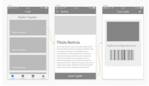
Figure 1: Workflow vouchers/coupons 01
To increase the assertiveness in carrying out this task, we have created, for most of the cases, two possibilities to access vouchers and coupons. During a summer festival, such as the Vodafone Paredes de Coura, there are brand activities that matter to the target market, such as the “Toyota rides”. As illustrated in Fig 1, the user can access the details in the news concerning the hitchhiking, and from there is redirected to the coupon associated with the action. However, and as a faster and more direct way of accessing, the user always has a direct button to the vouchers and coupons section available in the lower tab bar (Fig. 2). From here, all available coupons are displayed, and the corresponding details can be accessed just by clicking on “Use Coupon”.
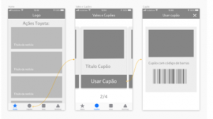
Figure 2: Workflow vouchers/coupons 02
This is an app aimed at gaining and maintaining user loyalty. The associated system of validation and acquisition of points, management of vouchers, and the awarding of rewards provides the app with a strong playful aspect, and is intended to contribute further towards connecting present and potential future users with the Toyota brand.
5.5. Interface design
After the wireframes and workflows design, we moved on to the rigorous design phase of the interface. The screens were designed with a set of graphic and usability concerns, with the goal of creating a credible product that reflected the values of the Toyota brand, and which could provide a best user experience. According to Tidwell [8], users do not trust amateur platforms where there are no efforts taken to create a pleasant appearance.
Since there was already a Spot Toyota version (but only a browser version), a number of aspects had to be taken into account for the restructuring of the entire platform, including the “Spot Toyota” logo (Fig. 3), regarding which it was decided to be kept unchanged.

Figure 3: Spot Toyota logo.
The graphical approach was developed based on the standards and guidelines defined by Toyota. Although this is an independent product from the car sales business, we have endeavored from the outset to maintain visual consistency with Toyota’s identity in Portugal. To achieve this goal, we worked with the guidelines provided in the new Toyota brand visual identity manual [19,20].
For the color system, the work was based on the reference colors defined by Toyota’s identity manual: “Primary Color” (grey “PMS Cool Grey 5”) and “Highlight Colors” (white, red “PMS 186”, and dark grey “PMS CG 11”). In addition to the color, the icons (Fig. 4) adapted for the platform were also conceptualized. We selected those that we considered as having a greater relevance with the app environment. The icons were thus kept as simple line drawings, that were easy to read and carried a minimalist and youthful visual language.
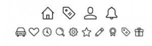
Figure 4: Application icons.
For the Toyota Display and Toyota Text typefaces (original typefaces designed exclusively for Toyota), specific indications in the Toyota brand’s visual identity manual were considered.
The layouts design was shaped based on these visual elements, such as icons, color and text. It was a constantly evolving process, however, at each step, Caetsu’s approvals were took into account, alongside with conclusions from user tests; and strategies that were considered appropriate for the target audience [21,22].
The first designed layouts had a higher incidence of the color red. With the work development, red was replaced with other colors of the pre-defined chromatic palette. With this change, it was possible to create greater harmony and clarity on the screens, particularly in those containing images, simplifying the interface graphic environment and minimizing the use of unnecessary contrasts.
In this follow-up, and through constant articulation with Caetsu’s perspectives, changes were implemented that would end up significantly altering the graphic aspect. Although the structure has been closed since the wireframe phase, it was necessary to optimize certain graphic aspects in order to achieve the best result.
As we can see in figures 5 and 6, the tab bar was one of the elements in which the color was changed from red to light grey.
As it was felt that the Spot Toyota logo needed further prominence, a bar in the same tone was also implemented, increasing the contrast considerably. This change ended up highlighting the menu titles in the nav bar in the same way.
Regarding the homepage, it was concluded that the news/action cards needed to highlight more their button functions. With these elements redesign, an attempt was made to remove any doubt that these areas were clickable, pushing this action.
Other changes focused mainly on the emphasis given to certain titles or text fields, the fonts weight on certain buttons, chromatic coherence in the “call to action” style, as well as certain improvements in content.
Figure 5: Final version screens.
In figure 6, we present through the example of the “home page” screen, the result of the changes made in the interface graphics.
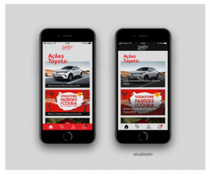
Figure 6: The first version (left) and the final version (right) of the “home page” screen.
5.6. Prototyping
The entire prototyping process proved essential for the communication between the entities involved in the project, Caetsu and Toyota. Since the first meeting, the prototype was an indispensable tool for the evaluation of the work developed and of what would be the real functioning of the mobile application (app).
For the realization of the prototype, we used the Marvel web application. By mapping the clickable zones per screen, we assign the function, the type of interaction and the animation we want for the target screen. Once this process was concluded, based on the workflows developed, we had a prototype capable of transmitting what was intended for the final app, and therefore a fundamental tool for testing with users [23,12].
Besides this type of prototyping, some simple animations were created to illustrate the app dynamics. Using these dynamic images, it became easier to present to the programming team what we wanted (Fig. 7).
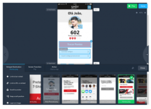
Figure 7: Marvel Platform. Connections between screens.
5.7. Usability tests
Usability tests were developed beginning from the first phase of interface designs. In conjunction with Caetsu, and as the project evolved, decisions were made based on constant user feedback. This process allowed the app to reach a final phase with considerable optimization of the user experience and interface, as well as a reduced number of errors and inconsistencies to be detected at a later stage.
For concluding usability tests with greater accuracy in the analysis method, ten users with an approximate profile to the project’s target audience were selected: young users, between the ages of 17 and 32, with some connection degree to the music festival environment.
In this process, user reactions were observed throughout their interaction with the app. For this procedure, we used the last developed online prototype.
For the tests, a set of different tasks to be performed by the test users was drawn up.
Task list:
- Log in to the app until you find Toyota shares/news;
- Access the coupon “Hitchhiking on Vodafone Paredes de Coura 2019”;
- Exchange 400 points for a black Toyota T-shirt;
- Enter a promotional code;
- Access the news “Hitchhiking on Vodafone Paredes de Coura 2019”;
- Edit your data profile.
After the presentation of these tasks, we asked users to indicate the difficulties encountered, suggestions for improvements, questions, and finally a personal evaluation of the app through a short inquiry form.
According to the observation made to the participants, we concluded that everyone was able to accomplish the proposed tasks. It was also found that the time taken to perform the tasks was identical, with minor differences justifiable by the different levels of users’ digital literacy. As expected, we depict these results has the outcome of constant proximity to users during the project development.
In order to assess the level of these same users’ satisfaction, we also used, as mentioned above, a short inquiry form. This was provided after completing the usability tests and enquired about the interaction quality and the information appearance, alongside the usefulness and the global appreciation.
The usability tests were extremely important as they allowed us to analyse and evaluate the project with regard to navigation issues, understanding and interface involvement. It proved to be a fundamental process to improve the app usability.
Based on the collected feedback, a high degree of overall satisfaction was obtained, both in terms of the app usage and perception of its added value. These assessments validated and helped to optimize content structuring, information organization, aesthetic and graphical approach, as well as the functionalities developed to capture the users’ interest.
6. Conclusions
The main objective of this research was to design a mobile application (app) capable of stimulating a closer relationship between the Toyota brand and its target audience, young people. Thus, through this app, it was intended to explore the potential of technology and digital communication for the loyalty programs development.
Based on the identification and analysis of the state of the art, it was possible to establish objectives that led to the conception of a totally differentiating and pioneering product in the automotive sector. Developed on a real need, and already tested in a previous version, this app aims to create value for Toyota, with effective implementation capacity in the market.
It became essential to understand all the needs, objectives and goals that Caetsu and Toyota Portugal had for the project. Only through this multidisciplinary work, reflected upon the objective articulation of ideas and communication between the entities involved, was it possible to successfully carry out this research project.
The methodology, once properly systematized, made it possible to explore and understand the context of use and the user, as well as Toyota’s intentions and expectations. We used several methods throughout the platform development process, including the understanding of UX and UI design, the application of the personas method, the design of information architecture and the creation of wireframes and workflows.
The implementation of Spot Toyota is expected to contribute effectively to a targeted and closer communication between the brand and its audience. From a selective list of features, users will be given access to exclusive brand information; rewards will be given for the use of the app; unique features will be made available for participation in brand actions, and finally, access will be given to a set of tools for awarding points that can be exchanged for products or services.
For Toyota, it will provide the opportunity to regain contacts lost by the entry into force of RGPD; increase its contact database; develop lead capture strategies; get to know better its target audience in terms of habits, behaviors and needs; and finally establish strong and lasting relationships with its target group.
Conflict of Interest
The authors declare no conflict of interest.
Acknowledgements
This research was supported by the Polytechnic Institute of Cavado and Ave [IPCA] and the Research Institute for Design, Media and Culture [ID+].
- N. Martins, D. Brandão, D. Raposo (Eds.), Perspectives on Design and Digital Communication: Research, Innovations and Best Practices, Cham: Springer, 2021 (in press). DOI: 10.1007/978-3-030-49647-0.
ISBN: 978-3-030-49646-3. - M. Erbschloe, “Customer Loyalty Programs”. Salem Press Encyclopedia. [Online]. Available: http://search.ebscohost.com/login.aspx?direct=true&db=ers&AN=89163635&site=eds-live. [Accessed: 23-Jul-2019]
- J. Oliver, “Forward Thinking Accounting Firms Turn to Apps to Boost Client Loyalty.” Credit Control, 39(1/2), 30–32. Retrieved from http://search.ebscohost.com/login.aspx?direct=true&db=heh&AN=128028330&site=eds-live [Accessed: 5-Nov-2019]
- W. Cook, “Five Reasons Why You Can’t Ignore Gamification”. Incentive, 187(1), 22–23, 2013. https://doi.org/10.1248/bpb.23.762
- E. Jun, H. Liao, A. Savoy, L. Zeng, and G. Salvendy, “The design of future things”, by D. A. Norman, basic books, New York, NY, USA. Hum. Factors Man., 18: 480-481, 2008. https://doi.org/10.1002/hfm.20127
- C. Vargas-Irwin, J.P. Donoghue “Automated spike sorting using density grid contour clustering and subtractive waveform decomposition”, Journal of Neuroscience Methods, vol. 164, 1-18, 2007. https://doi.org/10.1016/j.jneumeth.2007.03.025
- S. Krug, Don’t Make Me Think! In K. Whitehouse & L. Brazieal (Eds.), Don’t Make Me Think! A Common Sense Aproach to Web Usability (Second). Berkeley: New Riders, 2006.
- A. Dickinson, J. Arnott, S. Prior, and A. Dickinson, ‘Methods for human-computer interaction research with older people’, Behav. Inf. Technol. is, vol. 26, no. 4, 343–352, 2007.
- P. Morville & L. Rosenfeld, “Information Architecture for the World Wide Web”. In IEEE Transactions on Professional Communication (Third, Vol. 43), 2006. https://doi.org/10.1109/tpc.2000.826425
- R. A. Virzi, “Refining the test phase of usability evaluation: How many subjects is enough?” Special Issue: Measurement in human factors. Human Factors, 34(4), 457–468, 1992.
- E. Stevens, “What Is User Experience (UX) Design? Here’s What You Need To Know”, 2018 [Online]. Available: https://careerfoundry.com/en/blog/ux-design/what-is-user-experience-ux-design-everything-you-need-to-know-to-get-started. [Accessed: 8-May-2019]
- J. Nielsen, “10 Usability Heuristics for User Interface Design”, Nielsen Norman Group, 1995. [Online]. Available: https://www.nngroup.com/articles/ten-usability-heuristics. [Accessed: 14-Oct-2019].
- Raven L. Veal. “How to define a User Persona” [Online]. Available: https://careerfoundry.com/en/blog/ux-design/how-to-define-a-user-persona. [Accessed: 29-Mar-2019]
- R. Dam & T. Siang. “Personas: A Simple Introduction”. Interaction Design Foundation. [Online]. Available: https://www.interaction-design.org/literature/article/personas-why-and-how-you-should-use-them. [Accessed: 28-Mar-2019]
- N. Martins & T. Araújo, “The contribution of design in supporting the pregnancy process: The study of a mobile application towards a more informed relationship between the pregnant woman and the healthcare professional” in ARTECH 2019 – Proceedings of the 9th International Conference on Digital and Interactive Arts, Braga, 2019. Ed: ACM. pp. 191-197. https://doi.org/10.1145/3359852.3359857.
- Interaction Design Foundation, “What are User Personas?”, 2018. [Online]. Available: https://www.interaction-design.org/literature/topics/user-personas. [Accessed: 11-Jul-2019]
- Guilizzoni, P. “What Are Wireframes?” Balsamiq Wireframing Academy, 2019. [Online]. Available: https://balsamiq.com/learn/resources/articles/what-are-wireframes. [Accessed: 22-Jul-2019]
- J. Bernal, G. Flores, R. Vargas, “Diseñas: The web app for learning design terms for deaf students” in DIGICOM 2019 – 3rd International Conference on Design and Digital Communication: Proceedings, Barcelos, 2019. Ed: IPCA. pp. 315-324. https://digicom.ipca.pt/docs/DIGICOM2019-Proceedings.pdf. ISBN: 978-989-54489-5-1.
- J. Tidwell, Designing Interfaces. In M. Treseler & R. Monaghan (Eds.), Animal Genetics (Second Edi, Vol. 39). Sebastopol: O’Reilly Media, 2011.
- Toyota. Novo Manual de Identidade Visual da Marca Toyota. Portugal, 2012.
- J. K. Liker, D. Meier, The Toyota Way Fieldbook: A Practical Guide for Implementing Toyota’s 4Ps. New York, London: McGraw-Hill, 2006.
- S. Kujala, R. Mugge, T. Miron-Shatz, “The role of expectations in service evaluation: A longitudinal study of a proximity mobile payment service” International Journal of Human-Computer Studies, Vol. 98, 51-61, 2017 https://doi.org/10.1016/j.ijhcs.2016.09.011.
- C.P. Jansen, S.F. Donker, D.P. Brumby, A.L. Kunc “History and future of human-automation interaction”, International Journal of Human-Computer Studies, vol. 131, 99-107, 2019. https://doi.org/10.1016/j.ijhcs.2019.05.006