Data-Driven Activities Involving Electronic Health Records: An Activity and Task Analysis Framework for Interactive Visualization Tools


Abstract
:1. Introduction
2. A Proposed Activity and Task Analysis Framework
2.1. Higher-Level Activities: Interpreting, Predicting, and Monitoring
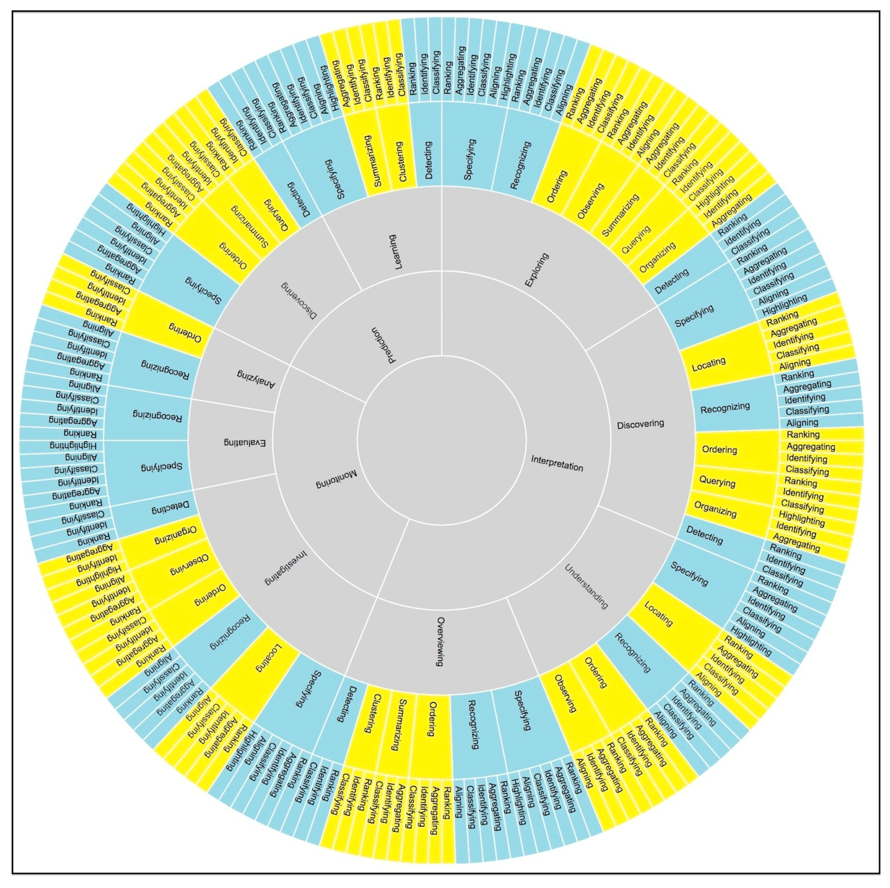
2.2. Hierarchical Structure of Activities, Sub-Activities, Tasks, and Sub-Tasks
3. Methods
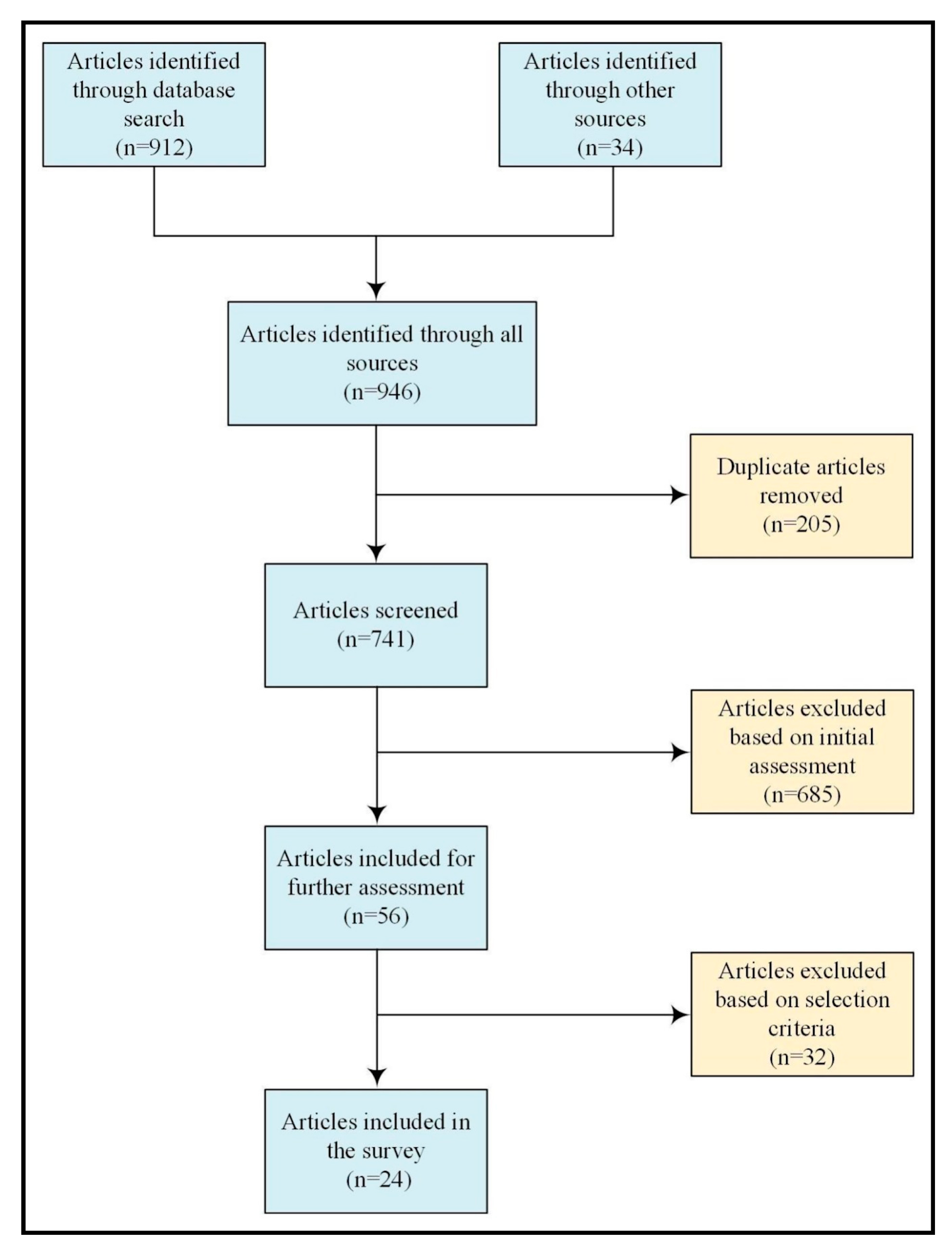
3.1. Search Strategy
3.2. Selection Criteria
3.3. Results
4. Survey of the Interactive Visualization Tools
4.1. Population-Based Tools
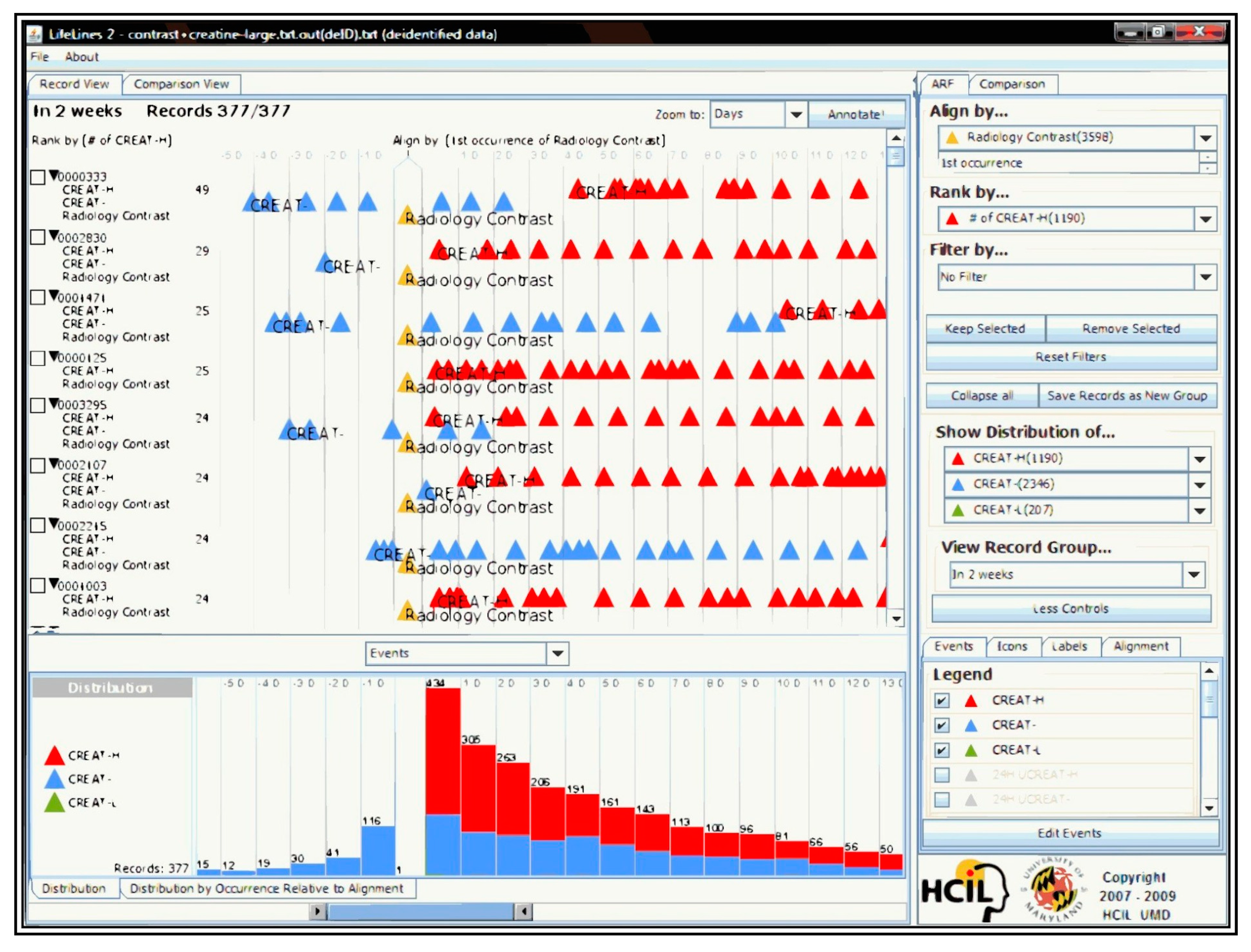
4.1.1. Lifelines2
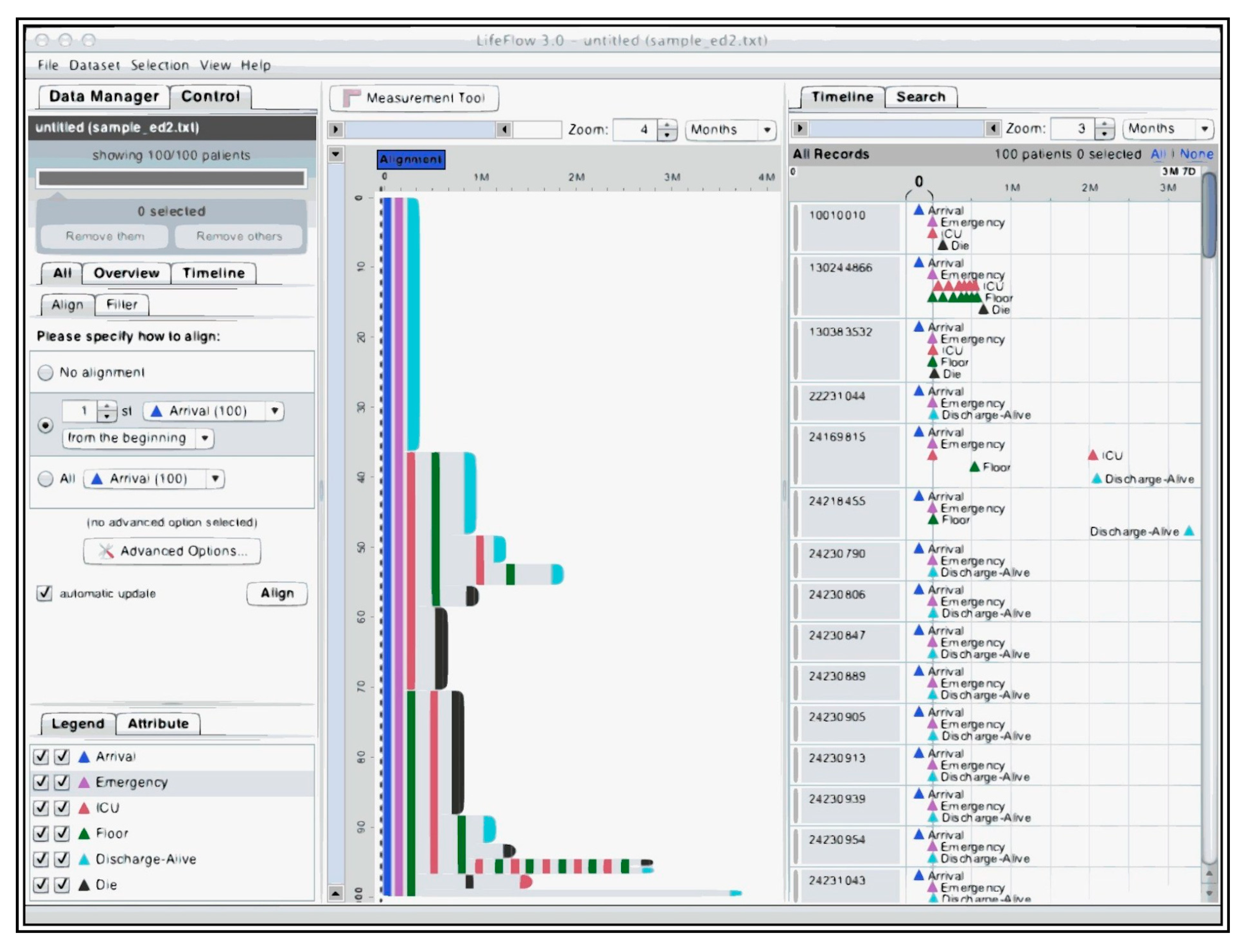
4.1.2. Lifeflow
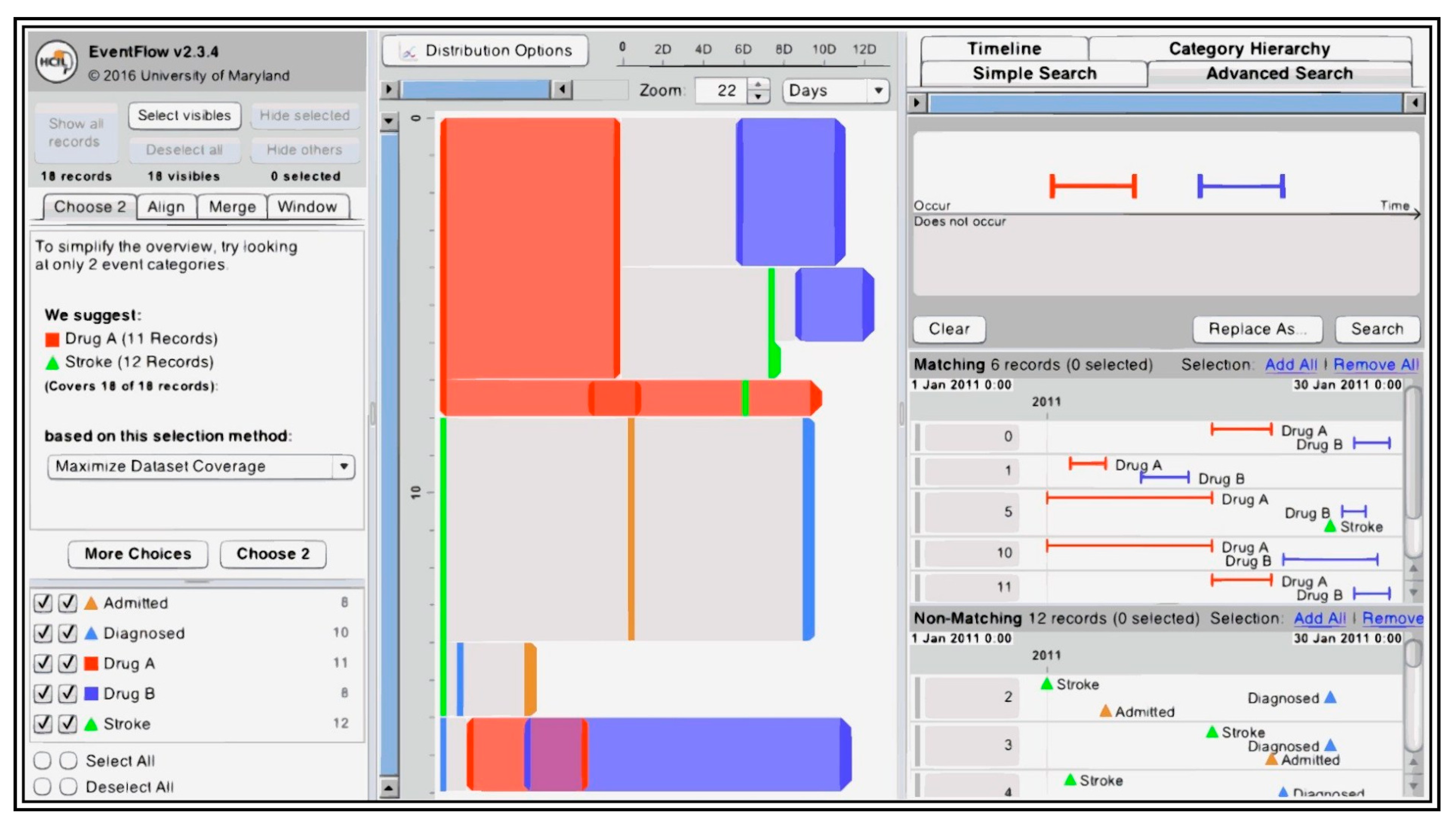
4.1.3. Eventflow
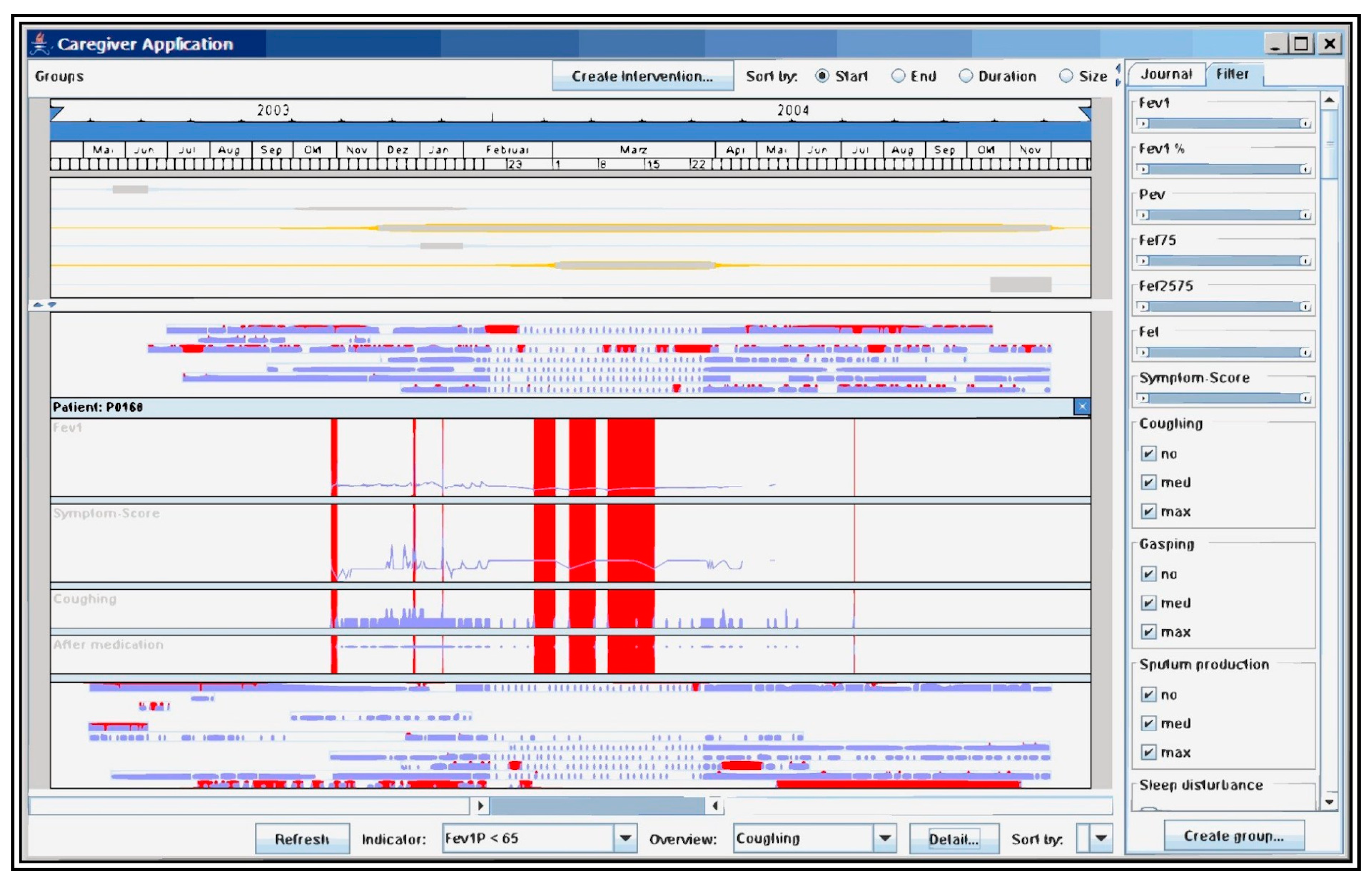
4.1.4. Caregiver
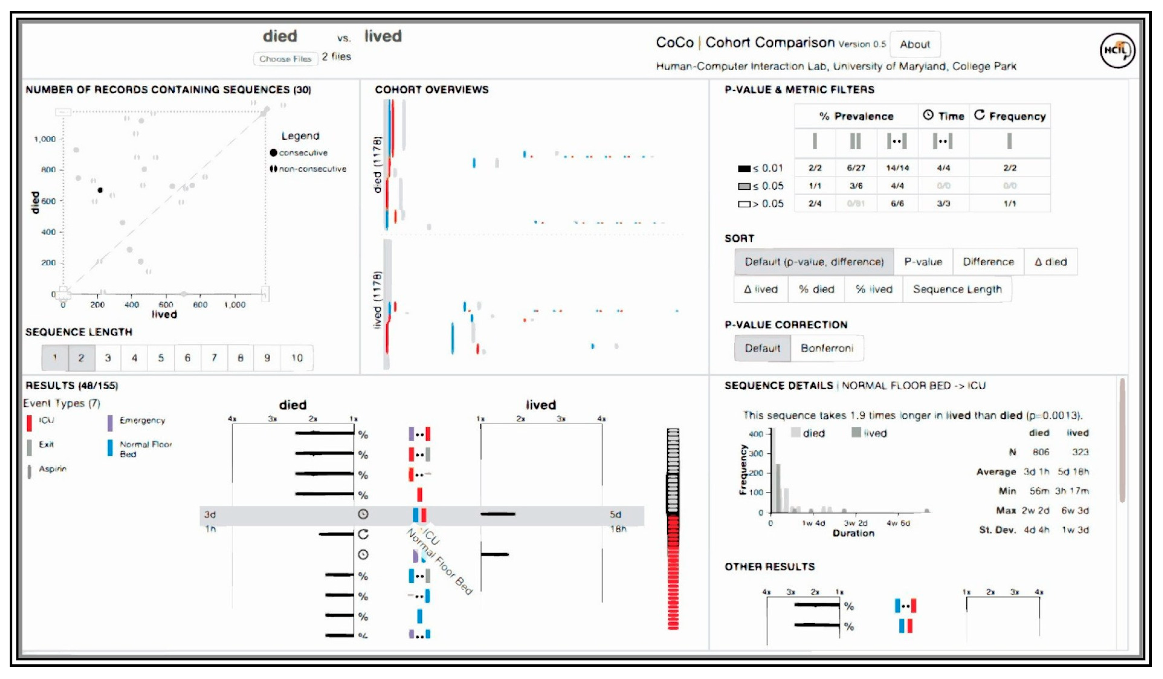
4.1.5. CoCo
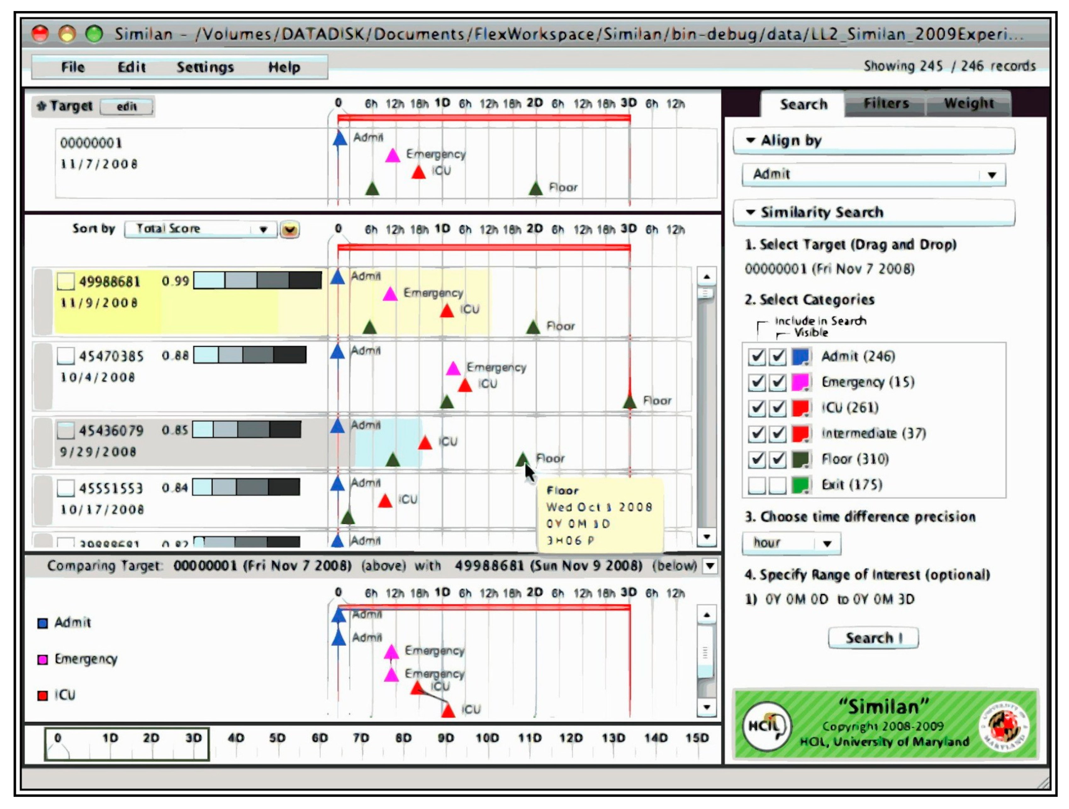
4.1.6. Similan
4.1.7. Outflow
4.1.8. IPBC
4.1.9. Gravi++
4.1.10. PatternFinder
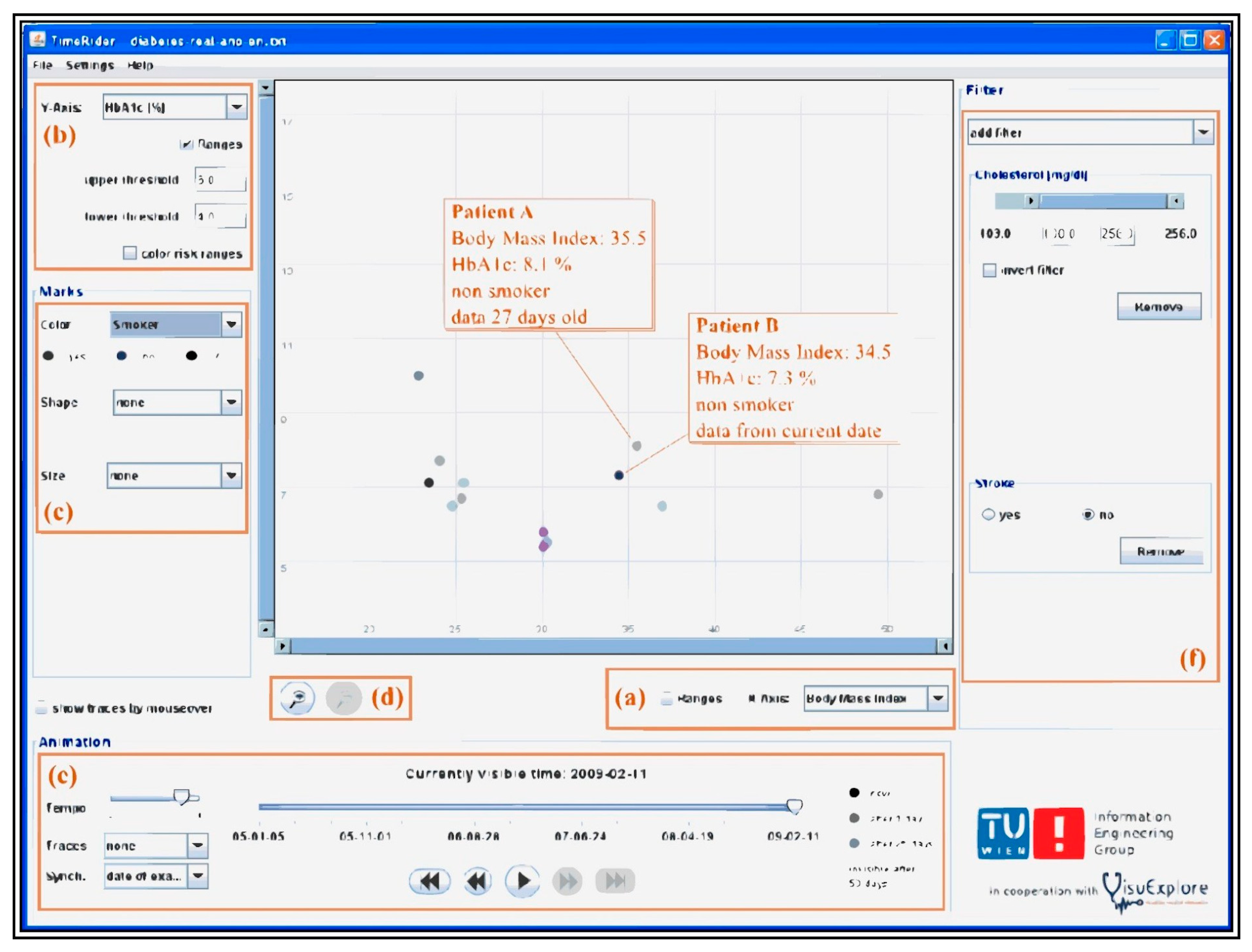
4.1.11. TimeRider
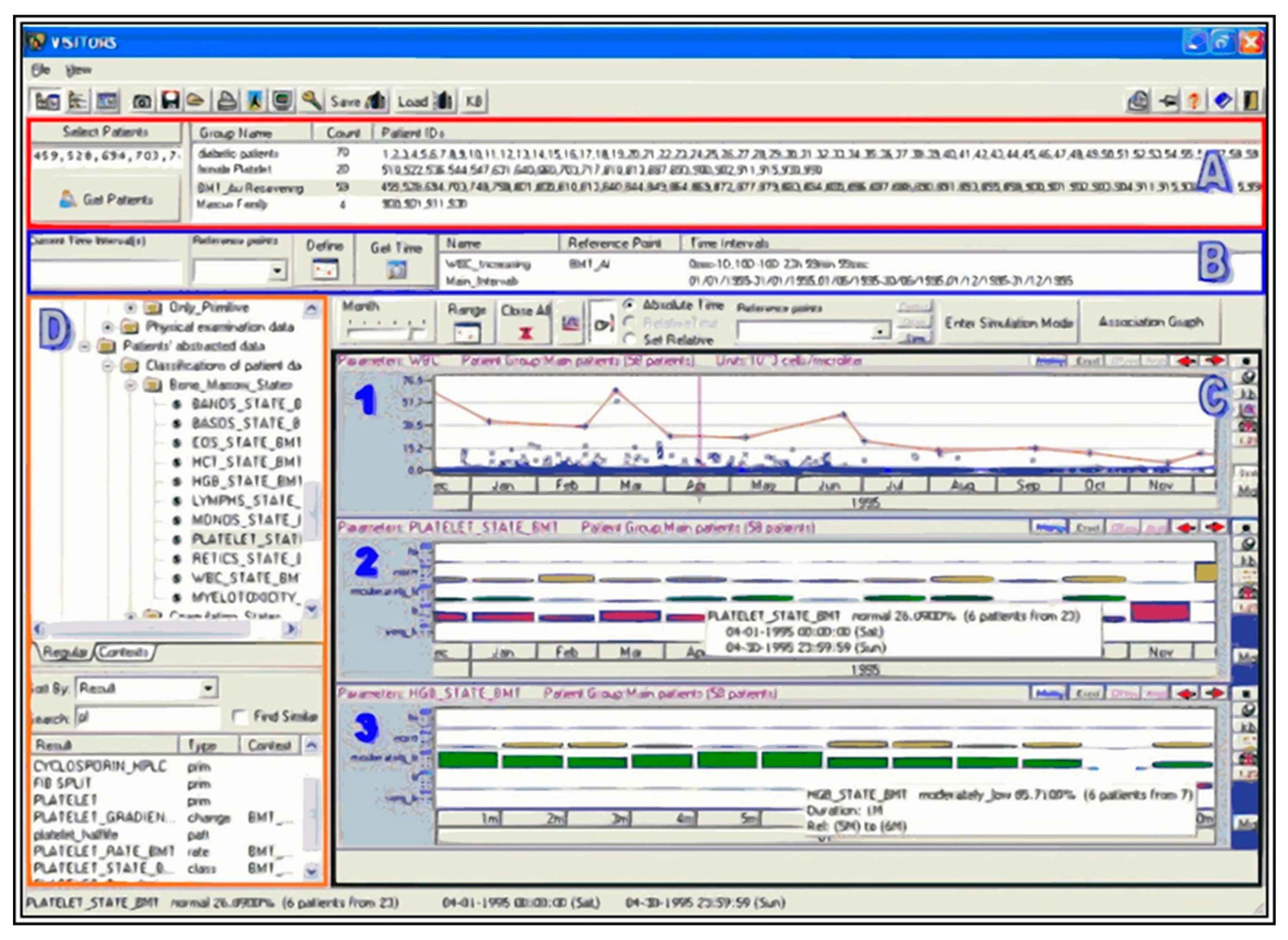
4.1.12. VISITORS
4.1.13. Prima
4.1.14. WBIVS
4.2. Single-Patient Tools
4.2.1. Midgaard
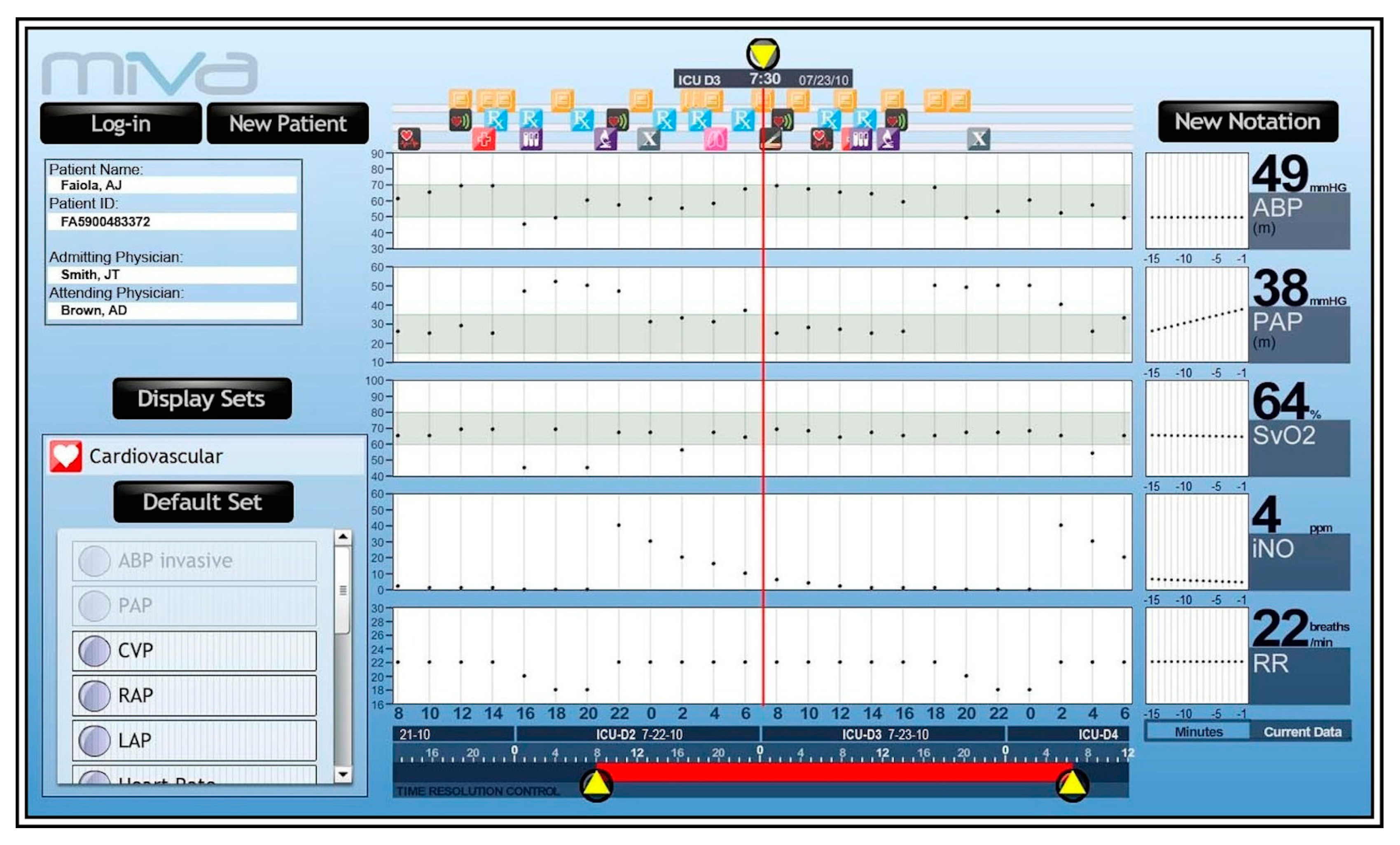
4.2.2. MIVA
4.2.3. VIE–VISU
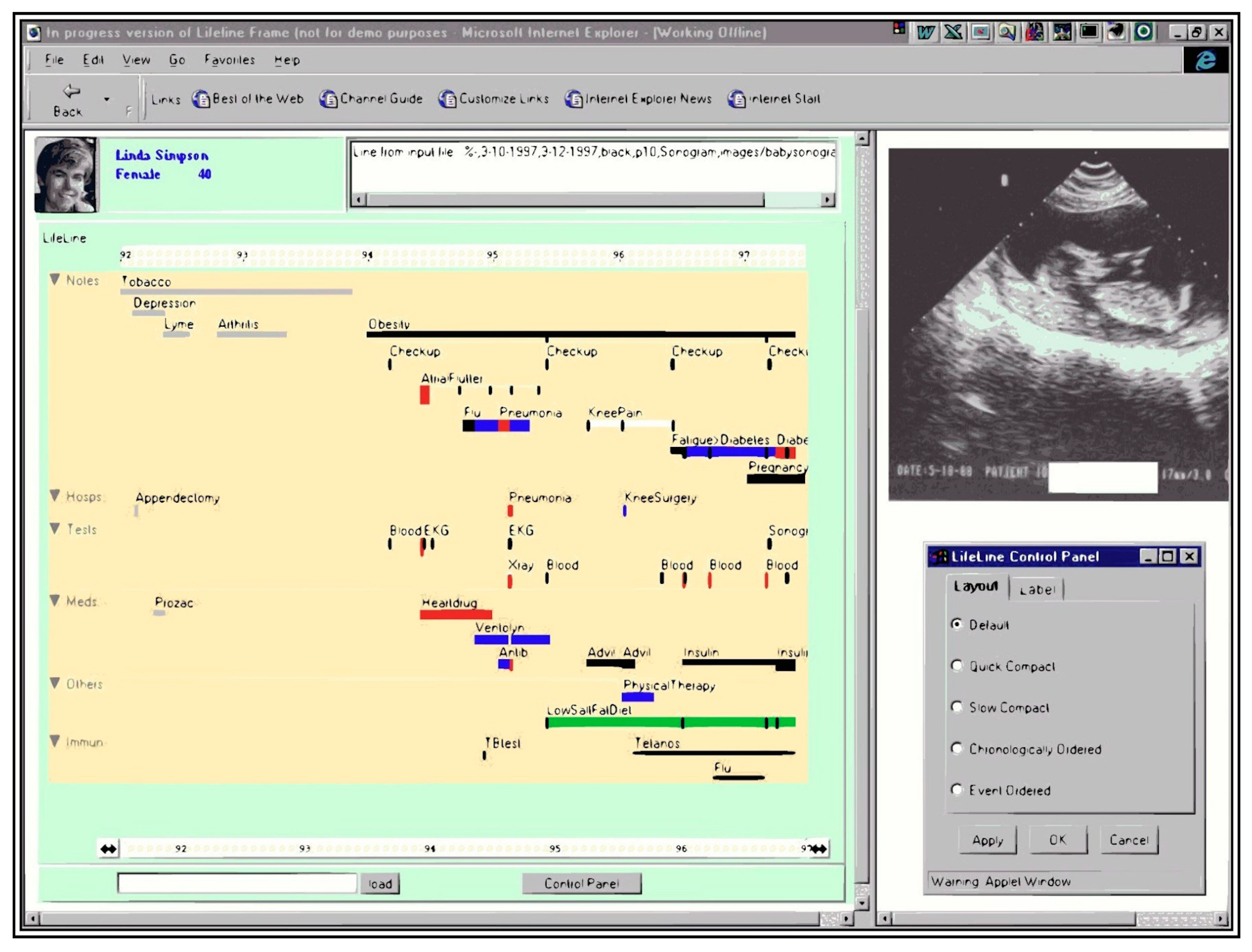
4.2.4. Lifelines
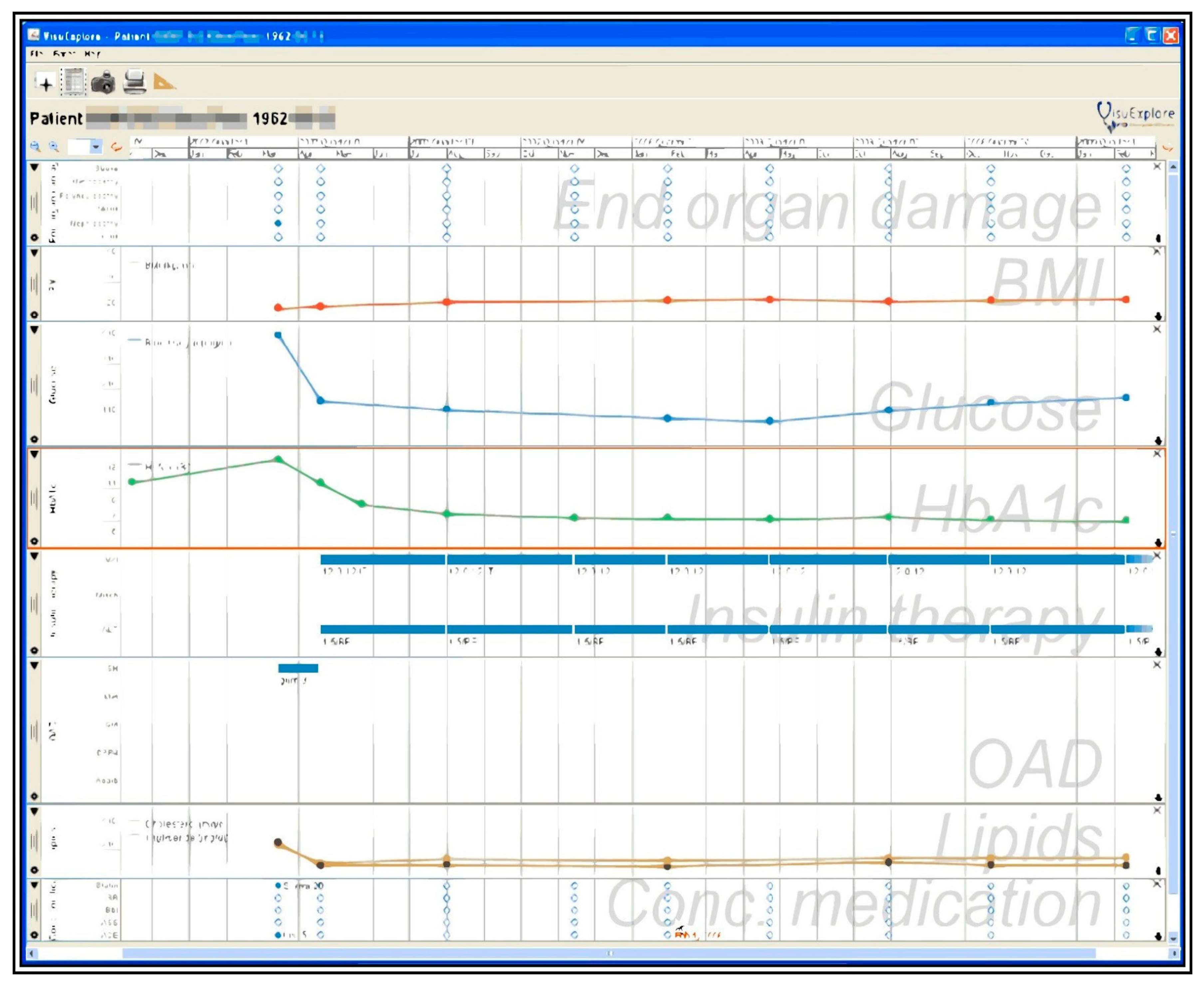
4.2.5. VisuExplore
5. Discussion and Limitations
Author Contributions
Funding
Acknowledgments
Conflicts of Interest
References
- Tang, P.C.; McDonald, C.J. Electronic health record systems. In Biomedical Informatics: Computer Applications in Health Care and Biomedicine; Health Informatics; Shortliffe, E.H., Cimino, J.J., Eds.; Springer: New York, NY, USA, 2006; pp. 447–475. ISBN 978-0-387-36278-6. [Google Scholar]
- Christensen, T.; Grimsmo, A. Instant availability of patient records, but diminished availability of patient information: A multi-method study of GP’s use of electronic patient records. BMC Med. Inform. Decis. Mak. 2008, 8, 12. [Google Scholar] [CrossRef] [PubMed] [Green Version]
- Boonstra, A.; Versluis, A.; Vos, J.F. Implementing electronic health records in hospitals: A systematic literature review. BMC Health Serv. Res. 2014, 14, 370. [Google Scholar] [CrossRef] [PubMed] [Green Version]
- Himmelstein, D.U.; Wright, A.; Woolhandler, S. Hospital computing and the costs and quality of care: A national study. Am. J. Med. 2010, 123, 40–46. [Google Scholar] [CrossRef] [PubMed]
- Rind, A.; Wang, T.D.; Aigner, W.; Miksch, S.; Wongsuphasawat, K.; Plaisant, C.; Shneiderman, B. Interactive information visualization to explore and query electronic health records. HCI 2013, 5, 207–298. [Google Scholar]
- Sears, A.; Jacko, J.A. The Human-Computer Interaction Handbook: Fundamentals, Evolving Technologies and Emerging Applications, 2nd ed.; CRC Press: Boca Raton, FL, USA, 2007; ISBN 978-1-4106-1586-2. [Google Scholar]
- Sedig, K.; Parsons, P. Design of visualizations for human-information interaction: A pattern-based framework. Synth. Lect. Vis. 2016, 4, 1–185. [Google Scholar] [CrossRef]
- Lesselroth, B.J.; Pieczkiewicz, D.S. Data Visualization Strategies for the Electronic Health Record; Nova Science Publishers, Inc.: Hauppauge, NY, USA, 2011; ISBN 978-1-61209-270-6. [Google Scholar]
- Combi, C.; Keravnou-Papailiou, E.; Shahar, Y. Temporal Information Systems in Medicine; Springer Science & Business Media: Berlin, Germany, 2010; ISBN 978-1-4419-6543-1. [Google Scholar]
- Aigner, W.; Kaiser, K.; Miksch, S. Visualization techniques to support authoring, execution, and maintenance of clinical guidelines. In Computer-Based Medical Guidelines and Protocols: A Primer and Current Trends; IOS Press: Amsterdam, The Netherlands, 2008; Volume 139, pp. 140–159. [Google Scholar]
- Ola, O.; Sedig, K. Discourse with visual health data: Design of human-data interaction. Multimodal Technol. Interact. 2018, 2, 10. [Google Scholar] [CrossRef] [Green Version]
- Sedig, K.; Parsons, P. Interaction design for complex cognitive activities with visual representations: A pattern-based approach. AIS Trans. Hum. Comput. Interact. 2013, 5, 84–133. [Google Scholar] [CrossRef] [Green Version]
- Wang, T.D.; Plaisant, C.; Quinn, A.J.; Stanchak, R.; Murphy, S.; Shneiderman, B. Aligning temporal data by sentinel events: Discovering patterns in electronic health records. In Proceedings of the SIGCHI Conference on Human Factors in Computing Systems-ACM, New York, NY, USA, 5–10 April 2008; pp. 457–466. [Google Scholar]
- Wongsuphasawat, K.; Guerra Gómez, J.A.; Plaisant, C.; Wang, T.D.; Taieb-Maimon, M.; Shneiderman, B. LifeFlow: Visualizing an overview of event sequences. In Proceedings of the SIGCHI Conference on Human Factors in Computing Systems-ACM, New York, NY, USA, 7–12 May 2011; pp. 1747–1756. [Google Scholar]
- Wongsuphasawat, K.; Gotz, D. Exploring flow, factors, and outcomes of temporal event sequences with the Outflow visualization. IEEE Trans. Vis. Comput. Graph. 2012, 18, 2659–2668. [Google Scholar] [CrossRef]
- Malik, S.; Du, F.; Monroe, M.; Onukwugha, E.; Plaisant, C.; Shneiderman, B. An evaluation of visual analytics approaches to comparing cohorts of event sequences. In Proceedings of the EHRVis Workshop on Visualizing Electronic Health Record Data at VIS, Paris, France, 9 November 2014; Volume 14. [Google Scholar]
- Fails, J.A.; Karlson, A.; Shahamat, L.; Shneiderman, B. A visual interface for multivariate temporal data: Finding patterns of events across multiple histories. In Proceedings of the 2006 IEEE Symposium On Visual Analytics Science And Technology IEEE, Baltimore, MD, USA, 31 October–2 November 2006; pp. 167–174. [Google Scholar]
- Klimov, D.; Shahar, Y.; Taieb-Maimon, M. Intelligent selection and retrieval of multiple time-oriented records. J. Intell. Inf. Syst. 2010, 35, 261–300. [Google Scholar] [CrossRef]
- Wongsuphasawat, K. Finding comparable patient histories: A temporal categorical similarity measure with an interactive visualization. In Proceedings of the IEEE Symposium on Visual Analytics Science and Technology (VAST), Atlantic City, NJ, USA, 11–16 October 2009. [Google Scholar]
- Monroe, M.; Lan, R.; Lee, H.; Plaisant, C.; Shneiderman, B. Temporal event sequence simplification. IEEE Trans. Vis. Comput. Graph. 2013, 19, 2227–2236. [Google Scholar] [CrossRef] [Green Version]
- Brodbeck, D.; Gasser, R.; Degen, M.; Reichlin, S.; Luthiger, J. Enabling large-scale telemedical disease management through interactive visualization. Eur. Notes Med. Inform. 2005, 1, 1172–1177. [Google Scholar]
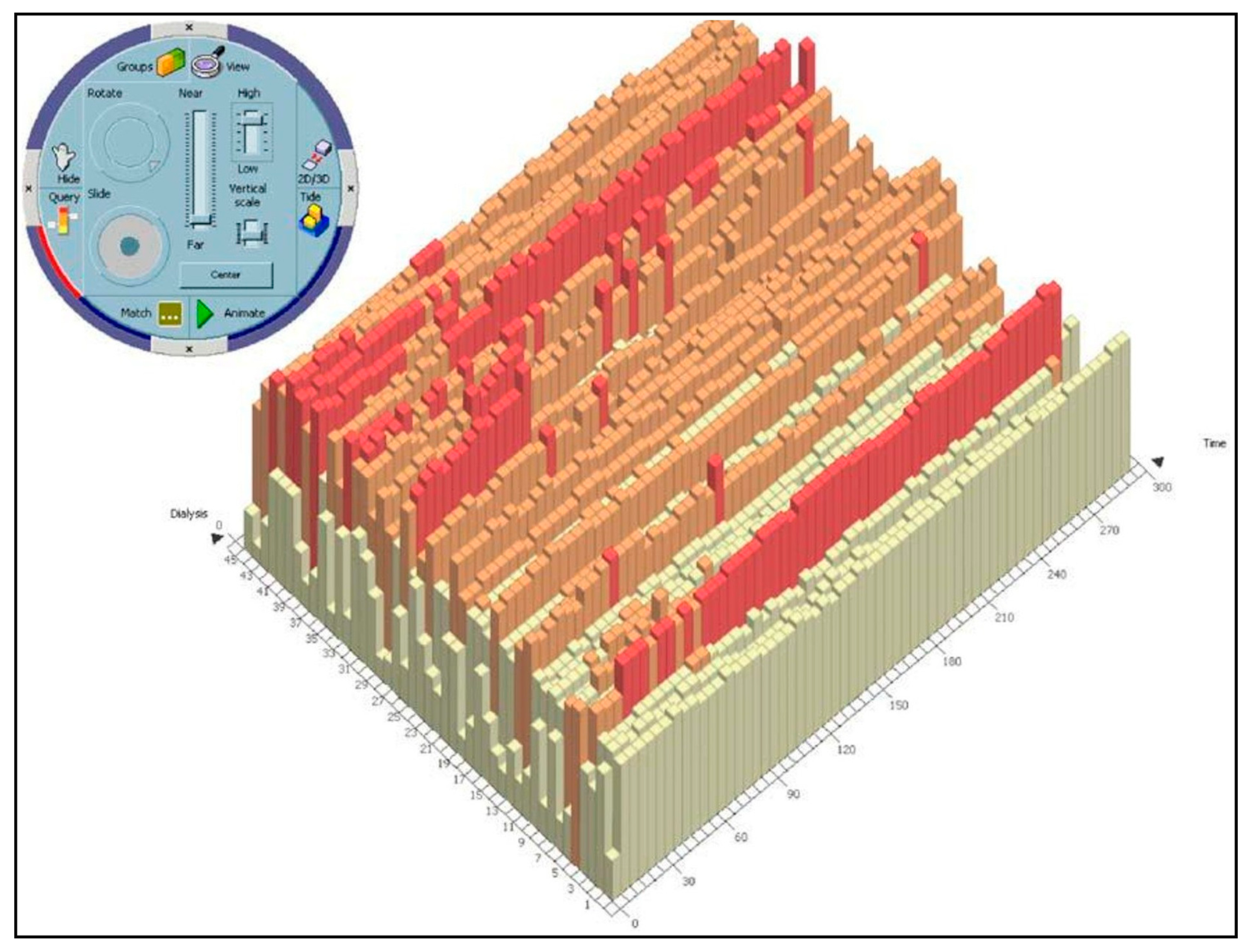
- Chittaro, L.; Combi, C.; Trapasso, G. Data mining on temporal data: A visual approach and its clinical application to hemodialysis. J. Vis. Lang. Comput. 2003, 14, 591–620. [Google Scholar] [CrossRef]
- Rind, A.; Aigner, W.; Miksch, S.; Wiltner, S.; Pohl, M.; Drexler, F.; Neubauer, B.; Suchy, N. Visually exploring multivariate trends in patient cohorts using animated scatter plots. In Ergonomics and Health Aspects of Work with Computers; Robertson, M.M., Ed.; Springer: Berlin/Heidelberg, Germany, 2011; pp. 139–148. [Google Scholar]
- Plaisant, C.; Mushlin, R.; Snyder, A.; Li, J.; Heller, D.; Shneiderman, B. LifeLines: Using visualization to enhance navigation and analysis of patient records. Proc. Am. Med. Inform. Assoc. Annu. Fall Symp. 1998, 76–80. [Google Scholar] [CrossRef]
- Faiola, A.; Newlon, C. Advancing critical care in the ICU: A human-centered biomedical data visualization systems. In Proceedings of the International Conference on Ergonomics and Health Aspects of Work with Computers; Springer: Berlin/Heidelberg, Germany, 2011; pp. 119–128. [Google Scholar]
- Pieczkiewicz, D.S.; Finkelstein, S.M.; Hertz, M.I. Design and evaluation of a web-based interactive visualization system for lung transplant home monitoring data. Proc. AMIA Annu. Symp. Proc. Am. Med. Inform. Assoc. 2007, 2007, 598. [Google Scholar]
- Bade, R.; Schlechtweg, S.; Miksch, S. Connecting time-oriented data and information to a coherent interactive visualization. In Proceedings of the SIGCHI Conference on Human Factors in Computing Systems ACM, Vienna, Austria, 24–29 April 2004; pp. 105–112. [Google Scholar]
- Hinum, K.; Miksch, S.; Aigner, W.; Ohmann, S.; Popow, C.; Pohl, M.; Rester, M. Gravi++: Interactive information visualization to explore highly structured temporal data. J. UCS 2005, 11, 1792–1805. [Google Scholar]
- Rind, A.; Aigner, W.; Miksch, S.; Wiltner, S.; Pohl, M.; Turic, T.; Drexler, F. Visual exploration of time-oriented patient data for chronic diseases: Design study and evaluation. In Proceedings of the Symposium of the Austrian HCI and Usability Engineering Group; Springer: Berlin/Heidelberg, Germany, 2011; pp. 301–320. [Google Scholar]
- Ordonez, P.; Oates, T.; Lombardi, M.E.; Hernandez, G.; Holmes, K.W.; Fackler, J.; Lehmann, C.U. Visualization of multivariate time-series data in a neonatal ICU. IBM J. Res. Dev. 2012, 56, 7:1–7:12. [Google Scholar] [CrossRef]
- Gresh, D.L.; Rabenhorst, D.A.; Shabo, A.; Slavin, S. Prima: A case study of using information visualization techniques for patient record analysis. In Proceedings of the IEEE Visualization (VIS 2002), Boston, MA, USA, 27 October–1 November 2002; pp. 509–512. [Google Scholar]
- Horn, W.; Popow, C.; Unterasinger, L. Support for fast comprehension of ICU data: Visualization using metaphor graphics. Methods Inf. Med. 2001, 40, 421–424. [Google Scholar]
- Låg, T.; Bauger, L.; Lindberg, M.; Friborg, O. The role of numeracy and intelligence in health-risk estimation and medical data interpretation. J. Behav. Decis. Mak. 2014, 27, 95–108. [Google Scholar] [CrossRef]
- Groves, M.; O’Rourke, P.; Alexander, H. Clinical reasoning: The relative contribution of identification, interpretation and hypothesis errors to misdiagnosis. Med. Teach. 2003, 25, 621–625. [Google Scholar] [CrossRef]
- Auffray, C.; Balling, R.; Barroso, I.; Bencze, L.; Benson, M.; Bergeron, J.; Bernal-Delgado, E.; Blomberg, N.; Bock, C.; Conesa, A.; et al. Making sense of big data in health research: Towards an EU action plan. Genome Med. 2016, 8, 71. [Google Scholar] [CrossRef]
- Komaroff, A.L. The variability and inaccuracy of medical data. Proc. IEEE 1979, 67, 1196–1207. [Google Scholar] [CrossRef]
- Kumar, M.; Stoll, N.; Kaber, D.; Thurow, K.; Stoll, R. Fuzzy filtering for an intelligent interpretation of medical data. In Proceedings of the 2007 IEEE International Conference on Automation Science and Engineering, Scottsdale, AZ, USA, 22–25 September 2007; pp. 225–230. [Google Scholar]
- Amarasingham, R.; Patzer, R.E.; Huesch, M.; Nguyen, N.Q.; Xie, B. Implementing electronic health care predictive analytics: Considerations and challenges. Health Aff. 2014, 33, 1148–1154. [Google Scholar] [CrossRef] [PubMed]
- Cohen, I.G.; Amarasingham, R.; Shah, A.; Xie, B.; Lo, B. The legal and ethical concerns that arise from using complex predictive analytics in health care. Health Aff. 2014, 33, 1139–1147. [Google Scholar] [CrossRef] [PubMed]
- Kankanhalli, A.; Hahn, J.; Tan, S.; Gao, G. Big data and analytics in healthcare: Introduction to the special section. Inf. Syst. Front. 2016, 18, 233–235. [Google Scholar] [CrossRef] [Green Version]
- Wang, Y.; Kung, L.; Byrd, T.A. Big data analytics: Understanding its capabilities and potential benefits for healthcare organizations. Technol. Forecast. Soc. Chang. 2018, 126, 3–13. [Google Scholar] [CrossRef]
- Simpao, A.F.; Ahumada, L.M.; Gálvez, J.A.; Rehman, M.A. A review of analytics and clinical informatics in health care. J. Med. Syst. 2014, 38, 45. [Google Scholar] [CrossRef]
- Raghupathi, W.; Raghupathi, V. Big data analytics in healthcare: Promise and potential. Health Inf. Sci. Syst. 2014, 2, 3. [Google Scholar] [CrossRef]
- Saeed, M.; Lieu, C.; Raber, G.; Mark, R.G. MIMIC II: A massive temporal ICU patient database to support research in intelligent patient monitoring. Proc. Comput. Cardiol. 2002, 29, 641–644. [Google Scholar]
- Tia, G.; Greenspan, D.; Welsh, M.; Juang, R.R.; Alm, A. Vital signs monitoring and patient tracking over a wireless network. In Proceedings of the 2005 IEEE Engineering in Medicine and Biology, 27th Annual Conference, Shanghai, China, 31 August–3 September 2005; pp. 102–105. [Google Scholar]
- Hauskrecht, M.; Batal, I.; Valko, M.; Visweswaran, S.; Cooper, G.F.; Clermont, G. Outlier detection for patient monitoring and alerting. J. Biomed. Inform. 2013, 46, 47–55. [Google Scholar] [CrossRef]
- Anderson, H.D.; Pace, W.D.; Brandt, E.; Nielsen, R.D.; Allen, R.R.; Libby, A.M.; West, D.R.; Valuck, R.J. Monitoring suicidal patients in primary care using electronic health records. J. Am. Board Fam. Med. 2015, 28, 65–71. [Google Scholar] [CrossRef]
- Kho, A.; Rotz, D.; Alrahi, K.; Cárdenas, W.; Ramsey, K.; Liebovitz, D.; Noskin, G.; Watts, C. Utility of commonly captured data from an EHR to identify hospitalized patients at risk for clinical deterioration. AMIA Annu. Symp. Proc. 2007, 2007, 404–408. [Google Scholar]
- Li, X.; Wang, Y. Adaptive online monitoring for ICU patients by combining just-in-time learning and principal component analysis. J. Clin. Monit. Comput. 2016, 30, 807–820. [Google Scholar] [CrossRef] [PubMed]
- Siegel, E. Predictive Analytics: The Power to Predict Who Will Click, Buy, Lie, or Die; John Wiley & Sons: Hoboken, NJ, USA, 2013; ISBN 978-1-118-35685-2. [Google Scholar]
- Glasziou, P.; Irwig, L.; Mant, D. Monitoring in chronic disease: A rational approach. BMJ 2005, 330, 644–648. [Google Scholar] [CrossRef] [PubMed] [Green Version]
- Wang, T.D.; Plaisant, C.; Shneiderman, B.; Spring, N.; Roseman, D.; Marchand, G.; Mukherjee, V.; Smith, M. Temporal summaries: Supporting temporal categorical searching, aggregation and comparison. IEEE Trans. Vis. Comput. Graph. 2009, 15, 1049–1056. [Google Scholar] [CrossRef]
- Guerra Gómez, J.; Wongsuphasawat, K.; Wang, T.D.; Pack, M.; Plaisant, C. Analyzing incident management event sequences with interactive visualization. In Proceedings of the Transportation Research Board 90th Annual Meeting, Compendium of Papers, Washington, DC, USA, 23–27 January 2011. [Google Scholar]
- Malik, S.; Du, F.; Monroe, M.; Onukwugha, E.; Plaisant, C.; Shneiderman, B. Cohort comparison of event sequences with balanced integration of visual analytics and statistics. In Proceedings of the 20th International Conference on Intelligent User Interfaces; ACM: New York, NY, USA, 2015; pp. 38–49. [Google Scholar]
- Wongsuphasawat, K.; Gotz, D. Outflow: Visualizing patient flow by symptoms and outcome. In Proceedings of the IEEE VisWeek Workshop on Visual Analytics in Healthcare; Providence, RI, USA, 23 October 2011, American Medical Informatics Association: Bethesda, MD, USA, 2011; pp. 25–28. [Google Scholar]
- Klimov, D.; Shahar, Y.; Taieb-Maimon, M. Intelligent visualization and exploration of time-oriented data of multiple patients. Artif. Intell. Med. 2010, 49, 11–31. [Google Scholar] [CrossRef]
- Pohl, M.; Wiltner, S.; Rind, A.; Aigner, W.; Miksch, S.; Turic, T.; Drexler, F. Patient development at a glance: An evaluation of a medical data visualization. In Human-Computer Interaction—INTERACT 2011; Campos, P., Graham, N., Jorge, J., Nunes, N., Palanque, P., Winckler, M., Eds.; Springer: Berlin/Heidelberg, Germany, 2011; Volume 6949, pp. 292–299. ISBN 978-3-642-23767-6. [Google Scholar]
- HER Intelligence. 40% of Physicians See More EHR Challenges than Benefits. Available online: https://ehrintelligence.com/news/40-of-physicians-see-more-ehr-challenges-than-benefits (accessed on 18 December 2019).


| Task | Sub-tasks | |
|---|---|---|
| Interactive | Ordering | Aggregating, Classifying, Identifying, Ranking |
| Locating | Aggregating, Aligning, Classifying, Identifying, Ranking | |
| Querying | Classifying, Identifying, Ranking, | |
| Organizing | Aggregating, Classifying, Identifying, Highlighting | |
| Summarizing | Aggregating, Classifying, Identifying | |
| Clustering | Classifying, Identifying, Ranking | |
| Observing | Aggregating, Aligning, Identifying, Ranking | |
| Visual | Recognizing | Aggregating, Aligning, Classifying, Identifying, Ranking |
| Specifying | Aggregating, Aligning, Classifying, Identifying, Highlighting, Ranking | |
| Detecting | Classifying, Identifying, Ranking |
| Terms Used |
|---|
| “Visualization*” +“Health Record*” |
| “Visualization*” + “Electronic Health Record*” |
| “Visualization*” + “EHR*” |
| “Visualization*” + “Electronic Patient Record*” |
| “Visualization*” + “Electronic Medical Record*” |
| “Visualization*” + “Patients Record*” |
| “Visualization*” + “Patient Record*” |
| “Visualization tool*” +“Health Record*” |
| “Visualization tool*” + “Electronic Health Record*” |
| “Visualization tool*” + “EHR*” |
| “Visualization tool*” + “Electronic Patient Record*” |
| “Visualization tool*” + “Electronic Medical Record*” |
| “Visualization tool*” + “Patients Record*” |
| “Visualization tool*” + “Patient Record*” |
| “Information visualization*” +“Health Record*” |
| “Information visualization*” + “Electronic Health Record*” |
| “Information visualization*” + “EHR*” |
| “Information visualization*” + “Electronic Patient Record*” |
| “Information visualization*” + “Electronic Medical Record*” |
| “Information visualization*” + “Patients Record*” |
| “Information visualization*” + “Patient Record*” |
| “Interactive visualization*” +“Health Record*” |
| “Interactive visualization*” + “Electronic Health Record*” |
| “Interactive visualization*” + “EHR*” |
| “Interactive visualization*” + “Electronic Patient Record*” |
| “Interactive visualization*” + “Electronic Medical Record*” |
| “Interactive visualization*” + “Patients Record*” |
| “Interactive visualization*” + “Patient Record*” |
| “Interactive visualization tool*” +“Health Record*” |
| “Interactive visualization tool*” + “Electronic Health Record*” |
| “Interactive visualization tool*” + “EHR*” |
| “Interactive visualization tool*” + “Electronic Patient Record*” |
| “Interactive visualization tool*” + “Electronic Medical Record*” |
| “Interactive visualization tool*” + “Patients Record*” |
| “Interactive visualization tool*” + “Patient Record*” |
| “Visualization system*” + “Health Record*” |
| “Visualization system*” + “Electronic Health Record*” |
| “Visualization system*” + “EHR*” |
| “Visualization system*” + “Electronic Patient Record*” |
| “Visualization system*” + “Electronic Medical Record*” |
| “Visualization system*” + “Patients Record*” |
| “Visualization system*” + “Patient Record*” |
| “Information visualization system*” + “Health Record*” |
| “Information visualization system*” + “Electronic Health Record*” |
| “Information visualization system*” + “EHR*” |
| “Information visualization system*” + “Electronic Patient Record*” |
| “Information visualization system*” + “Electronic Medical Record*” |
| “Information visualization system*” + “Patients Record*” |
| “Information visualization system*” + “Patient Record*” |
| IVTs | Interpreting | Predicting | Monitoring | ||
|---|---|---|---|---|---|
| Population-based tools | Lifelines 2 | Sub-activity | discovering, understanding, | no | investigating |
| Tasks | locating, observing, ordering | n/a | locating, observing, ordering | ||
| Sub-tasks | aggregating, identifying, ranking | n/a | aggregating, identifying, ranking | ||
| Lifeflow | Sub-activity | exploring, overviewing | no | analyzing | |
| Tasks | ordering, recognizing | n/a | ordering, recognizing | ||
| Sub-tasks | aggregating, classifying, identifying | n/a | aggregating, classifying, identifying | ||
| Eventflow | Sub-activity | exploring, overviewing | learning | investigating | |
| Tasks | recognizing, summarizing | specifying, summarizing | detecting | ||
| Sub-tasks | aggregating, classifying, identifying | aggregating, classifying, identifying | aggregating, classifying, identifying | ||
| Similan | Sub-activity | discovering, exploring | discovering | no | |
| Tasks | detecting, recognizing | ordering, querying | n/a | ||
| Sub-tasks | identifying, classifying, ranking | identifying, classifying, ranking | n/a | ||
| CoCo | Sub-activity | exploring | learning | investigating | |
| Tasks | detecting | detecting | detecting | ||
| Sub-tasks | classifying, identifying, ranking | identifying, classifying, ranking | identifying, classifying, ranking | ||
| Outflow | Sub-activity | exploring, overviewing | discovering | no | |
| Tasks | detecting, specifying, summarizing | detecting, specifying, summarizing | n/a | ||
| Sub-tasks | aggregating, classifying, identifying | aggregating, classifying, identifying | n/a | ||
| Caregiver | Sub-activity | discovering | learning | n/a | |
| Tasks | specifying | clustering, specifying | n/a | ||
| Sub-tasks | classifying, identifying, ranking | classifying, identifying, ranking | n/a | ||
| Gravi++ | Sub-activity | discovering, exploring | no | investigating | |
| Tasks | recognizing, specifying | n/a | recognizing, specifying | ||
| Sub-tasks | classifying, identifying | n/a | classifying, identifying | ||
| IPBC | Sub-activity | exploring | no | evaluating | |
| Tasks | recognizing, specifying | n/a | recognizing, specifying | ||
| Sub-tasks | classifying, identifying, ranking | n/a | classifying, identifying, ranking | ||
| Pattern Finder | Sub-activity | discovering, exploring | no | no | |
| Tasks | specifying, querying | n/a | n/a | ||
| Sub-tasks | identifying, ranking | n/a | n/a | ||
| Prima | Sub-activity | exploring | no | no | |
| Tasks | recognizing, specifying | n/a | n/a | ||
| Sub-tasks | aggregating, ranking | n/a | n/a | ||
| Timerider | Sub-activity | detecting, overviewing | no | investigating | |
| Tasks | clustering, recognizing, specifying | n/a | recognizing | ||
| Sub-tasks | aligning, identifying | n/a | n/a | ||
| VISITORS | Sub-activity | exploring | no | investigating | |
| Tasks | locating, observing, specifying | n/a | locating, observing, recognizing, specifying | ||
| Sub-tasks | aggregating, aligning, classifying | n/a | aggregating, aligning, classifying, identifying | ||
| WBIVS | Sub-activity | discovering, exploring | no | investigating | |
| Tasks | organizing, specifying | n/a | organizing, specifying | ||
| Sub-tasks | classifying, highlighting, identifying | n/a | classifying, highlighting, identifying | ||
| Single-Patient Tools | Midgard | Sub-activity | exploring | no | no |
| Tasks | recognizing | n/a | n/a | ||
| Sub-tasks | classifying, identifying | ||||
| MIVA | Sub-activity | exploring | no | no | |
| Tasks | recognizing, specifying | n/a | n/a | ||
| Sub-tasks | classifying, identifying | ||||
| VIE-Visu | Sub-activity | overviewing | no | evaluating | |
| Tasks | recognizing | n/a | specifying | ||
| Sub-task | aggregating, classifying | n/a | aggregating, classifying | ||
| Lifelines | Sub-activity | understanding | no | investigating | |
| Tasks | recognizing, specifying | n/a | outlining, summarizing | ||
| Sub-tasks | aggregating, classifying, identifying | n/a | aggregating, classifying, identifying | ||
| VisuExplore | Sub-activity | exploring | no | evaluating | |
| Tasks | specifying | n/a | recognizing | ||
| Sub-tasks | aligning, identifying | n/a | identifying |
© 2020 by the authors. Licensee MDPI, Basel, Switzerland. This article is an open access article distributed under the terms and conditions of the Creative Commons Attribution (CC BY) license (http://creativecommons.org/licenses/by/4.0/).
Share and Cite
Rostamzadeh, N.; Abdullah, S.S.; Sedig, K. Data-Driven Activities Involving Electronic Health Records: An Activity and Task Analysis Framework for Interactive Visualization Tools. Multimodal Technol. Interact. 2020, 4, 7. https://doi.org/10.3390/mti4010007
Rostamzadeh N, Abdullah SS, Sedig K. Data-Driven Activities Involving Electronic Health Records: An Activity and Task Analysis Framework for Interactive Visualization Tools. Multimodal Technologies and Interaction. 2020; 4(1):7. https://doi.org/10.3390/mti4010007
Chicago/Turabian StyleRostamzadeh, Neda, Sheikh S. Abdullah, and Kamran Sedig. 2020. "Data-Driven Activities Involving Electronic Health Records: An Activity and Task Analysis Framework for Interactive Visualization Tools" Multimodal Technologies and Interaction 4, no. 1: 7. https://doi.org/10.3390/mti4010007