Why Shape Matters—On the Inherent Qualities of Geometric Shapes for Cartographic Representations


Research Division Cartography, Department of Geodesy and Geoinformation, Vienna University of Technology, 1040 Vienna, Austria
ISPRS Int. J. Geo-Inf. 2019, 8(5), 217; https://doi.org/10.3390/ijgi8050217
Submission received: 15 November 2018
/
Revised: 23 April 2019
/
Accepted: 2 May 2019
/
Published: 8 May 2019
(This article belongs to the Special Issue Human-Centered Geovisual Analytics and Visuospatial Display Design)
Abstract
:All human communication involves the use of signs. By following a mutually shared set of signs and rules, meaning can be conveyed from one entity to another. Cartographic semiology provides such a theoretical framework, suggesting how to apply visual variables with respect to thematic content. However, semiotics does not address how the choice and composition of such visual variables may lead to different connotations, interpretations, or judgments. The research herein aimed to identify perceived similarities between geometric shape symbols as well as strategies and processes underlying these similarity judgments. Based on a user study with 38 participants, the (dis)similarities of a set of 12 basic geometric shapes (e.g., circle, triangle, square) were examined. Findings from cluster analysis revealed a three-cluster configuration, while multidimensional scaling further quantified the proximities between the geometric shapes in a two-dimensional space. Qualitative and quantitative content analyses identified four strategies underlying the participants’ similarity judgments, namely visual, affective, associative, and behavioral strategies. With the findings combined, this research provides a differentiated perspective on shape proximities, cognitive relations, and the processes involved.
1. Introduction
All human communication, in its widest sense, involves the use of signs to share information and to express oneself [1]. Communication refers to the act of conveying intended meanings from one entity or group to another through the use of a mutually shared set of signs and semiotic rules. Although all species communicate, human communication is notable for its precision and flexibility, allowing one “to formulate an unlimited number of meaningful novel messages that are not tied to the immediate present” [2] (p.1). Through language, people are able to refer to and think about concrete objects and abstractions, past events and experiences, and affairs remote both in space and time or those which exist only in the imagination [1].
To communicate, humans use signs (i.e., signifiers) which can take the form of words, images, speech sounds, objects, etc. When humans imbue signs with meaning, they become meaningful because they stand for something (i.e., the signified) [3]. Yet, the relation between signifier and signified may reflect a wholly arbitrary connection [1], constructed individually, socially, or culturally, based on experiences, knowledge, or shared norms. In other words, the physical means of communication, such as language and maps, do not carry meaning per se, but rather trigger or release meaning [4]. And yet, despite their similarities, maps are unlike language; their elements are unlike words. The elements of a map are independent associative symbols with a reference fixed by convention but not by fixed associations or single, unequivocal reference [5,6]. Maps are cultural artifacts, based on an accumulation of choices, each of which reveals particular values [7].
In his famous work Semiology of Graphics, Jacques Bertin stresses that visual variables (i.e., shape, color, hue, size, texture, and orientation) must be carefully selected in a way corresponds with the information they represent [5]. With his semiotic theory, Bertin provided a theoretical framework for cartographic visualization, suggesting how to apply visual variables with respect to the thematic content, such as how to depict information which is selective, associative, ordinal, or quantitative [5,8]. Yet, the variety of methods available for representing information through cartographic representations allow for strikingly different results created from a single set of data [9]. While a map may be designed to convey a single focus of interest, it does not convey a single universal message [9]. The influence of cartographic representations on the perception and interpretation of maps is therefore significant [10]. Chandler even claims that “changing the form of the signifier while keeping the same signified can generate different connotations. Changes of style or tone may involve different connotations, such as when using different typefaces for exactly the same text, or changing from sharp focus to soft focus when taking a photograph” [3] (p.143).
Empirical research from related domains supports this notion. Loftus and Palmer, for example, showed that a simple change in the wording of a question can markedly and systematically affect individuals’ associations and responses, like judgments of speed estimation and memory [11]. Sianipar et al. argue that as constituents of language, words do not only have abstract semantic or referential meanings but also convey the emotional quality of their underlying concepts or references, i.e., they also have connotative, affective meaning [12]. A word’s affective dimensions thus modulate cognitive processes, such as learning, memory, and attention. Such connotative, affective dimensions may not only refer to language alone but be present in any human-stimulus interaction [13,14]. The Gestalt psychologist Wolfgang Köhler claimed that objects and situations imbue a particular “Anmutungsqualität” (“appearance quality”), which refers to an object or situation’s vague effect on a viewer through perception [15]. Köhler tested this claim and found that in the majority of cases, participants assigned the soft-sounding word maluma to round shapes while assigning the word takete to angular-shaped figures. This intuitive, non-arbitrary correspondence between the different channels of human perception has been replicated in different contexts [16,17] and cultures [18,19].
Recent research in cartography has also begun to study the influence of design decisions on human responses. Findings support the notion that changes in visual map style influence the map readers’ judgments, trust, liking, recall [20,21], and emotional responses [22,23]. Likewise, the style of line shapes in origin-destination flow maps (e.g., curved versus straight flow lines) influence people’s preferences and accuracy of judgments [24]. In recent years, the impact of cartographic representations has most profoundly been studied for the depiction of uncertain phenomena. Findings strongly imply a significant influence of the type of uncertainty visualization on intuitiveness, uncertainty judgments, and people’s preferences [8,25,26,27]. Research moreover emphasizes the importance of visual saliency in cartographic communication which influences the effectiveness (e.g., detection time) and efficiency (e.g., accuracy) of map reading [28]. Salient information draws the attention of the reader, while visualizations of greater cognitive fit will produce faster and more effective decisions [29]. Such cognitive fit can already be found in school children, indicated by the associative and metaphorical use of signs and symbols even at an early age [30,31].
Such empirical research in the field of cartography, however, is still scarce. There still remains the need for a differentiated perspective in terms of the “identification and articulation of the basic visual variables that can be manipulated to encode information” [8] (p.2496). Inasmuch as Jacques Bertin’s Semiology of Graphics provides a shared set of signs and rules [5], cartographic semiotics does not address how the depiction of information through a particular graphic variable may lead to different associations, interpretations, or judgments. Semiotic rules provide a framework to adequately select between the types of visual variables in order to correspond with the particular information they aim to represent, such as when to depict information by shape, color, or size. These rules, however, do not further differentiate within each type of visual variable, such as regarding the effects of different shapes on people’s associations and map interpretation.
Yet, shapes—in particular, geometric shapes—are considered as core visual variables over a wide range of disciplines [5,32,33]. In cartography, geometric shapes are prevalently applied as point symbols in thematic maps to represent nominal data and to locate spatiotemporal occurrences. To this day, the cartographer still faces the challenge of near infinite variations of shapes to choose from. This challenging fact is acknowledged by Bertin’s semiotic rules, which further help guide the selection process, such as by recommending to choose shapes which are associative to the content they represent [5]. While this provides helpful guidance in the cartographic communication process, the selection for the most adequate visual signifier can still be a difficult task [34]. Besides following conventions, such decisions may be based on the map maker’s individual associations, knowledge, and preferences. Hence, inasmuch as cartographic semiology does provide a theoretical framework for geospatial communication, it does not further explain the effects of shape characteristics on the map reader’s responses and judgments. While empirical findings strongly support the notion that variations in visual representation can change the map reader’s responses on multiple levels, it still remains obscure why some shape symbols emerge as more effective than others in conveying particular information.
The present study will therefore explore the qualities assigned to two-dimensional, geometric shapes – such as triangle, point, or square – and examine their similarities. The concept of similarity (or sense of sameness) is pivotal to theories in cognitive sciences. By identifying similarities between two stimuli, part of the stimuli’s cognitive structure and relatedness can be revealed. Shapes that are perceived as more similar can be regarded as more cognitively related. Besides studying perceived similarities, the present study will further explore strategies and processes underlying the similarity judgments. With a better understanding of why some shapes are perceived as more similar, shapes can be more accurately be discriminated [35], allowing for more effective and associative visualization of information.
2. Materials and Methods
2.1. Materials
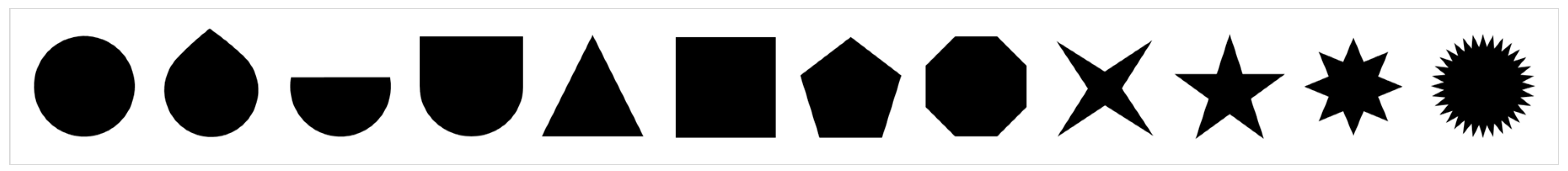
The study’s stimulus material comprised of 12 paper cards, each showing one two-dimensional geometric shape at a size of 1.7 x 1.7 cm, with the exception of the semicircular shape due to its semi-size nature. All shapes were displayed in black on a white paper background. Full shape filling in black aimed to control for responses towards the shape’s qualities and to preclude similarity judgments based on color associations. Geometric shapes were systematically created by increasing complexity, i.e., by increasing the number of vertices of an initial point-shape. As such an approach could result in an infinite number of shape variations, the number of stimuli was limited to a set of commonly used shapes [5,36]. As a result, a set of 12 geometric shapes was selected and further used in this research study (Figure 1).
2.2. Participants
In total, 38 Bachelor’s students of regional planning and geodesy from Vienna University of Technology, Austria participated in the study (19 men, 19 women; mean age = 21.50 years, SD = 3.00). Students were recruited from a course on “Thematic Cartography in Regional Planning”. Students participated voluntarily. For their participation, students received course credits in the form of bonus points which counted towards their final grades. The study was conducted at the facilities of the Research Division Cartography at Vienna University of Technology, in October 2018. In individual settings, all participants were tested by the same female instructor to control for experimenter effects. The study was conducted in German. Before participating in the study, each student gave their informed consent. The study was conducted in accordance with the Declaration of Helsinki.
Sociodemographic information was gathered at the end of the survey, regarding the participant’s affinity for graphic design (self-evaluation on a unipolar four-point rating scale, from “not at all” to “very affine”), field of study, age, and sex. The majority of participants were quite (18 individuals, approx. 47%) or very affine towards graphic design (15 individuals, approx. 40%). Five participants rated their affinity for design to be low (approx. 13%) and one individual reported to have no interest in graphic design.
2.3. Study Design
After giving their informed consent, participants were given a short introduction about the aim of the study to better understand how shapes are perceived (German introduction: “Wir sind daran interessiert wie Formen auf Sie wirken und wie Sie diese wahrnehmen.” Translation: “We are interested in how shapes affect you and how you perceive them.”). Each participant was asked for permission to audio record the responses.
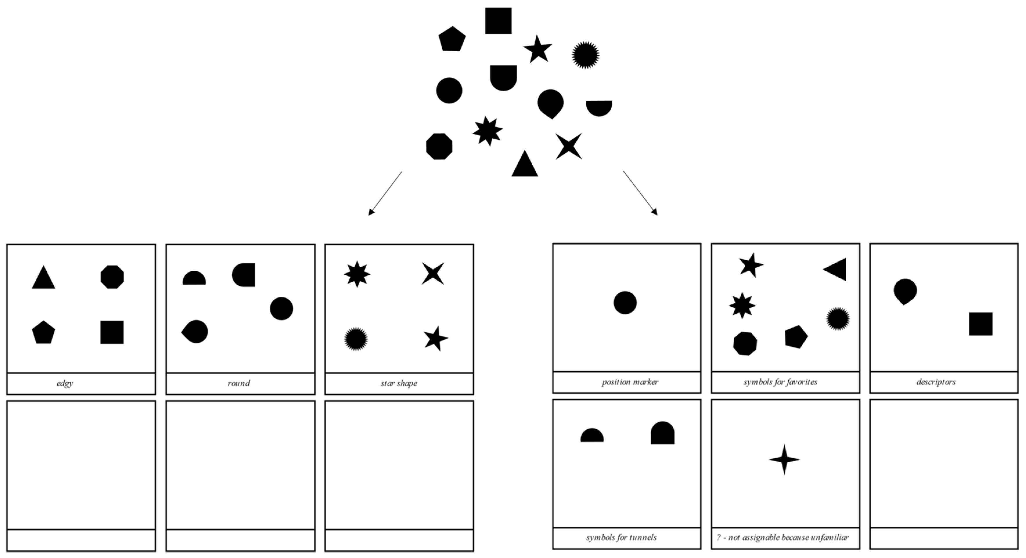
The main study was structured using three tasks: a free-sorting task (task 1), a retrospective verbalization task (task 2) which aimed to identify strategies applied when grouping the geometric shapes, and a labeling task (task 3) in which the participants were instructed to label each group by its most prominent characteristic(s). Figure 2 illustrates the grouping procedure of task 1 and the free-labeling of task 3.
At the end of the three tasks, sociodemographic information was gathered from the participants, regarding their affinity for graphic design, the field of study, age, and sex (see Chapter 2.2).
2.3.1. Free-Sorting (Task 1)
Task 1 aimed to identify perceived similarities of geometric shapes. Hence, each of the participants performed a free-sorting task based on their intuitive judgments. Each participant was handed a pile of paper cards comprising 12 geometric shapes in a randomized order. Subjects were instructed to first look at the shapes, and then to freely sort them according to their intuition. Shapes, which were perceived to be similar, should be assigned to the same group, while shapes, which did not match any other shape, could be sorted as a single-item group. Subjects were free to create as many groups as needed without a time limit. Participants were further instructed to tape their grouping results onto DIN A3 papers, with each separate group of shapes placed into one of the fields on the papers (Figure 2 illustrates two visual protocols revealed from this task).
2.3.2. Retrospective Verbalization (Task 2)
After completing the free-sorting task, each participant was asked to explain their decisions through retrospective verbalization [37]. With the retrospective verbalization method, “a direct trace is obtained of the heeded information, and hence, an indirect one of the internal stages of the cognitive process” which underlie the participants’ grouping decisions [38] (p.220). The task aimed to uncover underlying processes and concepts which participants used for grouping, such as associations or connotations. Instructions for this task were phrased as open-ended questions to allow for flexibility in explanation. In detail, participants were instructed to explain their decisions and describe which particular aspects contributed to their decisions (German instruction: “Sie haben [Anzahl] Gruppen gebildet. Können Sie Ihre Entscheidungen nun erklären? Anhand welcher Aspekte haben Sie die Formen gruppiert?” Translation: “You have created [quantity] groups. Could you now explain your decisions? According to which aspects did you group the shapes?”). Participants verbalized their thoughts and decisions for each group of shapes successively. The experimenter audio recorded the participants’ responses.
2.3.3. Free-Labeling (Task 3)
After the retrospective verbalization was completed, participants performed a labeling task. Participants were instructed to freely label each group according to what best described the group (German instruction: “Können Sie nun jede Gruppe anhand des wichtigsten Gruppenmerkmals benennen?” Translation: “Could you now label each group according to its most significant group characteristic?”), and to note down the group labels (as indicated in Figure 2). The free-labeling task aimed to provide another approach to explore relevant processes and strategies underlying the similarity judgments from task 1.
3. Results
3.1. Shape Similarities
The study aimed to identify perceived similarities between geometric shapes as well as strategies and processes underlying similarity judgments. In order to reveal shape similarities, participants freely sorted a set of 12 geometric shapes based on their intuitive judgments. In doing so, participants were free to create as many groups as needed. The free-sorting resulted in 177 groups, in total. Most frequently, the participants sorted the geometric shapes into five or six groups, Min = 3, Max = 7 (see Table 1).
In order to study perceived similarities between the geometric shapes in depth, co-occurrences of each pair of shapes were calculated, their proximities analyzed by cluster analysis, and further quantified and illustrated through the means of multidimensional scaling.
3.1.1. Co-Occurrence Matrix
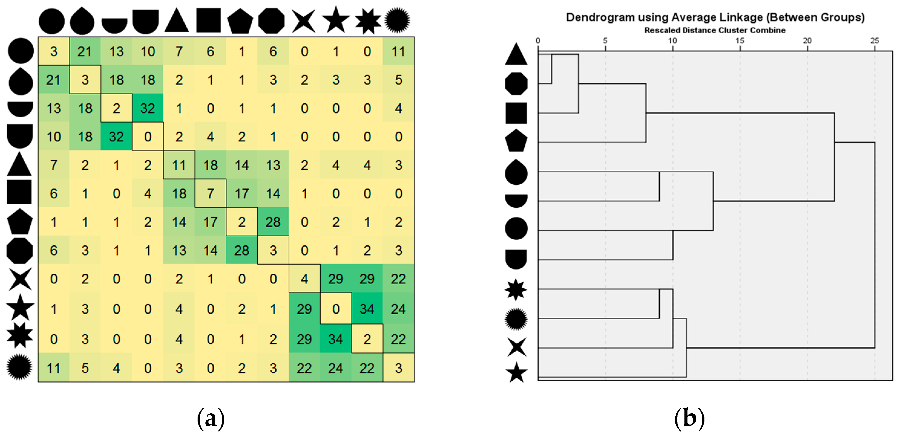
First, the frequencies of co-occurring pairs of shapes were mapped into a co-occurrence matrix. Co-occurrence values represent the strength of association between objects by analyzing how often each pair of objects appears in the same group [39]. In this study, co-occurrences represent the perceived similarity among the set of 12 geometric shapes. The co-occurrence matrix consists of a row and column for each of the geometric shapes, resulting in a 12x12 symmetric matrix. Each cell in the matrix represents the number of times a given pair of shapes was grouped across participants. The higher the number in a cell, the more frequently those two shapes were placed in the same group, and the higher the perceived association between those shapes (see Figure 3a).
Since the sorting task (task 1) also allowed participants to assign single items to a unique group, Figure 3a further illustrates the frequencies of single-item groups with respect to shape type. Most frequently, the triangular shape was assigned as a single-item class (11 times, 29%), followed by the quadratic shape (7 times, 18%). In most of the cases, however, triangle and square were paired into the same group.
3.1.2. Cluster Analysis
In the next step, a hierarchical cluster analysis was performed based on the co-occurrence matrix in order to statistically identify clusters of shapes with similar qualities. The statistical software package SPSS was used to analyze the matrix [40]. An agglomerative clustering approach was applied, which starts with each item as its own cluster and progressively links them based on their estimate of distance to one another (for detailed results see Supplementary Materials Table S1). A cluster distance measure of average linkage was employed, which balances the limitations of single and complete linkage methods, i.e., using information about all pairs of distances to assign cluster membership, not just the nearest or the farthest item pairs. Results indicate a three-cluster solution (see dendrogram Figure 3b). The dendrogram revealed one cluster comprised of polygons, while round and partly round shapes fall into cluster two. Star-like shapes fall in cluster three. Moreover, the cluster analysis dendrogram indicates that round shapes (cluster one) and polygons (cluster two) belong to a shared meta-cluster (Figure 3b).
3.1.3. Multidimensional Scaling (MDS)
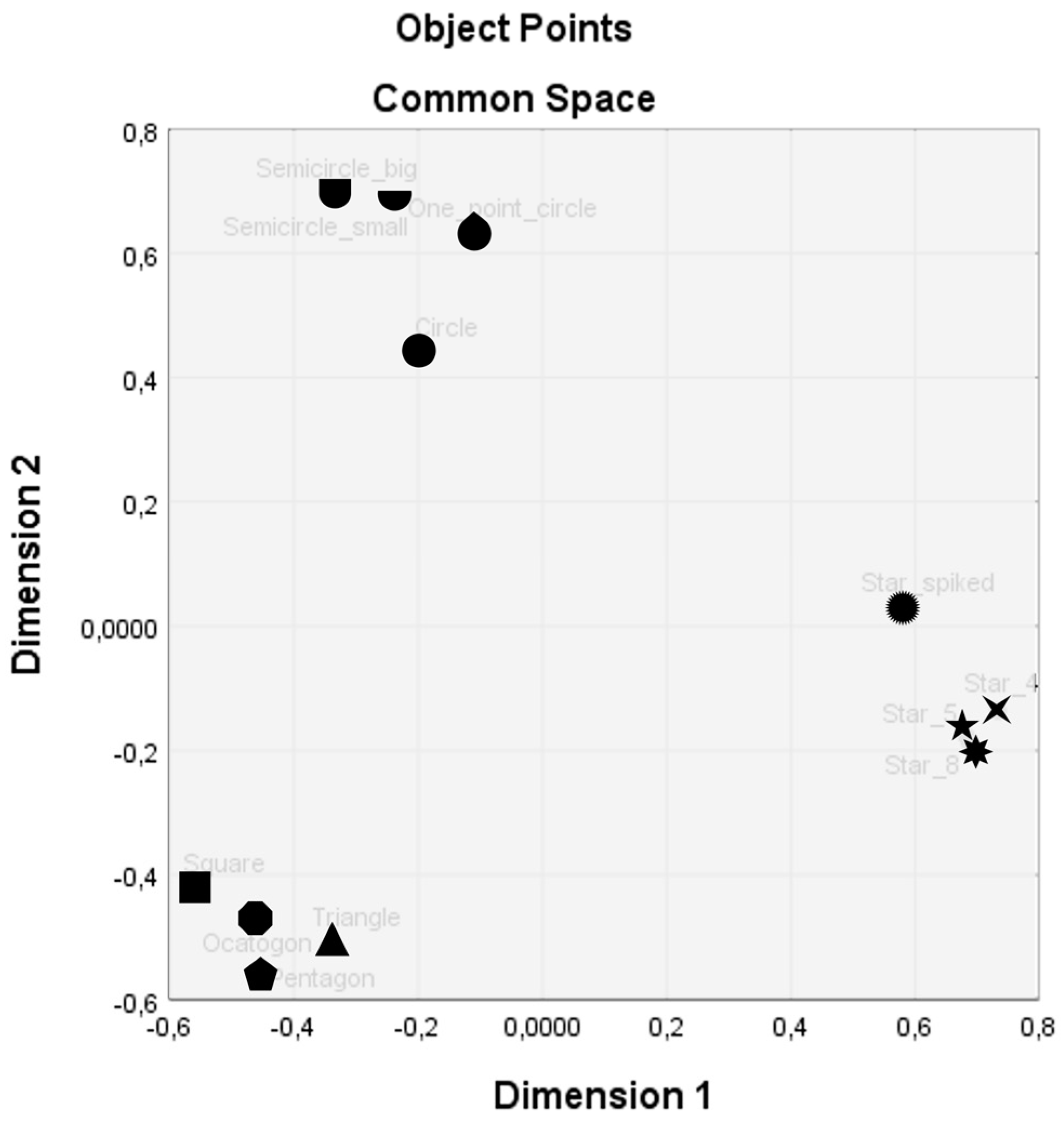
MDS was applied to reduce the complexity of the data set and permit a visual appreciation of the underlying relational structures. Through MDS, distances between items are quantified and proximities and relations revealed. The outcome of MDS is a dimensional space that conveys relationships among items, wherein similar items are located proximal to one another, while dissimilar items are located proportionately farther apart [35]. Thus, proximities between the geometric shapes were calculated based on the 12x12 co-occurrence matrix composed previously, resulting in 66 similarity counts (k items, (k * (k − 1)) / 2). The co-occurrence matrix was subjected to a PROXSCAL scaling algorithm to disclose the spatial relationship between the geometric shapes, treated as ordinal data. A scree plot was computed to determine the appropriate number of dimensions, indicating a two-dimensional configuration (see Supplementary Materials Figure S1 and Table S2). Figure 4 illustrates the two-dimensional space and the relationships between the 12 geometric shapes used in this study (see Supplementary Material Table S3 for detailed coordinates of each shape). Similar shapes are located proximal and dissimilar shapes are located distant from one another. Results support the previous findings of a three-cluster solution, while further distinguishing the individual proximities between as well as within each cluster, in more detail.
3.2. Grouping Strategies
Besides identifying perceived similarities of geometric shapes (see Chapter 3.1), the study aimed to uncover core processes and strategies which contributed to similarity judgments. Thus, the materials derived from all three tasks (visual protocols—task 1; verbal protocols—task 2, and textual protocols—task 3), were subjected to in-depth analyses. The visual protocols from task 1 were subjected to quantitative content analysis to analyze behavioral strategies applied when grouping geometric shapes (see Chapter 3.2.1). Furthermore, the verbal and textual protocols were analyzed by an inductive qualitative content approach to reveal processes and strategies underlying the participants’ similarity judgments (see Chapter 3.2.2).
3.2.1. Quantitative Content Analysis of Visual Protocols
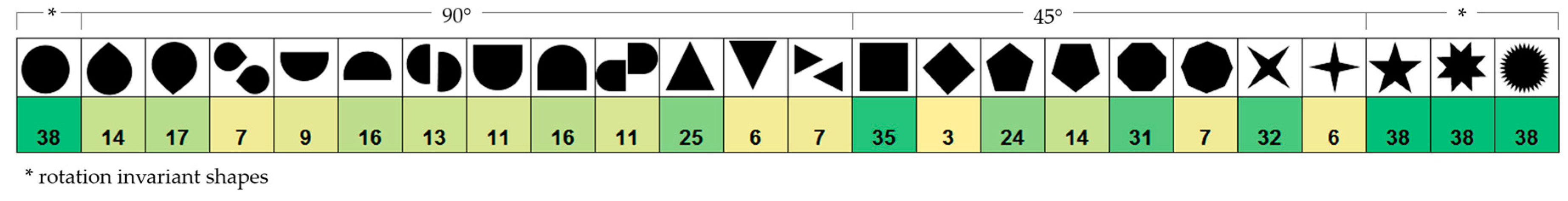
In the free-sorting task 1, participants were instructed to freely group the set of 12 geometric shapes by similarity. In doing so, participants were also free to alter the shapes’ orientations – despite not being explicitly instructed to do so. The tendency to rotate shapes, which can change the character of shapes [33], emerged frequently during the free-sorting task. In order to analyze this behavioral pattern in more detail, the visual protocols derived from free-sorting were subjected to a rotation frequency analysis, aiming to identify, quantify, and compare shapes which were more – or less – prone to rotation behavior. For this purpose, each visual protocol and each shape were examined individually by the experimenter to identify the orientation of each shape. A coding scheme was applied based on Arnheim [33] and all shapes assigned to a matrix according to one of the following orientations: (a) 90° rotation for shapes with fewer than four vertices, (b) 45° rotation for shapes with four or more vertices, and (c) rotation invariant shapes. Figure 5 illustrates the frequencies of shape orientations for each of the 12 geometric shapes based on the shape orientation scheme and responses from all 38 participants.
Behavioral strategies: The findings indicate that shape rotation emerged as a prevalent behavioral strategy to actively alter a shape’s orientation, and by doing so, to adjust its (dis)similarity to other shapes. Yet, some geometric shapes were found to be less prone to rotation than others (see Figure 5). In detail, the results suggest that a shape’s line features may be used to rotate or orient geometric shapes in a particular way. Square, octagon, pentagon, and triangle were most often positioned according to one of their edges. In 92% of the cases, the square was positioned along one of its edges, X² (1, N = 38) p < 0.00, the octagon in 82% of the cases, X² (1, N = 38) = 15.16, p < 0.00, the pentagon 63%, X² (1, N = 38) = 2.63 p = 0.11, and the triangle in 66% of all cases, X² (2, N = 38) = 36.11, p < 0.00. Similarly, both semi-circles were most often oriented along their edges, both in 42% of the cases (16 times). While most star-like shapes in the study were treated as orientation invariant, the 4-point star was shown to be an exception: in 84% of the cases (32 times), this shape was oriented with two of its spikes facing downwards, X² (1, N = 38) = 17.79, p < 0.00.
3.2.2. Qualitative Content Analysis
After the free-sorting task was completed, each participant was instructed to retrospectively verbalize their decisions (task 2) and to further label each group by its core characteristics (task 3). Responses from both tasks were subjected to a qualitative content analysis [41,42] to further uncover core processes and strategies from the collected data across participants. In particular, a reductive content analysis approach was applied, in which “the category systems are developed inductively out of the concrete material” [42] (p.13). The analysis was performed manually, in a systematic, sequential, and iterative process, following the sub-procedure of inductive category formation proposed by Mayring [41,42].
The analysis followed a distinct research question to set a clear focus on the content to be examined [42], i.e., which processes account for the similarity groupings of shapes? The analysis took into account the audio recordings from the retrospective verbalizations (task 2) and labels assigned to each group (task 3). All relevant text passages from the participants’ retrospective verbalizations were extracted and paraphrased to create condensed, meaningful units tailored to the research question. The assigned group labels derived from the free-labeling task 3 were transcribed, and together with the condensed retrospective verbalizations, transferred to a written protocol. As a result, the written protocol was comprised of each participant’s responses, structured by participant and by each group of shapes (see Supplementary Materials Table S4).
The written protocols were scanned line by line, with those passages which appeared to capture key thoughts or concepts highlighted. As this process continued, “labels for codes emerge that are reflective of more than one key thought” [43] (p. 1279). By processing the text, first labels were gradually derived and text units with similar meaning subsumed under the same label, while new labels were formulated for new thoughts or concepts. Once no new concepts appeared, the initial coding scheme and its logic were revised to achieve a set of labels which was distinct enough to adequately represent the core meanings as well as broad enough to account for the whole range of responses.
The final set of labels became the coding scheme, which was used by two coders who coded all responses independently. This resulted in a 2x177 data matrix (2 coders x 177 responses), with each cell in the matrix containing a code (comprising of one or more labels) or a period character (“.”) for missing judgements (see Supplementary Materials Table S4 for an excerpt of the final coding of coder 1). The coding results of both coders were subjected to Krippendorff’s alpha inter-coder reliability estimate by applying KALPHA macro for SPSS [44]. Results indicate a high inter-coder reliability of α = 0.87, CI [0.82, 0.93].
In a final interpretative process, codes were related across participants and organized into categories with a higher level of abstraction. Findings suggest three core strategies applied when free-sorting shapes according to their (dis)similarities, i.e., visual, associative, and affective strategies.
Visual strategies: Most participants expressed visual shape properties to explain their grouping decisions. In total, visual strategies were reported 132 times, accounting for 59.5% of all responses. Similarities based on visual characteristics primarily referred to (a) the shape’s visual appearance and geometry (e.g., similarity due to their vertices, edges, roundness), followed by (b) visual hierarchy and containment (e.g., basic shapes versus complex shapes, one shape fits into the other or contains the other), and (c) symbiosis and completion (e.g., one shape completes the other, or two shapes together account for a new shape).
Associative strategies: Associative strategies used to group the stimuli were found 52 times, or in 23.4% of the cases. When grouping by associations, subjects explained their sorting results (a) with reference to natural or human-made objects (e.g., associations referring to street signage, heavenly bodies, tunnel, balloon, or two semicircles together representing an open capsule), or (b) by associating shapes to a cartographic context (e.g., shapes representing a pin on a map to mark a point of interest).
Affective strategies: In 17.1% of the responses or 38 times, participants explained their grouping decisions by evaluating the shapes. Such responses emerged as corresponding to the three dimensions found in semantic and affective space theories [45,46,47]. Hence, participants’ evaluative responses were further differentiated based on this deductive, theory-driven consideration, corresponding to the three dimensions of affect – valence, arousal, and dominance. In detail, participants who sorted the geometric shapes by their affective qualities, explained their decisions along the dimensions of (a) valence (e.g., incomplete, boring), (b) arousal (e.g., restless, aggressive, calm), or (c) dominance (e.g., showy, brutal, dominant, heavy).
Results from qualitative content analysis were further complemented by quantitative analyses, revealing that in the majority of all cases (87%, or 138 times), participants explained their grouping decisions by one of the three strategies. In 20.3% of the cases (i.e., 36 times), participants used two strategies to explain their grouping results, while two participants (i.e., in 1.1% of the cases) used all three strategies to explain their decisions. In one case, the explanation for grouping could not be assigned to any of the categories, thus, this response was treated as a missing value. The quantitative analysis further showed that female and male participants used visual and affective strategies similarly often to explain their grouping decisions. Associative strategies, on the other hand, were expressed twice as often by males than by females (see Supplementary Materials Table S5 for details).
4. Discussion
Human communication is notable for its variability and flexible use of signs to share and express information, both verbally and visually. The choice of signs, however, must be selected carefully, since the selection will influence how people perceive and respond to the information. Research in visual communication, for example, shows that visual signifiers can be processed more intuitively, faster, and with less cognitive effort, when associative to the information they convey. In the field of cartography, in particular, such an associative and intuitive communication process is aimed for. Yet, the selection for visual variables which are most effective to convey particular information still remains a challenge. With a better understanding of why some shapes are perceived as more similar, however, shape symbols can more accurately be discriminated [35] and then using more informed choices, allowing for more effective and associative information visualization, such as in cartography. By unraveling core qualities of shapes, the findings of this research aim to contribute to such a better understanding of why some shapes may be more suitable to represent particular content than others.
The present study, therefore, focused on exploring qualities assigned to geometric shape symbols by assessing their proximities (i.e., similarities) to uncover part of their cognitive structure and relatedness. The present study further explored the strategies and processes underlying these similarities. With its multi-method approach, this empirical research aimed to contribute a differentiated perspective on shape proximities, cognitive relations, and hierarchies, as well as on underlying concepts and processes involved in similarity judgments.
In detail, the findings from cluster analysis strongly imply that even simple, geometric shapes imbue qualities which distinguish them from one another. The study discovered three independent similarity clusters based on a set of 12 geometric shapes: polygons, round shapes, and star-like shapes. These clusters may not be surprising since qualitative content analyses, moreover, revealed that predominantly visual strategies were applied when grouping shapes according to their similarities. In addition, findings from cluster analysis indicate not only the shapes’ cognitive proximities but also a hierarchical order. In particular, the clusters of round shapes and polygons suggest a shared meta-concept; distinguishing both clusters from star-like shapes. The result of a three-cluster solution is further supported by the distribution of the geometric shapes in the two-dimensional semantic space illustrated in this research. By identifying the similarities of the 12 shape stimuli, part of the stimuli’s cognitive structure and relatedness is disclosed. It is particularly beneficial to have a quantitative estimate of the proximity between two concepts, which allows appropriate discrimination between them. The concept of similarity is therefore pivotal in theories in cognitive and communication sciences.
The present empirical study, moreover, discovered four particular processes involved in the participants’ similarity judgments: visual, associative, affective, and behavioral strategies. Most frequently, visual strategies were applied when grouping geometric shapes according to their similarities. This finding corresponds with existing literature, claiming that visual qualities are the most powerful of all, which “reach us most directly and deeply” [48] (p.97). At the same time, findings of the present study suggest that not only visual characteristics guide similarity judgments but that associations and affective-evaluative judgments also account for the (dis)similarities of visual stimuli – although to a less significant extent. The participants’ affective-evaluative responses emerged to correspond to the three dimensions of semantic and affective space theories: valence, arousal, and dominance [45,46,47]. Affective strategies, however, were mentioned least often by the participants of the study to explain grouping decisions. While female and male participants used visual and affective strategies similarly often, associative strategies were expressed twice as often by males than by females. However, due to the small sample size, these differences cannot claim statistical significance. Besides the three cognitive-affective strategies identified through qualitative content analysis, a fourth, behavioral strategy was found which was shown to influence shape similarities, i.e., shape rotation. According to J.J. Gibson’s Affordance Theory [49], the environment and the stimuli therein are not merely perceived in terms of shapes and spatial relationships but also in terms of their possibilities for action (i.e., affordances). Present findings from rotation analysis support this notion as being applicable to static, two-dimensional geometric shapes. The results indicate that a shape’s line features (edges) may serve as cues used to rotate a shape towards a particular orientation. It appears that a shape’s edges may serve as “baselines”, along which shapes are more likely to be aligned to. With its results, the present study provides empirical evidence of geometric shapes more and less prone to be rotated. While these findings are of relevance for design decisions, the possibility to rotate the geometric shapes in the present study must be treated as a constraint at the same time. As Arnheim claims, orientation may change a shape’s character [33]. While participants were allowed to freely group and rotate the 12 geometric shapes, results have not been further subjected to rotation-dependent analyses. Future research is, therefore, needed to explore the influence of shape rotation on shape characteristics in more detail. Future studies are also needed to expand upon the variety and number of shapes and to further explore the different facets which account for the perceived (dis)similarities between and relatedness of such visual stimuli. While the present study aimed to embrace the most basic and prominently used two-dimensional, geometric shapes, its results are limited to these shapes.
Inasmuch as the present research aims to advance our understanding of shape similarities and underlying processes, the results’ transferability to more applied scenarios are nonetheless limited. When people make choices, they always do so in particular mindsets and contexts. Research has long recognized the power of situation and context [50] and have demonstrated many ways in which situations activate particular contents of memory, making related constructs more accessible [51], and by doing so, influencing associations and behaviors, even without an individual’s awareness [52,53]. Despite the attempt to deprive the present study of context, the prevailing associations towards cartography indicate an influence due to the participants’ and research study’s background of cartography. Associations found in this research through retrospective verbalization must therefore not be treated to be exhaustive. The perceived similarity between two shapes may change given different environments, cultures, or contexts [35]. In cartographic research, this challenge has been widely acknowledged, stressing that by focusing on the effects of map elements in an isolated way, the criterion of ecological validity may not necessarily be met, i.e., that results may not be transferable to cartographic representations due to their more complex, holistic nature [4,54]. At the same time, “changing the nature of the map task or the precise design of the test materials often led to variability in the results” [54] (p.295). Thus, both research approaches – controlled and applied studies – have merits and limitations: “the lack of careful isolation of variables in user studies makes it difficult if not impossible to determine whether the results can be generalized to any scenario without identical design and tasks. Without an explanation for why an effect occurs, there is rarely an indication of what and how much can change while maintaining the benefits of a particular design” [55] (p.3). Hence, both approaches are needed to allow for conceptual replications of each other [55].
This research studied shape qualities at their most fundamental and purest level. This controlled approach allowed for the exploration of shape proximities and underlying processes fairly independent of context. In doing so, this research revealed shape proximities and four strategies which accounted for similarity judgments found in the study. While future research is needed to further explore the distinct qualities of individual shapes, the four groups of strategies identified can provide a useful framework for future studies. With profound knowledge of shape qualities and their relatedness, hypotheses about their communication effects can more deliberately be generated and tested, such as in applied scenarios, with different levels of visual complexity, in different contexts, and in different visual disciplines. Current findings, therefore, aim to be expanded upon. With a profound understanding of shape qualities and their effects on perception and communication, design decisions can likewise be supported, such as to allow for deliberate choices on whether two shapes are similar enough to be acted upon as the same, or whether they are dissimilar enough to require different decisions. Being able to more accurately discriminate between graphic variables, can help to make more informed decisions and better tailor information visualizations in cartography and beyond.
5. Conclusions
Visual communication requires deliberate decisions to share and express information successfully. The choice of signifiers used to communicate information will affect people’s responses towards it. Inasmuch as cartographic semiology provides a theoretical framework for geospatial communication, it hitherto cannot explain the effects of visual design choices on human responses and judgments. While empirical findings strongly support the notion that variations in visual representations can change the map reader’s responses on multiple levels, it remains unclear, why some shape symbols emerge as more effective in conveying particular information than others.
The present study aimed to unravel the subtle communication effects of shape symbols, in particular encompassing the concept of similarity. By identifying similarities, cognitive structures and relatedness can be disclosed, which is pivotal to theories in cognitive and communication sciences. Furthermore, four distinct processes were identified which aim to contribute to a differentiated understanding of proximities, namely visual, associative, affective, and behavioral strategies. Despite future research, which is needed to further explore the qualities of individual shapes, the four groups of strategies can provide a useful framework for guiding future research. The proximity space uncovered, together with a more differentiated understanding of underlying processes and distinct shape qualities, can advance our understanding of visual communication materials and enable us to more effectively create and communicate information in visual disciplines in the future.
Supplementary Materials
The following are available online at https://www.mdpi.com/2220-9964/8/5/217/s1, Figure S1: Scree plot based on PROXSCAL MDS for ordinal data, based on the 12x12 co-occurrence matrix, indicating a two-dimensional configuration. Table S1: Hierarchical agglomerative cluster analysis dissimilarity matrix. Frequencies according to Phi-Square. Table S2: Goodness of Fit for a two-dimensional MDS configuration, based on a 12x12 co-occurrence matrix. Table S3: Coordinates for Common Space by applying a two-dimensional MDS configuration, based on a 12x12 co-occurrence matrix. Table S4: Excerpt of the inductive category formation process and coding results of coder 1 (translated from German). Table S5: Cross-tabulation of female versus male responses of the three strategies identified, based on the results of coder 1.
Funding
This research received no external funding.
Acknowledgments
I thank Damian Dziwior for contributing as second, independent coder in this research study. I am grateful to Matthias Wunsch, Silas Howland, Florian Ledermann, and Georg Gartner for their feedback and support throughout this research. I thank the four anonymous reviewers for their valuable comments and suggestions for improving the manuscript. I also wish to thank the editors for the opportunity to share this research. The author gratefully acknowledges the TU Wien Bibliothek for financial support through its Open Access Funding Program.
Conflicts of Interest
The author declares no conflict of interest.
References
- Keates, J.S. Understanding Maps; Addison Wesley Longman Limited: Harlow, UK, 1996; p. 334. [Google Scholar]
- Krauss, R.M. The Psychology of Verbal Communication. In International Encyclopedia of the Social and Behavioral Sciences; Snekser, N.J., Baltes, P.B., Eds.; Elsevier: Amsterdam, The Netherlands, 2002. [Google Scholar]
- Chandler, D. Semiotics: The Basics; Psychology Press: London, UK, 2002. [Google Scholar]
- Petchenik, B.B. Cognition in cartography. Cartogr. Int. J. Geogr. Inf. Geovis. 1977, 14, 117–128. [Google Scholar] [CrossRef]
- Bertin, J. Graphische Semiologie: Diagramme, Netze, Karten; Translated from the 2nd French Edition (1973); Walter de Gruyter: Berlin, Germany, 1974; ISBN 3-11-003660-6. [Google Scholar]
- Langer, S.K. Feeling and Form: A Theory of Art Developed from Philosophy in a New Key; Charles Scribner’s Sons: New York, NY, USA, 1953. [Google Scholar]
- Wood, D. Rethinking the Power of Maps; Guilford Press: New York, NY, USA, 2010. [Google Scholar]
- MacEachren, A.M.; Roth, R.E.; O’Brien, J.; Li, B.; Swingley, D.; Gahegan, M. Visual Semiotics & Uncertainty Visualization: An Empirical Study. IEEE Trans. Vis. Comput. Graph. 2012, 18, 2496–2505. [Google Scholar]
- Thompson, M.A.; Lindsay, J.M.; Gaillard, J. The influence of Probabilistic Volcanic Hazard Map Properties on Hazard Communication. J. Appl. Volcanol. 2011, 4, 6. [Google Scholar] [CrossRef]
- Monmonier, M. How to Lie with Maps; The University of Chicago Press: Chicago, IL, USA, 1996. [Google Scholar]
- Loftus, E.F.; Palmer, J.C. Reconstruction of Automobile Deconstruction: An Example of the Interaction Between Language and Memory. J. Verbal Learning Verbal Behav. 1974, 13, 585–589. [Google Scholar] [CrossRef]
- Sianipar, A.; Van Groenestijn, P.; Dijkstra, T. Affective Meaning, Concreteness, and Subjective Frequency Norms for Indonesian Words. Front. Psychol. 2016, 7, 639. [Google Scholar] [CrossRef] [PubMed] [Green Version]
- Russell, J.A. A Circumplex Model of Affect. J. Pers. Soc. Psychol. 1980, 39, 1161–1178. [Google Scholar] [CrossRef]
- Barrett, L.F.; Bliss-Moreau, E. Affect as a Psychological Primitive. Adv. Exp. Soc. Psychol. 2009, 41, 167–218. [Google Scholar] [Green Version]
- Köhler, W. Gestalt Psychology, 2nd ed.; Liveright Publishing Corporation: New York, NY, USA, 1947. [Google Scholar]
- Sapir, E. A Study in Phonetic Symbolism. J. Exp. Psychol. 1929, 12, 225–240. [Google Scholar] [CrossRef]
- Spence, C. Crossmodal correspondences: A tutorial review. Atten. Percept. Psycho. 2011, 73, 971–995. [Google Scholar] [CrossRef] [PubMed] [Green Version]
- Ramachandran, V.S.; Hubbard, E.M. Synaesthesia - A Window into Perception, Thought and Language. J. Conscious. Stud. 2001, 8, 3–34. [Google Scholar]
- Davis, R. The fitness of names to drawings. A cross-cultural study in Tanganyika. Br. J. Psychol. 1961, 52, 259–268. [Google Scholar] [CrossRef]
- Muehlenhaus, I. If Looks Could Kill: The Impact of Different Rhetorical Styles on Persuasive Geocommunication. Cartogr. J. 2012, 49, 361–375. [Google Scholar] [CrossRef]
- Muehlenhaus, I. The design and composition of persuasive maps. Cartogr. Geogr. Inf. Sci. 2013, 40, 401–414. [Google Scholar] [CrossRef]
- Fabrikant, S.I.; Christophe, S.; Papastefanou, G.; Maggi, S. Emotional Response to Map Design Aesthetics. In Proceedings of the 7th International Conference on Geographical Information Science, Columbus, OH, USA, 18–21 September 2012; pp. 18–21. [Google Scholar]
- Christophe, S.; Hoarau, C. Expressive Map Design Based on Pop Art: Revisit of Semiology of Graphics? Cartogr. Perspect. 2013, 73, 61–74. [Google Scholar] [CrossRef]
- Jenny, B.; Stephen, D.M.; Muehlenhaus, I.; Marston, B.E.; Sharma, R.; Zhang, E.; Jenny, H. Design Principles for Origin-destination Flow Maps. Cartogr. Geogr. Inf. Sci. 2018, 45, 62–75. [Google Scholar] [CrossRef]
- Padilla, L.M.; Ruginski, I.T.; Creem-Regehr, S.H. Effects of ensemble and summary displays on interpretations of geospatial uncertainty data. Cogn. Res. Princ. Implic. 2017, 2, 40. [Google Scholar] [CrossRef] [Green Version]
- Kinkeldey, C.; MacEachren, A.M.; Schiewe, J. How to Assess Visual Communication of Uncertainty? A Systematic Review of Geospatial Uncertainty Visualisation User Studies. Cartogr. J. 2014, 51, 372–386. [Google Scholar] [CrossRef] [Green Version]
- Cheong, L.; Bleisch, S.; Kealy, A.; Tolhurst, K.; Wilkening, T.; Duckham, M. Evaluating the impact of visualization of wildfire hazard upon decision-making under uncertainty. Int. J. Geogr. Inf. Sci. 2016, 30, 1–28. [Google Scholar] [CrossRef]
- Garlandini, S.; Fabrikant, S.I. Evaluating the Effectiveness and Efficiency of Visual Variables for Geographic Information Visualization. Internet Sci. 2009, 5756, 195–211. [Google Scholar]
- Padilla, L.M.; Creem-Regehr, S.H.; Hegarty, M.; Stefanucci, J.K. Decision making with visualizations: A cognitive framework across disciplines. Cogn. Res. Princ. Implic. 2018, 3, 29. [Google Scholar] [CrossRef] [PubMed]
- Michaelidou, E.; Filippakopoulou, V.; Nakos, B. Children’s Choice of Visual Variables for Thematic Maps. J. Geogr. 2007, 106, 49–60. [Google Scholar] [CrossRef]
- Voženílek, V.; Morkesová, P.; Vondráková, A. Cognitive Aspects of Map Symbology in the World School Atlases. Procedia - Soc. Behav. Sci. 2014, 112, 1121–1136. [Google Scholar] [CrossRef] [Green Version]
- Klee, P. Schöpferische Konfession: Paul Klee. In Tribüne der Kunst und Zeit - Eine Schriftensammlung, Band XIII; Edschmid, K., Ed.; Erich Reiß Verlag: Berlin, Germany, 1920; pp. 28–40. [Google Scholar]
- Arnheim, R. Kunst und Sehen: Eine Psychologie des schöpferischen Auges; Walter de Gruyter: Berlin, Germany, 1978; ISBN 3110066823. [Google Scholar]
- Michaelidou, E.; Filippakopoulou, V.; Nakos, B.; Petropoulou, A. Designing point map symbols: The effect of preattentive attributes of shape. In Proceedings of the 22th International Cartographic Association Conference, A Coruña, Spain, 9–16 July 2005. [Google Scholar]
- Hout, M.C.; Papesh, M.H.; Goldinger, S.D. Multidimensional Scaling. Wiley Interdiscip. Rev. Cogn. Sci. 2013, 4, 93–103. [Google Scholar] [CrossRef]
- Prange, R. Paul Klee und Wassily Kandinsky als Bauhauslehrer. Kunsthistorische Arbeitsblätter 2001, 6, 41–50. [Google Scholar]
- Ericsson, K.A.; Simon, H.A. Protocol Analysis; MIT press: Cambridge, MA, USA, 1993. [Google Scholar]
- Ericsson, K.A.; Simon, H.A. Verbal Reports as Data. Psychol. Rev. 1980, 87, 215. [Google Scholar] [CrossRef]
- Cox, T.F.; Cox, M.A.A. Multidimensional Scaling, 2nd ed.; Chapman & Hall/CRC: Boca Raton, FL, USA, 2001; ISBN 1584880945. [Google Scholar]
- IBM SPSS Statistics for Windows, Version 25.0; Released 2017; IBM Corp: Armonk, NY, USA, 2017.
- Mayring, P. Qualitative Inhaltsanalyse: Grundlagen und Techniken, 12th ed.; Beltz: Weinheim, Germany, 2015; ISBN 9783407257307. [Google Scholar]
- Mayring, P. Qualitative Content Analysis: Theoretical Foundation, Basic Procedures and Software Solution. Available online: http://nbn-resolving.de/urn:nbn:de:0168-ssoar-395173 (accessed on 3 May 2019).
- Hsieh, H.-F.; Shannon, S.E. Three Approaches to Qualitative Content Analysis. Qual. Heal. 2005, 15, 1277–1288. [Google Scholar] [CrossRef] [PubMed]
- Hayes, A.F.; Krippendorff, K. Answering the Call for a Standard Reliability Measure for Coding Data. Commun. Methods Meas. 2007, 1, 77–89. [Google Scholar] [CrossRef]
- Osgood, C.E.; Suci, G.J.; Tannenbaum, P.H. The Measurement of Meaning; University of Illinois Press: Champaign, IL, USA, 1957. [Google Scholar]
- Mehrabian, A.; Russell, J.A. An approach to environmental psychology; The Massachusetts Institute of Technology: Cambridge, MA, USA, 1974. [Google Scholar]
- Bakker, I.; Van Der Voordt, T.; Vink, P.; De Boon, J. Pleasure, arousal, dominance: Mehrabian and Russell revisited. Curr. Psychol. 2014, 33, 405–421. [Google Scholar] [CrossRef]
- Arnheim, R. Art and Visual Perception: A Psychology of the Creative Eye; University of California Press: Oakland, CA, USA, 1974; ISBN 0520243838. [Google Scholar]
- Gibson, J.J. The Ecological Approach to Visual Perception; Psychology Press Ltd: Hove, UK, 2014. [Google Scholar]
- Ross, L.; Nisbett, R.E. The Person and the Situation: Perspectives of Social Psychology; Pinter & Martin Ltd: London, UK, 2011. [Google Scholar]
- Berger, J.; Meredith, M.; Wheeler, S.C. Contextual priming: Where people vote affects how they vote. Proc. Acad. Sci. 2008, 105, 8846–8849. [Google Scholar] [CrossRef] [Green Version]
- Darley, J.M.; Batson, C.D. "From Jerusalem to Jericho": A study of situational and dispositional variables in helping behavior. J. Pers. Soc. Psychol. 1973, 27, 100–108. [Google Scholar] [CrossRef]
- Yi, Y. The Effects of Contextual Priming in Print Advertisements Embarrassed Customers: The Dark Side of Receiving Help from Others View project. Artic. J. Consum. Res. 1990, 17, 215–222. [Google Scholar] [CrossRef]
- Montello, D.R. Cognitive Map-Design Research in the Twentieth Century: Theoretical and Empirical Approaches. Cartogr. Geogr. Inf. Sci. 2002, 29, 283–304. [Google Scholar] [CrossRef]
- Kosara, R.; Haroz, S. Skipping the Replication Crisis in Visualization: Threats to Study Validity and How to Address Them. In Proceedings of the 2018 IEEE Evaluation and Beyond - Methodological Approaches for Visualization (BELIV), Berlin, Germany, 21 October 2018; pp. 102–107. [Google Scholar] [CrossRef]
Figure 1.
Stimulus material used in the present study, comprised of 12 geometric shapes.

Figure 2.
Illustration of two visual protocols from two participants, after completing free-sorting task 1 and free-labeling task 3.
Figure 2.
Illustration of two visual protocols from two participants, after completing free-sorting task 1 and free-labeling task 3.

Figure 3.
Co-occurrences of geometric shapes from free-sorting task 1, illustrated as (a) co-occurrence matrix: the values indicate the frequency counts of co-associations and those of single-item groups (see diagonal values) - higher values indicate higher similarity; and as (b) dendrogram based on agglomerative hierarchical cluster analysis.

Figure 4.
Two-dimensional configuration of 12 geometric shapes using MDS.

Figure 5.
Shape orientation scheme and frequencies of shape rotations according to the set of 12 geometric shapes (N = 38).
Figure 5.
Shape orientation scheme and frequencies of shape rotations according to the set of 12 geometric shapes (N = 38).


Table 1.
Frequency of grouping solutions for 12 geometric shapes, based on 38 participants.
| Group Frequencies | |||||||
|---|---|---|---|---|---|---|---|
| 1 Group | 2 Groups | 3 Groups | 4 Groups | 5 Groups | 6 Groups | 7 Groups | |
| Frequency | . | . | 8 | 9 | 10 | 10 | 1 |
| Percentage | . | . | 21% | 24% | 26% | 26% | 3% |
© 2019 by the author. Licensee MDPI, Basel, Switzerland. This article is an open access article distributed under the terms and conditions of the Creative Commons Attribution (CC BY) license (http://creativecommons.org/licenses/by/4.0/).
Share and Cite
MDPI and ACS Style
Klettner, S. Why Shape Matters—On the Inherent Qualities of Geometric Shapes for Cartographic Representations. ISPRS Int. J. Geo-Inf. 2019, 8, 217. https://doi.org/10.3390/ijgi8050217
AMA Style
Klettner S. Why Shape Matters—On the Inherent Qualities of Geometric Shapes for Cartographic Representations. ISPRS International Journal of Geo-Information. 2019; 8(5):217. https://doi.org/10.3390/ijgi8050217
Chicago/Turabian StyleKlettner, Silvia. 2019. "Why Shape Matters—On the Inherent Qualities of Geometric Shapes for Cartographic Representations" ISPRS International Journal of Geo-Information 8, no. 5: 217. https://doi.org/10.3390/ijgi8050217
Note that from the first issue of 2016, this journal uses article numbers instead of page numbers. See further details here.