5-hydroxymethylcytosine marks regions with reduced mutation frequency in human DNA
- University of Oxford, United Kingdom
Figures
Figure 1 with 3 supplements
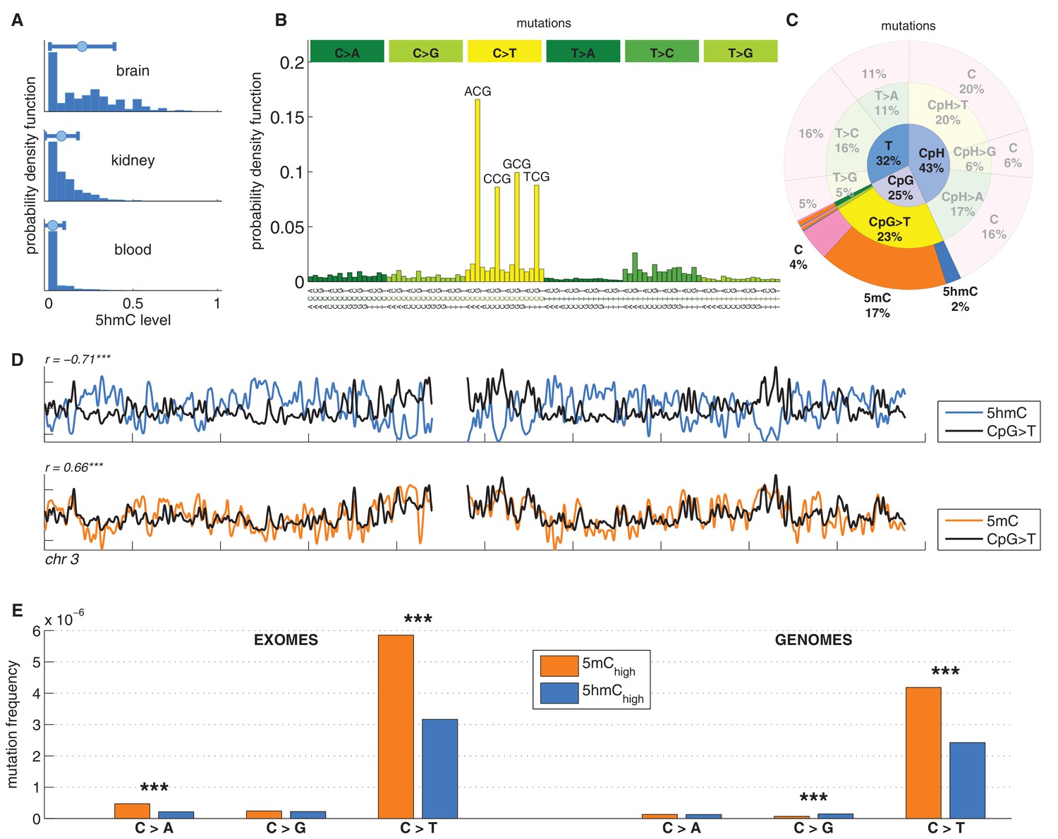
C>T mutations are common in the genome but depleted in 5hmC sites compared to 5mC sites.
(A) Distribution of 5hmC in a CpG context in brain compared to kidney and blood. (B) Frequency of SNVs in brain cancer exomes, stratified by sequence context, normalised by frequency of trinucleotides. (C) Distribution of single-nucleotide variants (whole genomes) in brain cancer according to type, context and modification state. (D) CpG>T mutation frequency (black), 5hmC (blue) and 5mC (orange) density in 100 kbp windows of chromosome 3, smoothed with a Gaussian filter (n = 50, sigma = 2.5). (E) Average fraction of mutated sites for 5mChigh vs. 5hmChigh over all patient samples (CpG sites only; ***p<0.001; **p< 0.01; *p< 0.05, see Materials and methods).
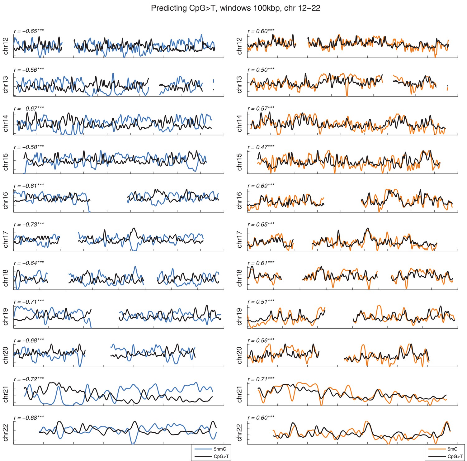
Figure 1—figure supplement 1

Distribution of CpG>T mutations vs modifications across all chromosomes.
CpG>T mutation frequency (black), 5 hmC (blue) and 5 mC (orange) density in 100 kbp windows, smoothed with a Gaussian filter (n = 50, sigma = 2.5).
Figure 1—figure supplement 2
Distribution of CpG>T mutations vs modifications across all chromosomes.
CpG>T mutation frequency (black), 5 hmC (blue) and 5 mC (orange) density in 100 kbp windows, smoothed with a Gaussian filter (n = 50, sigma = 2.5).
Figure 1—figure supplement 3
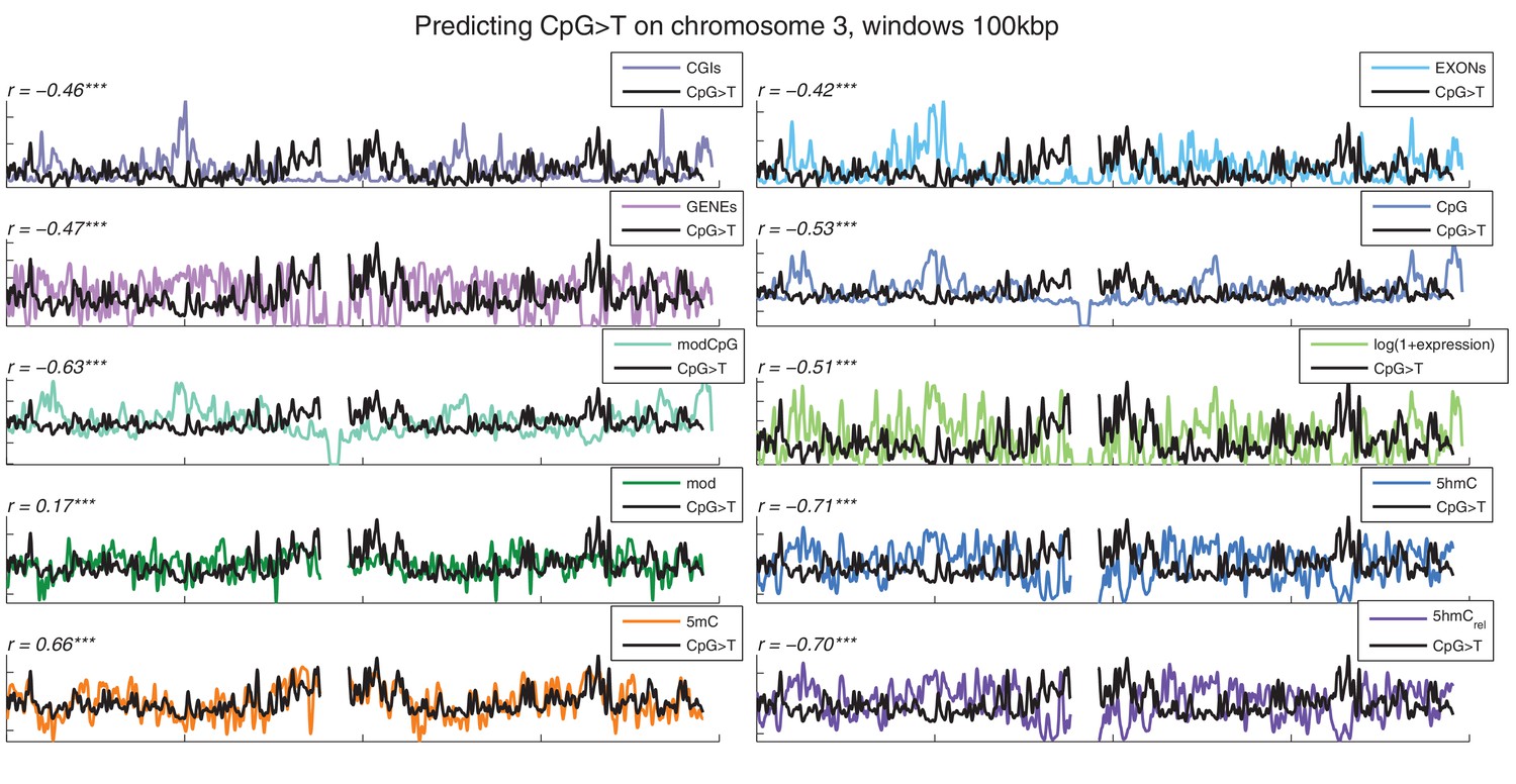
Distribution of CpG>T mutations vs other genomic features.
CpG>T mutation frequency (black) and several genomic features in 100 kbp windows on chromosome 3, smoothed with a Gaussian filter (n = 50, sigma = 2.5).CGIs: density of CpG islands, EXONs: density of exons, GENEs: density of genes, CpG: density of CpGs, modCpG: density of CpGs with mod level ≥ 10%; and average modification levels: mod, 5 hmC, 5 mC, and 5 hmCrel.
Figure 2 with 1 supplement
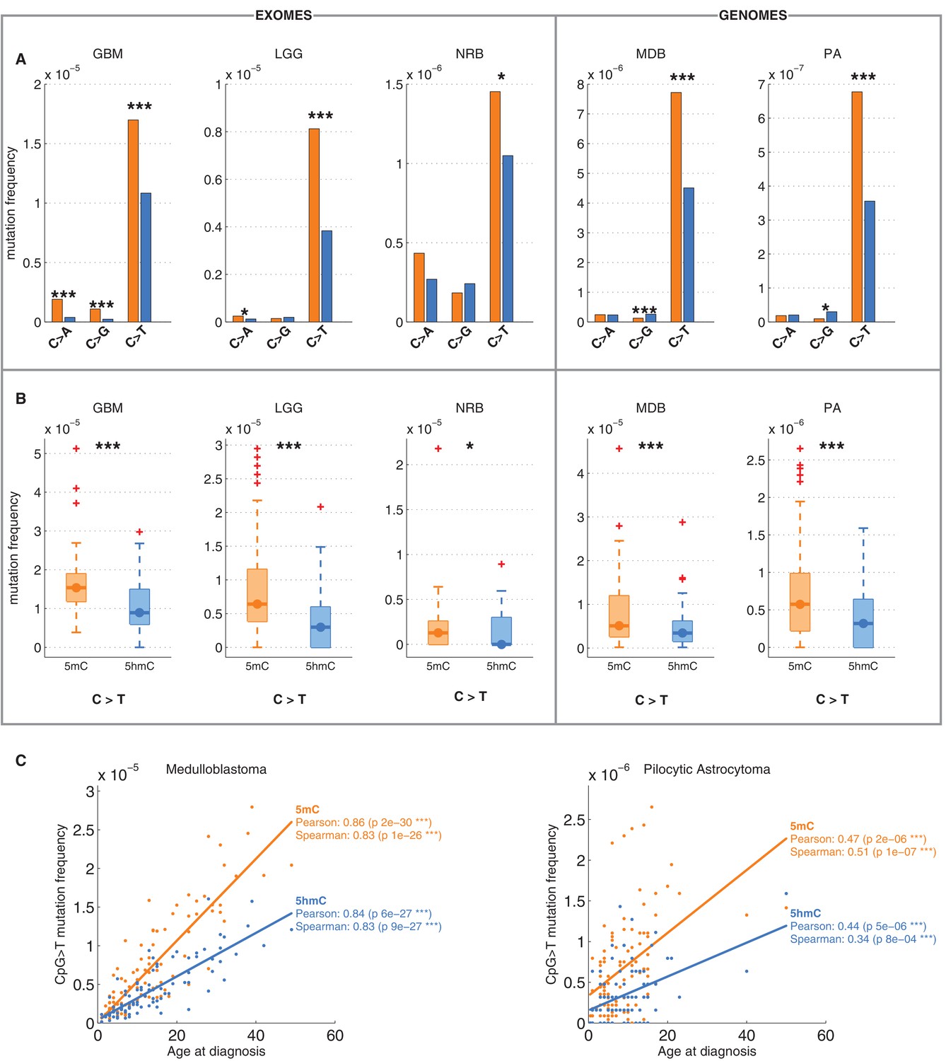
Differential mutation frequency between 5mC and 5hmC is present in all 5 brain cancer types and correlates with age at diagnosis.
(A) Average fraction of mutated CpG sites for 5mChigh vs. 5hmChigh computed separately for each cancer type. (B) Box plot of C>T mutation frequency, as shown in A. (C) Correlation of whole genome CpG>T mutation frequency with age at the time of diagnosis in patients with Medulloblastoma and Pilocytic Astrocytoma.
Figure 2—figure supplement 1
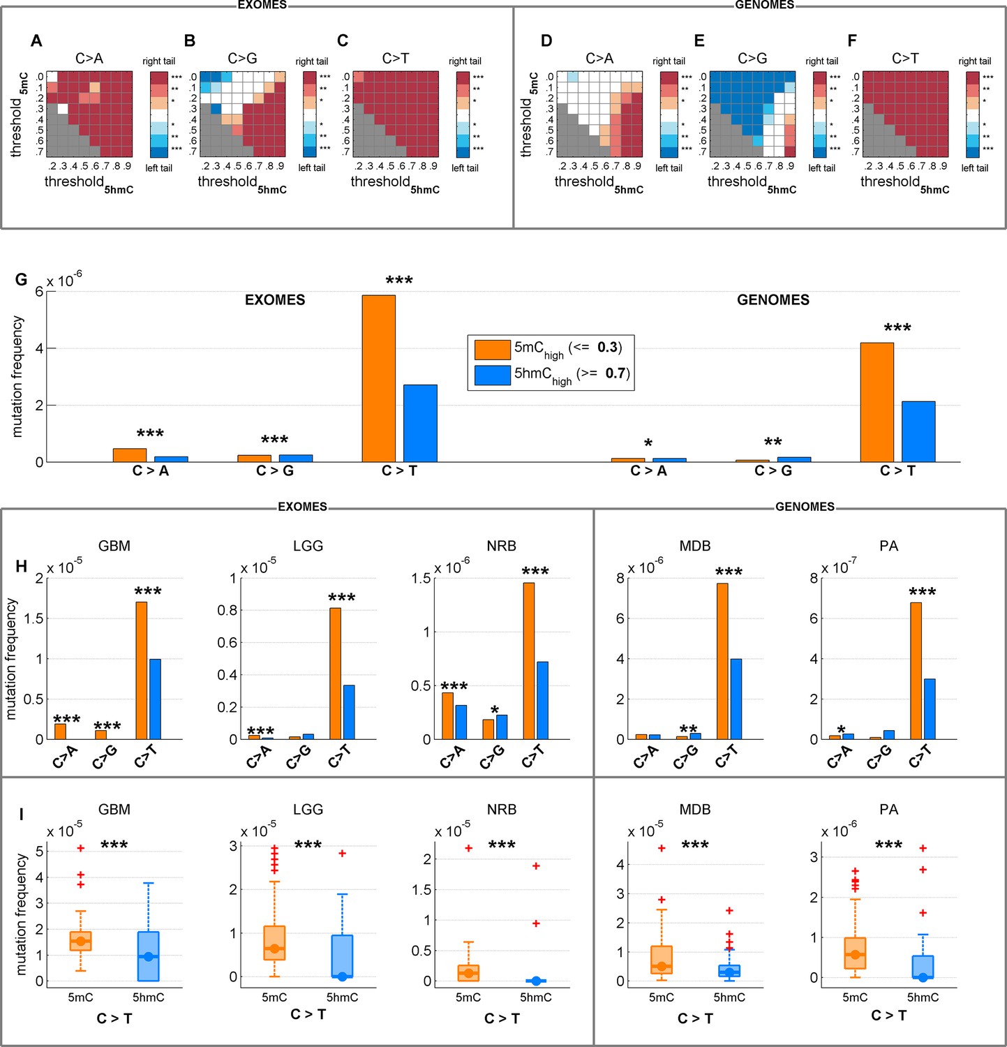
Depletion of C>T mutations in 5hmChigh is relatively insensitive to varying definitions of 5mChigh and 5hmChigh.
(A–F) Significance of a difference in mutation frequency in 5mChigh and 5hmChigh, for a range of values of threshold5mC and threshold5hmC (5mChigh is defined as sufficiently modified sites with 5hmCrel ≤ threshold5mC; 5hmChigh is defined as sufficiently modified sites with 5hmCrel ≥ threshold5hmC). One-sided paired Wilcoxon sign-rank test was used. Red colour represents a significant increase of mutation frequency in 5mChigh (right tail test) whereas blue colour represents elevated mutations in 5hmChigh (left tail test). (G–I) C>T mutation frequency for 5mChigh vs. 5hmChigh with threshold5mC =0.3 and threshold5hmC =0.7.
Figure 3 with 1 supplement
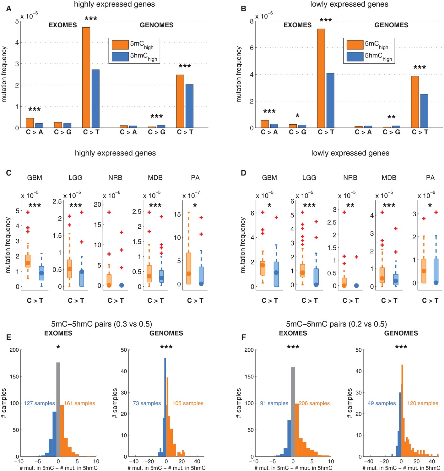
Depletion of C>T mutations in 5hmC sites is not explained by gene expression or regional mutation rate variation.
(A–B) Frequency of mutations in 5mChigh vs 5hmChigh sites within highly expressed (A) or lowly expressed (B) genes (see Materials and methods). (C–D) Boxplot visualisation of C>T mutation frequency for each cancer type. (E) For each patient sample, the overall difference in mutations in paired sites was calculated and compared using a Wilcoxon signed-rank test. Shown here is a histogram of samples by the difference in mutations for paired 5mC and 5hmC sites (negative values shown blue, positive in orange; see Materials and methods for details). Mutations in 5mC sites exceed paired 5hmC sites, causing a shift to the right. (F) Same as E but using a more stringent definition of 5mC (only sites with threshold5mC ≤ 0.2).
Figure 3—figure supplement 1

Depletion of C>T mutations in 5hmChigh is relatively insensitive to varying definitions of 5mChigh and 5hmChigh.
(A–D) C>T mutation frequency for 5mChigh vs. 5hmChigh in highly vs. lowly expressed genes with threshold5mC =0.3 and threshold5hmC =0.7. (E–F) C>G mutation frequency with threshold5mC =0.0 and threshold5hmC =0.5. (G) Mutation frequency around aligned 5mC and 5hmC sites.
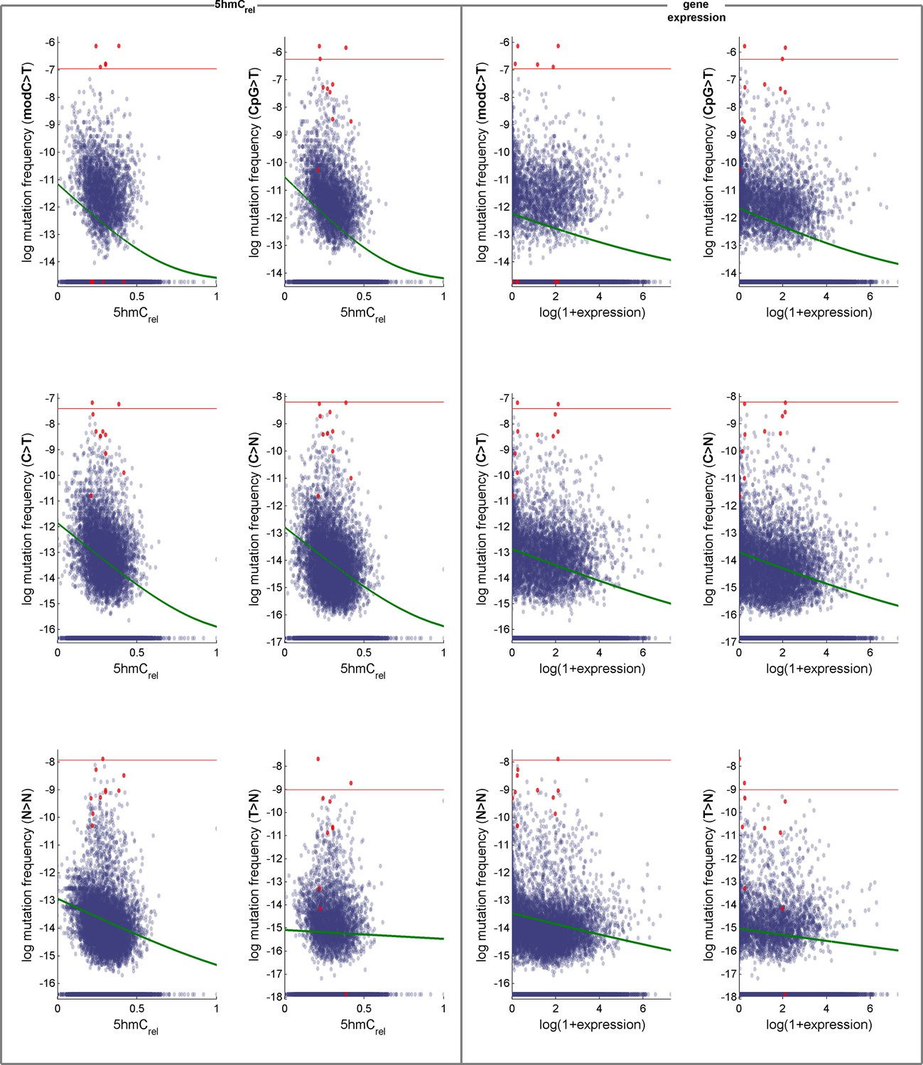
Figure 4 with 1 supplement
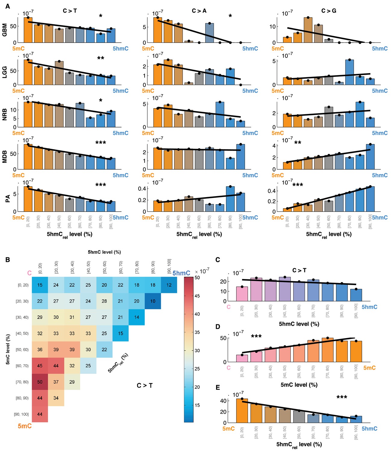
Mutation frequency negatively correlates with 5hmCrel level per base.
(A) Fraction of mutated CpG sites as a function of 5hmCrel levels by mutation and cancer type. Bins to the left represent sites predominantly methylated, while bins to the right contain increasingly hydroxymethylated sites. Black line denotes linear regression fit (F-test for coefficient deviation from 0, see Materials and methods). (B) Distribution of CpG>T mutation frequency by modification type. The top left bin contains cytosines that are mostly unmodified, the bottom left bin contains exclusively methylated cytosines and the top right bin contains cytosines that are mostly hydroxymethylated. (C) Top row of B, i.e. distribution of mutations in unmethylated sites. (D) First column of B, i.e. distribution of mutations in sites without 5hmC. (E) Diagonal of B, i.e. distribution of mutations in highly modified sites.
Figure 4—figure supplement 1

CpG>T mutation frequency as a function of 5hmCrel levels with equal binning (each bin contains approximately the same number of sites).
https://doi.org/10.7554/eLife.17082.012
Figure 5 with 3 supplements
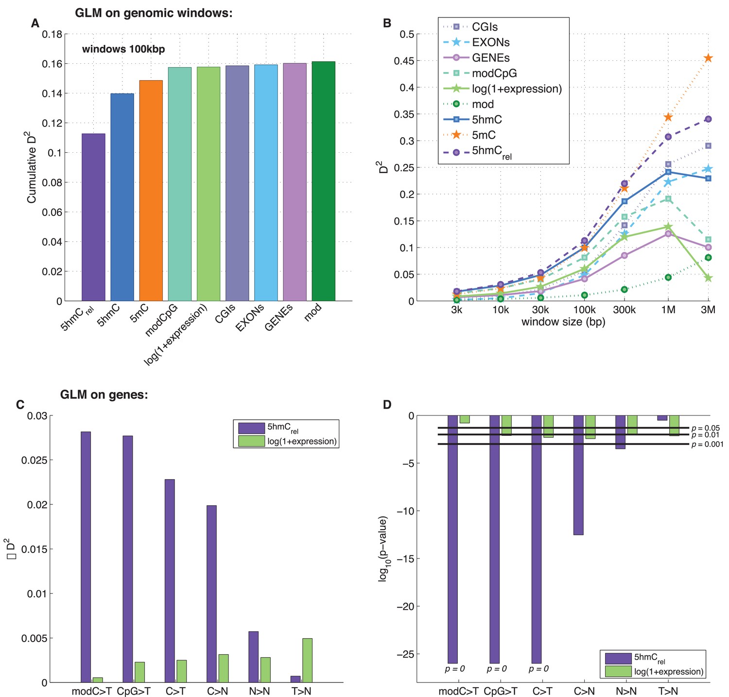
Predictors of mutations: 5hmCrel compared to other genomic features.
(A) Prediction of CpG>T mutation frequency (using whole genome sequencing only) in 100 kbp genomic windows. Predictors are sorted according to the D2 in a univariate model. The height of the kth bar denotes the D2 of a model with the first k predictors. (B) Comparison of the nine predictors of CpG>T mutation features by D2 in a univariate models, in a range of window sizes. (C) Prediction of different types of mutation frequency in genes. Increase in D2 of a generalised linear model including 5hmCrel over gene expression (purple) or gene expression over 5hmCrel (green) (see Materials and methods). (D) Significance of observations in C (see Materials and methods).
Figure 5—figure supplement 1

Genome-wide prediction of CpG>T mutation frequency: 5hmCrel compared to other genomic features.
(A–C) Comparison of nine predictors of CpG>T mutation frequency in a range of window sizes by p-value of univariate generalised linear models (A), Spearman correlation (B), and Pearson correlation (C). (D) Effects of window size and patient numbers on D2 of GLM with one response variable (simulated mutation frequency) generated proportionally from a single ideal predictor (see Materials and methods for details).
Figure 5—figure supplement 2
Effects of 5hmCrel levels on gene mutability.
Data for GLM with Poisson distribution (the fitted curve is in green). Genes defined as outliers in at least one definition of mutation frequency (above the red line) are plotted in red. For convenience, the mutation frequency is plotted on log-scale.
Figure 5—figure supplement 3
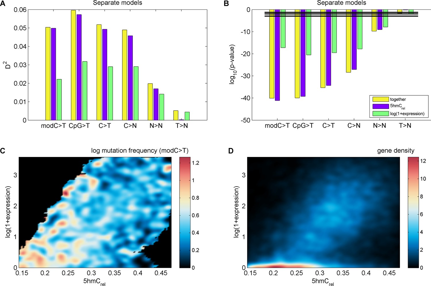
Effects of 5hmCrel levels on gene mutability.
(A–B) GLM results fitted separately for 5hmCrel (purple) and gene expression (green) and both of them together (yellow). (C–D) Frequency of modC>T mutations of all genes (C) and gene density (D) in the space of 5hmCrel and gene expression. Briefly, for figures C and D the space was limited to [quantile(x, 0.05), quantile(x, 0.95)] on both axes and then binned into 100x100 bins. In each bin, the average mutation frequency (in the form of log(mutFreq + min(mutFreq(mutFreq>0)))) was computed. The resulting matrix was smoothed by applying a Gaussian filter (radius 5 bins, sigma 2) weighted by the number of genes in each bin (bins with ≥ 2/3 missing values in their neighbourhood were set to NaN) and plotted with pcolor (NaN bins are shown in black).
Figure 6 with 3 supplements
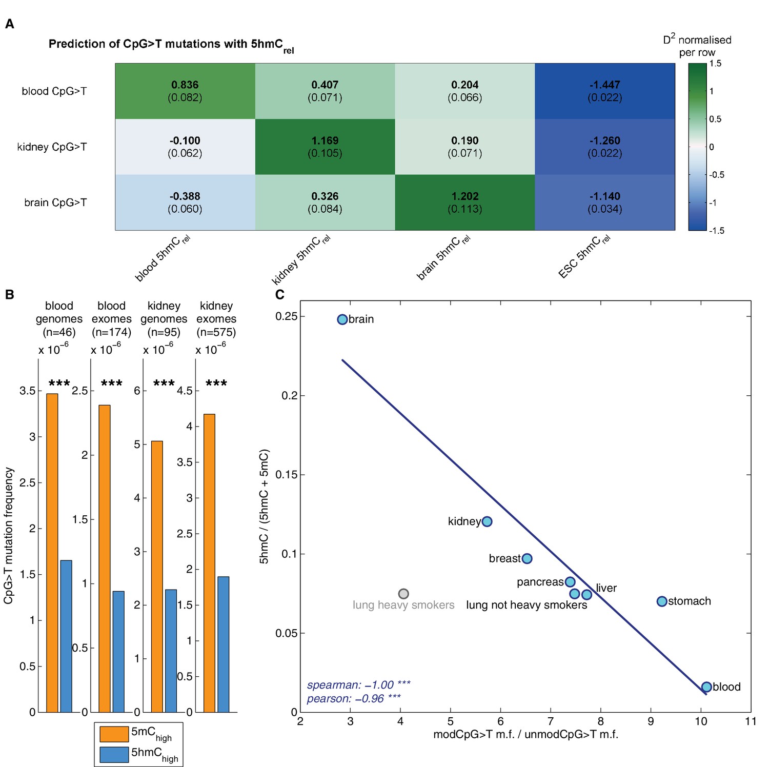
Decreased CpG>T mutation frequency in 5hmC is not limited to brain tissue.
(A) Predictions of CpG>T mutation frequency in whole genome cancers in blood (AML), kidney and brain using 5hmCrel maps from blood, kidney, brain and embryonic stem cells (ESC) in 100 kbp genomic windows. The values are z-score normalised per rows in order to normalise for different number of patients and mutations in each cancer type (the original D2 values are in parentheses); the higher values of D2 (green), the better predictions. (B) CpG>T mutation frequency in 5mC vs. 5hmC in kidney and blood. (C) Correlation of total 5hmCrel levels (measured with HPLC) with frequency of CpG>T mutations in modified cytosines normalised by the frequency in unmodified cytosines in different tissues (see Materials and methods).
Figure 6—figure supplement 1
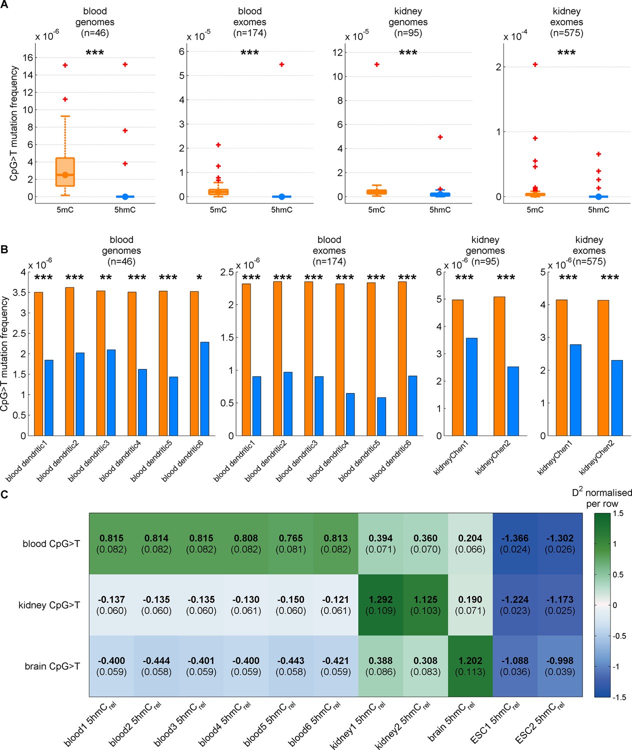
Decreased CpG>T mutation frequency in 5hmC is present in three tissues consistently for different replicates of modification maps.
(A) CpG>T mutation frequency in 5mC compared to 5hmC in blood and kidney using modification maps from different replicates merged together (A) and used separately (B). (C) Predictions of CpG>T mutation frequency in whole genome cancers in blood (AML), kidney and brain using different replicates of 5hmCrel maps from blood, kidney, brain and embryonic stem cells (ESC) in 100 kbp genomic windows. The values are z-score normalised per rows in order to normalise for different number of patients and mutations in each cancer type (the original D2 values are in parentheses); the higher values of D2 (green colour), the better predictions.
Figure 6—figure supplement 2
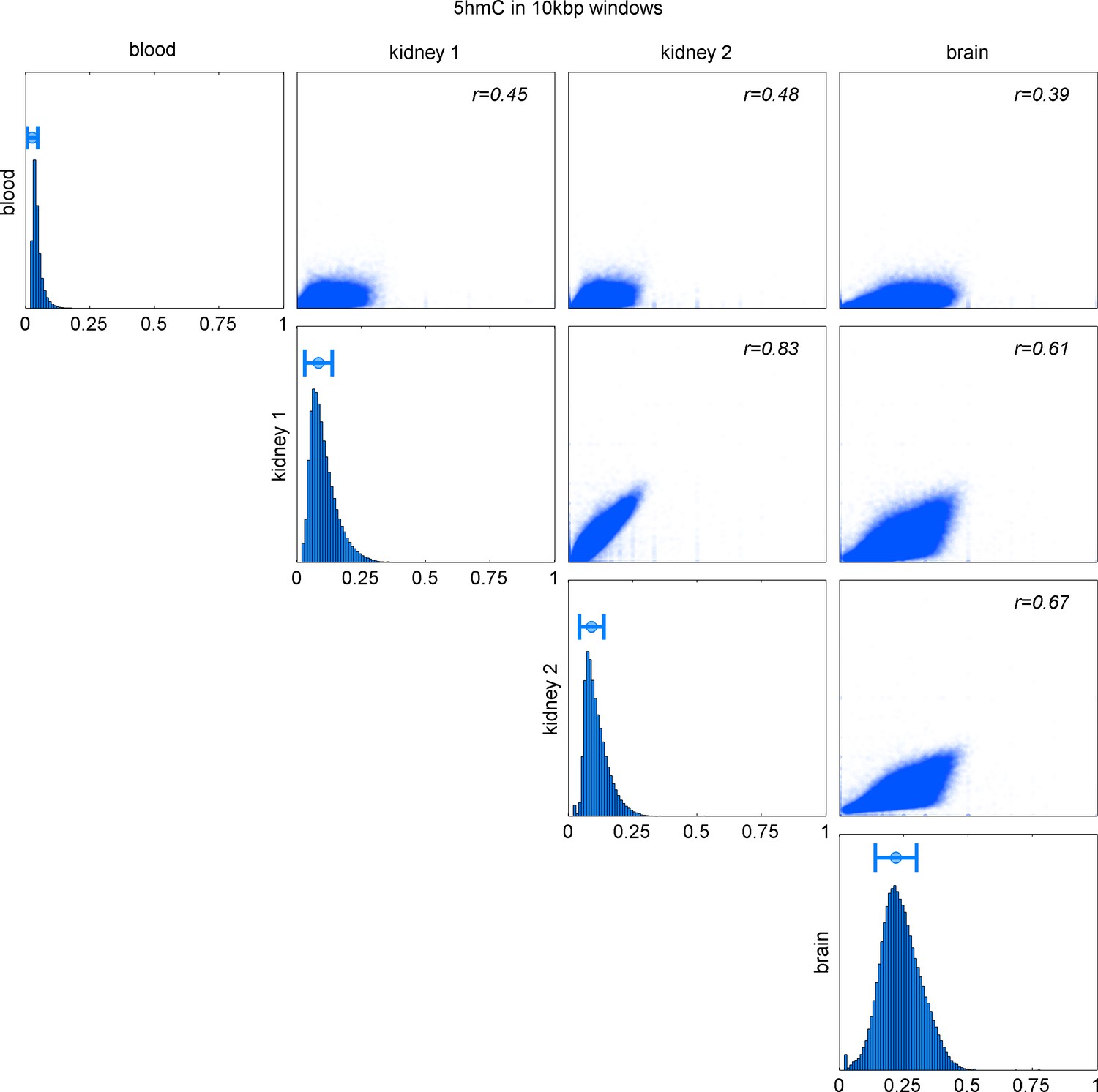
Comparison of 5hmC in 10 kbp windows in blood, kidney (2 replicates), and brain.
Distribution of 5hmC values in each map and Pearson correlation of pairs of maps.
Figure 6—figure supplement 3
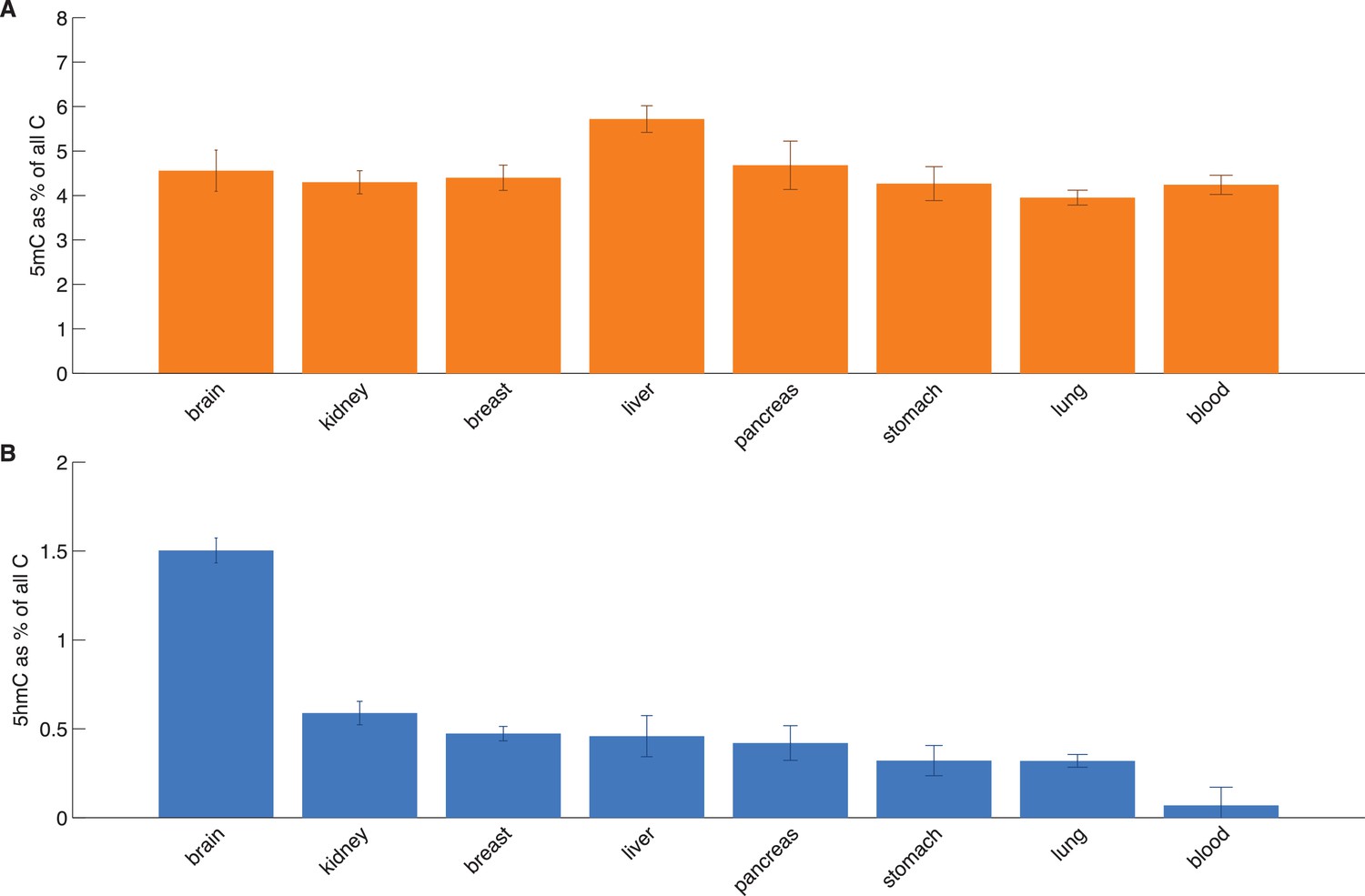
HPLC measurements of total 5hmC and 5mC in eight tissues.
Average values with standard deviation of 5mC and 5hmC (as a percentage of total cytosine).
Additional files
-
Supplementary file 1
(a) Overview of BS-Seq and TAB-Seq data used to generate modification maps. (b) Overview of whole genome and exome sequencing data used for mutation information.
- https://doi.org/10.7554/eLife.17082.021
Download links
A two-part list of links to download the article, or parts of the article, in various formats.
Downloads (link to download the article as PDF)
Open citations (links to open the citations from this article in various online reference manager services)
Cite this article (links to download the citations from this article in formats compatible with various reference manager tools)
5-hydroxymethylcytosine marks regions with reduced mutation frequency in human DNA
eLife 5:e17082.
https://doi.org/10.7554/eLife.17082


