Cartographic Symbology for Crisis Mapping: A Comparative Study †


Faculty of Geodesy, University of Zagreb, 10000 Zagreb, Croatia
*
Author to whom correspondence should be addressed.
†
extended conference paper from GI4DM 2019.
ISPRS Int. J. Geo-Inf. 2020, 9(3), 142; https://doi.org/10.3390/ijgi9030142
Submission received: 23 January 2020
/
Revised: 17 February 2020
/
Accepted: 27 February 2020
/
Published: 28 February 2020
(This article belongs to the Special Issue GI for Disaster Management)
Abstract
:Cartographic symbols on crisis maps serve as means of depicting information about the position, properties, and/or numerical values of objects, phenomena or actions specific to crisis mapping. Many crisis cartographic visualisations require simple, clear, categorised and visually organised symbols that can be easily read and understood by a wide range of crisis map users. Cartographic symbol sets for crisis mapping depend on effective graphic design, good availability (sharing and promotion, dissemination and promulgation) and standardisation (ensuring the general and repeatable use of map symbols). In this research, our aim was to examine the extent of these challenges in current cartographic symbology for crisis mapping. Through a comparative study of prominent symbol sets, we analysed efforts invested so far and proposed future directions. The results of this study may be of assistance in understanding less unified or coherent symbologies currently in use, or in revising or amplifying existing sets for future publication.
1. Introduction
During crisis response it is critical to share and understand complex spatial, thematic, and temporal information in a timely, visual and compelling way. Cartography plays an important role in delivering reliable, understandable, attractive, user-friendly, visual information through maps [1]. A crisis map is a thematic map on which objects, phenomena or actions specific to crisis management are represented according to their importance and highlighted using appropriate cartographic symbols [1,2]. Cartographic symbols on such maps serve as means of depicting information about the position, properties, and/or numerical values of objects, phenomena or actions specific to the crisis event. They are essential for communication to heterogeneous audiences in the unique environment of a crisis characterised by the immediate risk of considerable loss and stress. Consequently, many crisis cartographic visualisations rely on simple, clear, aesthetically pleasing symbols that can be read and understood easily by a wide range of crisis map users [2,3,4]. If they are incomprehensible, illegible, ambiguous, unclassified, random, or lack hierarchical organisation and other important design characteristics, they may fail to convey the intended message and complicate cooperative crisis management strategies at local, regional and international levels.
The problem of ineffective mapping that fails to communicate messages during a crisis was identified following Hurricane Andrew (in the Bahamas and south-eastern coast of the USA in 1992) and Hurricane Fran (in the USA in 1996) [3], when retrograde research was conducted on how the maps produced during or immediately after these events were used. The same problem was identified after major tragedies such as the 9/11 terrorist attack (in the USA in 2001), the Christmas tsunami (on the coasts of Indonesia, Thailand, Sri Lanka, and India in 2004) and Hurricane Katrina (in the USA, 2005).
Immediately after these events, issues were pinpointed such as the lack of cartographic symbols for communication in crisis situations, and visually overloaded maps which reduced legibility and made essential crisis information difficult to understand [2]. The need for cartographic symbols specifically adapted for use on crisis maps was highlighted. As a result, cartographic symbol sets were specially designed for communication and action in crises and were promoted within the crisis community.
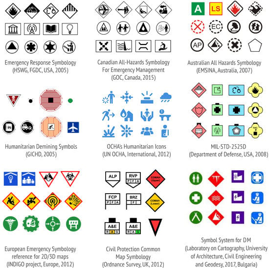
Examples include (Figure 1):
- Emergency Response Symbology (Homeland Security Working Group (HSWG), Federal Geographic Data Committee (FGDC), USA, 2005) [5]
- Canadian All-Hazards Symbology For Emergency Management [6] (Government Operations Centre Geomatics (GOC), Canada, 2015) and its predecessors: Canadian Disaster Database Symbology (2007) and Emergency Mapping Symbology (2010)
- Australian All Hazards Symbology (Emergency Management Spatial Information Australia (EMSINA), Australia, 2007) and a revised edition issued in 2018 [7]
- OCHA’s Humanitarian Icons (United Nations Office for the Coordination of Humanitarian Affairs (OCHA), International, 2012) and a completely revamped set of symbols released in 2018 [8]
- Humanitarian Demining Symbols (Geneva International Center for Humanitarian Demining (GICHG), International, 2005) [10]
- Symbol System for Disaster Management (Laboratory on Cartography, University of Architecture, Civil Engineering and Geodesy, 2017, Bulgaria) [11]
- Civil Protection Common Map Symbology (Ordnance Survey, UK, 2012) [13].
Despite the fact they were designed for the same purpose, these symbol sets differ in various aspects. At first glance, the most noticeable difference is the graphic appearance of the symbols—from economically stylized specific pictorial symbols to extremely simple geometric abstract forms (Figure 1). They also differ in how they are ordered, structured and visually organised within the set, how they are disseminated, promulgated and shared between organisations, the extent to which they are commonly recognised and accepted, etc.
Although the latest research in crisis management has mostly covered the technological aspects of improving efficiency and strengthening crisis response capacity [4], there is still a need for research examining characteristics important for determining how easy symbols are to use. Four general challenges related to the development of symbology for crisis mapping have been identified in a recent study by Kostelnick and Hoeniges [14] through a review of the cartographic literature and results of a survey conducted among different humanitarian organisations. These are: (1) symbol taxonomies, (2) symbol design issues, (3) symbol availability, sharing and promulgation, (4) standardisation process in the wider community.
In this research, our aim was to examine the extent of these challenges within current cartographic symbology for crisis mapping. Through a comparative study of prominent examples of existing symbol sets, our objectives were to analyse the efforts undertaken so far and propose future directions. We paid particular attention to sets that have undergone new, revised or amplified editions and examined whether the latest changes implemented succeed in meeting the challenges of crisis mapping symbology.
We were guided by the following research questions. (1) Symbol taxonomies: What does the taxonomy of cartographic symbols in sets and their internal breakdown look like? What graphic variables are used to support the visual and cognitive organisation of the symbols within the set? (2) Symbol design: Are all the basic geometric–graphical elements (point, line, and area) for depicting the position and quality of objects included in the set? Are the graphic and semantic qualities (such as simplicity, clarity, visibility, aesthetic appeal, traditionalism, familiarity, general acceptability, hierarchy, concreteness, semantic closeness) respected in their design? (3) Availability: Where can the symbol set be found and how easily? How and in which format have the symbols been shared? How are they promoted? Are there any study and training resources available (user manuals, best practice guidelines, etc.)? (4) Standardisation: Can the set be expanded with additional symbols? Are guidelines for the graphic design of new symbols provided? Has any assessment of the design, efficiency, and recognisability of cartographic symbols on crisis maps been carried out?
2. Materials and Methods
We examined six cartographic symbol sets published in different countries. Three were designed exclusively for crisis management (American Emergency Response Symbology, Canadian All-Hazard Symbology, Australian All Hazard Symbology), while two were intended for humanitarian activities (OCHA’s Humanitarian Icons and Humanitarian Demining Map Symbols), and one for military operations (MIL-STD-2525 Common Warfighting Symbology). The main selection criterion was that all the cartographic symbol sets should contain symbols representing objects, phenomena and actions specific to crisis management, regardless of their primary purpose. Other criteria were their availability in the public domain and their recognition by the cartographic scientific and crisis mapping community [11,15,16,17].
To begin with, we systematised general information about each cartographic symbol set: its official name and country of origin, the responsible institution, the year it became publicly available, the chronology of addenda and/or new editions, the internet source, the format in which the symbols are available for download, and the terms of use.
We then conducted a comparative analysis to examine, compare and contrast specific aspects of symbol taxonomies, their design, standardisation and availability within the six selected cartographic symbol sets.
Regarding (1) symbol taxonomies, if the symbols in the set were classified in groups, we analysed comparatively their division into categories, pattern of arrangement, and order of connection. We analysed how thematic organisation in categories was transferred to the graphic appearance of the symbols. Transcription in a cartographic symbol set must be selective to clearly distinguish affiliation to a particular type, but also, within each type, it must be associative to clearly show its affiliation [18]. The available graphical variables (also known as visual variables outlined by Bertin [19]) are size, shape, colour hue, colour value, texture, and orientation. This initial set was later extended to include two variables used in cartographic design (colour saturation and arrangement) and three which are easier to manipulate through digital production methods (crispness, resolution, and transparency) [18]. Each visual variable can be used when designing appropriate cartographic symbols to show the position and quality of a discrete object, or to present information on its properties. However, each visual variable has specific properties and is more suitable for transcribing one aspect of information than others [19,20]. The criteria for the respective perceptual characteristics of visual variables and their semiotic association were based on findings documented in cartographic textbooks [18,19,20,21].
Regarding (2) symbol design we made a quantitative analysis of the total number of cartographic symbols in each set and their representation according to dimensions. Considering dimensions, the cartographic symbols were divided into point, line, area, volume, and space-time (four-dimensional) (according to [18]). We then analysed comparatively the implementation of four semantic qualities (concreteness, semantic closeness, familiarity, acceptability) and four graphic qualities (simplicity, visibility, consistency and aesthetic appeal) in the design of pictorial symbols. The choice of symbol qualities for analysis and the criteria for rating them were based on the general qualities of symbols documented in cartographic and behavioural literature through research into the characteristics important in determining how easy pictorial symbols are to use [22,23].
In terms of (3) availability, we analysed comparatively methods of sharing and promoting, disseminating and promulgating the cartographic symbol sets. We identified methods for disseminating symbols from existing sets, such as advertising, publications, presentations, workshops, brochures, flyers, posters, websites, exhibitions, conferences, training activities, innovation networks, and so on. We examined the technical aspects of how the cartographic symbols were shared, such as the format available for download, and whether they were embedded in existing GIS software (ArcGIS and QGIS) or symbol sharing platforms. We also researched and listed any available accompanying resources such as study and training materials, demonstrations of the use of symbols on maps, user manuals, best practice guidelines, etc.
In terms of (4) standardisation, we analysed comparatively measures taken regarding the general and repeated use of cartographic symbols from the set. We asked whether it was possible to extend the set with additional symbols, and whether there were any guidelines, requirements, rules for graphic design, or rules for implementing the symbols on crisis maps. Had an assessment of the design, efficiency, and recognition of cartographic symbols on crisis maps been carried out? Were there any recorded uses of the symbols on maps in real-case scenarios? We analysed whether the symbols were intended for use on a certain type of map at a certain scale.
3. Results
The elements of the cartographic symbols sets covered by the analysis are summarized and presented in Table S1 and given in the Supplementary Materials. The results of the comparative analysis, with specific examples, are reported in the subsections which follow.
3.1. Taxonomy, Visual and Hierarchical Organisation of Cartographic Symbols
A comparative analysis of the sets revealed different approaches to the hierarchical, thematic and visual organisation of cartographic symbols. For example, the symbols in Canadian All-Hazards Symbology and Humanitarian Demining Map Symbols were organised in three categories, while those in American Emergency Response Symbology, Australian All Hazard Symbology and MIL-STD-2525 Common Warfighting Symbology were organised in four categories. In the OCHA’s Humanitarian Icons, many themes of interest to the humanitarian community, from natural disasters (such as tsunamis and earthquakes) to relief supplies (such as water containers and shelter kits) were covered. Complex humanitarian topics such as access to people in need and protection of civilians were also covered. However, no clear thematic division into categories was stated.
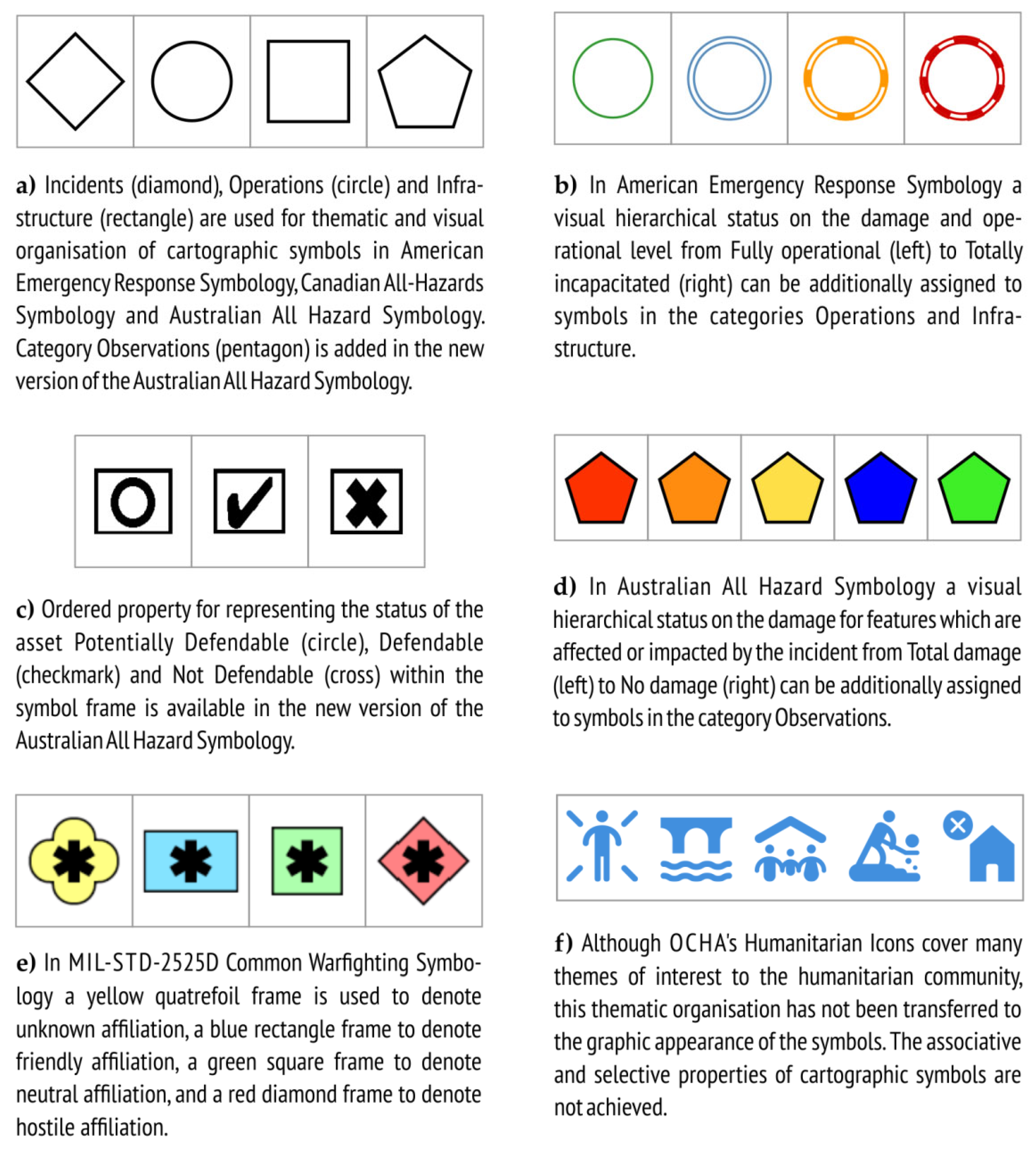
Although the total number of categories and their names in the sets differed, general similarities could be found. Incidents, operations and infrastructure are three commonly used categories for the thematic organisation of cartographic symbols for communication and action in a crisis. In American Emergency Response Symbology, Canadian All-Hazards Symbology and Australian All Hazard Symbology, visual organisation is achieved by connecting particular geometric shapes to particular categories of symbols (Figure 2a). In a new version of the Australian All Hazard Symbology (2018), a new category of observations has been added for features which are affected or impacted by the incident (Figure 2a).
In American Emergency Response Symbology a visual hierarchical status on the damage caused, marked by the particular geometric shape and/or colour hue of the symbol frame, can be additionally assigned to symbols in the operations and infrastructure categories (Figure 2b).
In the new edition of Australian All Hazard Symbology, graphic variables have been introduced for expressing ordered (hierarchical) properties (Figure 2c). A visual hierarchical status can also be assigned for features which are affected or impacted by the incident (Figure 2d).
Following the example of American Emergency Mapping Symbology, a new version of Canadian All-Hazards Symbology incorporates the use of different frames—a diamond for an incident, a rectangle for infrastructure, and a circle for operations. A frame with dashes represents a disruption to an incident or infrastructure. When the symbology set is distributed, these frames will be provided so users can combine them with any symbol [6].
In MIL-STD-2525 Common Warfighting Symbology, affiliation is shown by framing the symbols using different shapes and colour fills (for example, the relationship between an operator and an operative object). The basic categories of affiliation are unknown, friendly, neutral and hostile (Figure 2e).
Although the symbols in OCHA’s Humanitarian Icons and Humanitarian Demining Map Symbols are thematically organised in categories, this has not been transferred to the graphic appearance of the symbols (Figure 2f). Since all the symbols in OCHA’s Humanitarian Icons set are the same colour hue, associative and selective properties are not achieved. Although the pictograms in Humanitarian Demining Map Symbols use frames of different geometric shapes and colour fills, these variables are not applied to achieve visual organisation of the symbols, but arbitrarily.
3.2. Design of Cartographic Symbols
3.2.1. Representation of Cartographic Symbols according to Their Dimensions
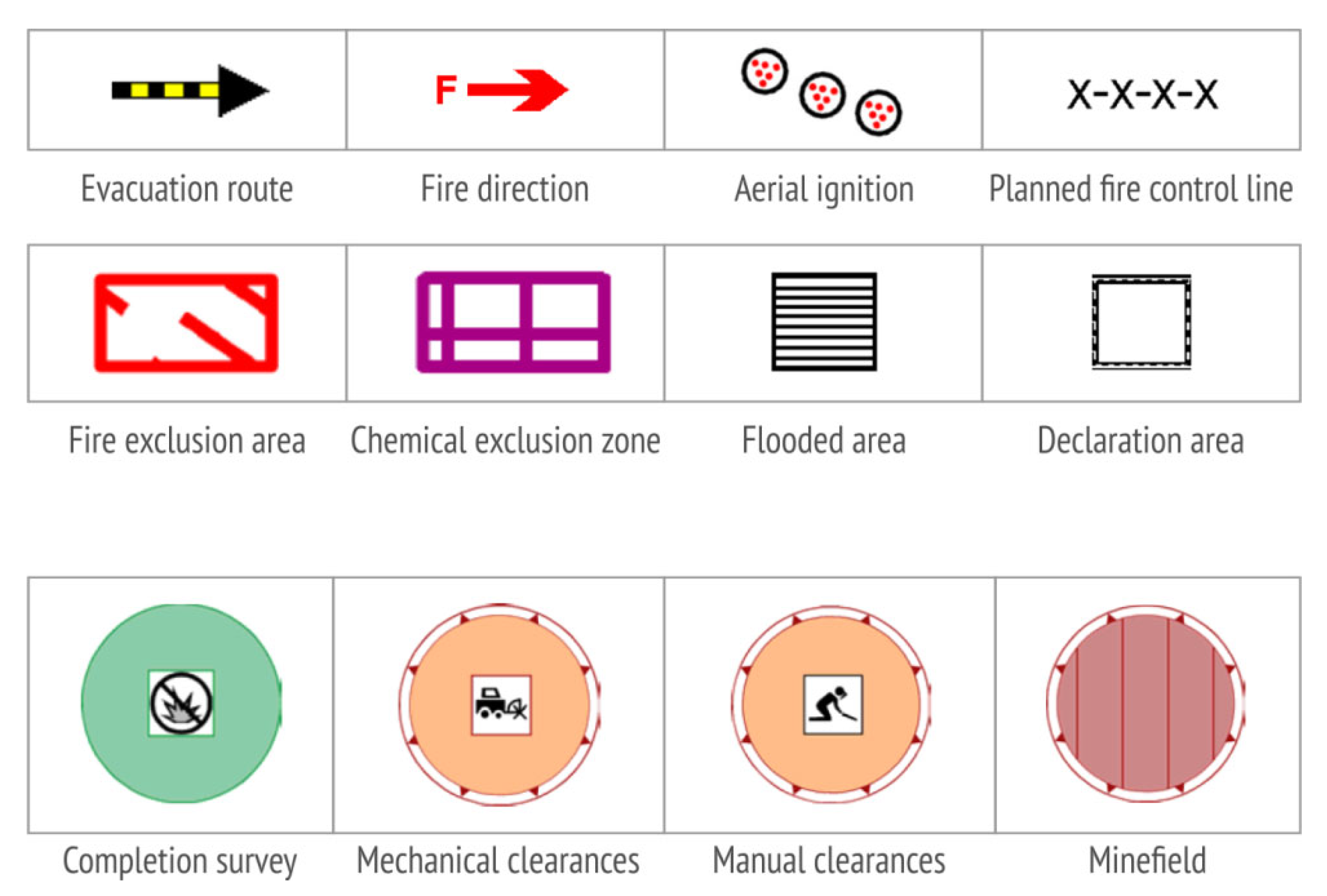
A quantitative analysis of the cartographic symbols according to their dimensions showed that in the cartographic symbol sets, there were generally no line and area symbols envisaged for representing objects, phenomena, and actions specific to crisis management (see Table S1). The exceptions were the Australian All Hazard Symbology (with 13 line and 10 area symbols), and the Humanitarian Demining Map Symbols (with 31 area symbols) (Figure 3).
3.2.2. Concreteness of Cartographic Symbols
Concreteness refers to the extent to which the symbol depicts real objects, materials, or people [23]. Pictorial symbols tend to be more concrete and visually obvious in comparison to associative, geometric or alphanumeric versions [22].
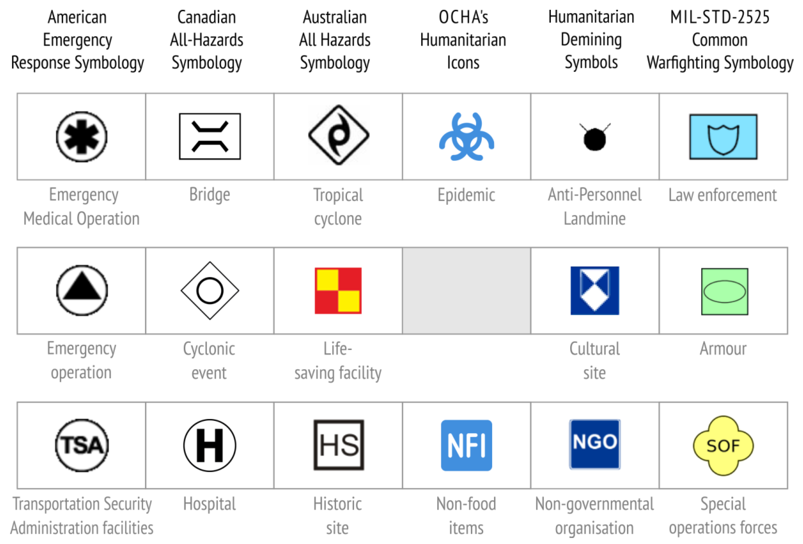
For the comparative analysis of symbol concreteness in the sets, a quantitative analysis of representation of cartographic symbols according to appearance was made. Point cartographic symbols were divided into pictorial, associative, geometric and alphanumeric [18]. The symbols were considered pictorial if they were simplified drawings of important external (formal) or symbolic features of objects. The symbols were considered associative if a combination of geometric and pictorial characteristics was used to form a shape associated with the intended theme. If the symbols were derived from basic geometric shapes or from regular linear and area alignments of lines or points, they were regarded as geometric. Alphanumeric symbols were those formed using letters or numbers.
The quantitative analysis showed that associative, geometric and alphanumerical symbols were also represented in the sets in addition to pictorial ones. The exception was OCHA’s Humanitarian Icons set where no geometric symbols were found. Examples of associative, geometric and alphanumeric symbols selected from each set are shown in Figure 4.
3.2.3. Semantic Closeness of Cartographic Symbols
Pictorial symbols were further analysed on the basis of how the symbol (i.e. the visual representation) was linked to its meaning (i.e. the referent). Semantic closeness is the measure of the distance between the map symbol and what it is intended to represent [22,23].
At the general level, representation strategies in terms of visual similarity, semantic association and arbitrary convention were observed within the sets. Through visual similarity, the referent was represented by depicting its visual characteristics, as shown in selected pictograms from OCHA’s Humanitarian Icons (Figure 5, top row). This kind of representation was regarded as the closest semantically.
Through semantic association, the connection between the referent and the symbol was mediated by depicting concepts that were semantically close to the referent. Semantic association in the selected pictograms from Canadian All-Hazards Symbology was achieved by depicting the visual characteristics of typical representatives (e.g. a knife and fork for a food distribution centre, a mortarboard for a university) (Figure 5, second row), or by depicting the visual characteristics of a pictogram with a higher level of meaning abstraction (e.g. binoculars for a rescue action, a helmet for safety, a maple leaf as the national symbol for a Canadian significant site) (Figure 5, third row).
The representation was semantically farthest when the referent was represented through an arbitrary convention that had to be learned in order to interpret it correctly (e.g. a rod of Asclepius for a health facility, or the international trefoil for radiological material) (Figure 5, bottom row).
3.2.4. Familiarity and Acceptability of Cartographic Symbols
Familiarity of symbols is the frequency with which they are encountered [22,23]. For example, most people find the symbols used to indicate public toilets very familiar, despite variations.
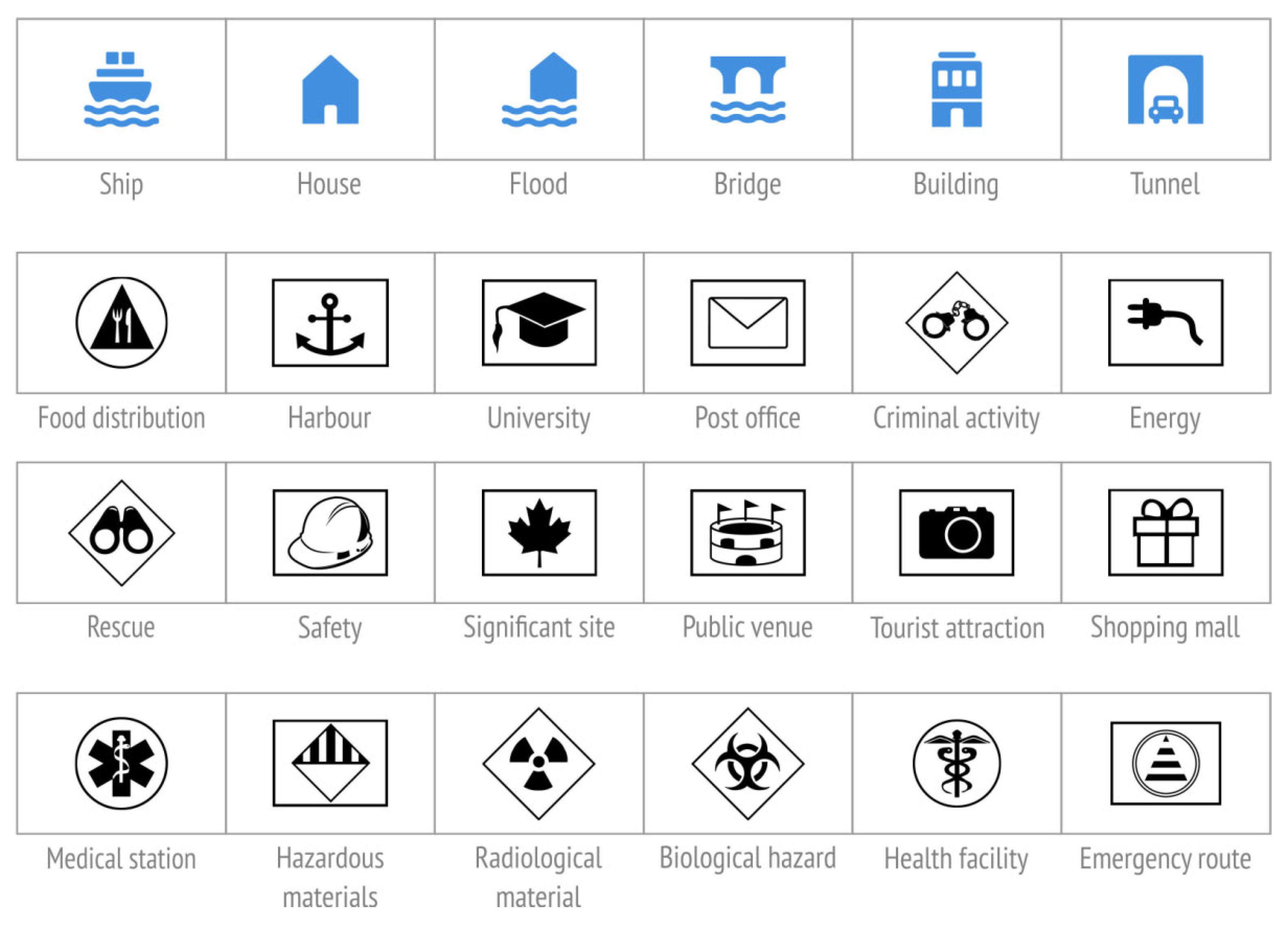
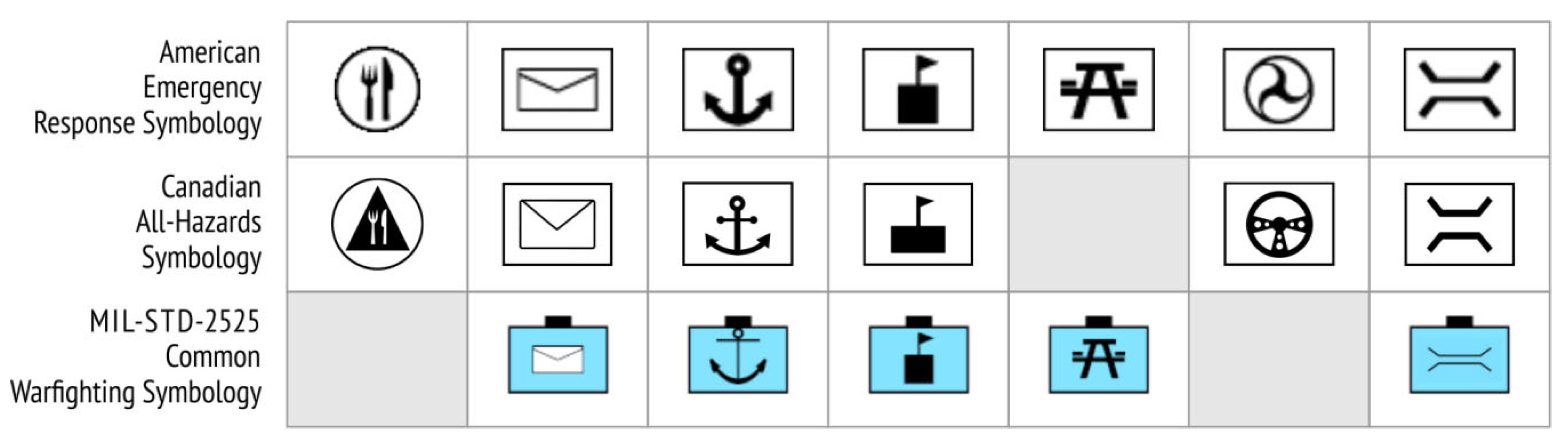
Cartographic symbols that have been used in almost unchanged or very similar forms over a long period of time were present in all the analysed sets (e.g. a knife and fork are usually used for a place where food is served, an envelope for a post office, an anchor for a ship port, along with commonly used cartographic symbols for a school, public recreation area, transport and bridge) (Figure 6).
Additionally, in OCHA’s Humanitarian Icon, pictograms were identified that are regularly used in traffic communication, such as violent wind, snowfall, landslide and gas station, and to communicate public information, such as toilets and disabled persons. Generally accepted hazard pictograms were also present, e.g. for poison (which indicates danger in general, not just danger of poisoning), hazardous material, radioactive material and biohazardous infectious materials.
3.2.5. Visual Complexity (Simplicity) of Cartographic Symbols
The visual complexity of a symbol refers to the intricacy of its edges, the number of its elements, and level of detail [24]. A comparative analysis of cartographic symbols in the sets showed that the level of detail used to depict objects, phenomena and actions specific to crisis mapping differed, from economically stylized concrete pictorial symbols (e.g. American Emergency Response Symbology and OCHA’s Humanitarian Icons) to extremely simple geometric abstract forms (e.g. MIL-STD-2525 Common Warfighting Symbology).
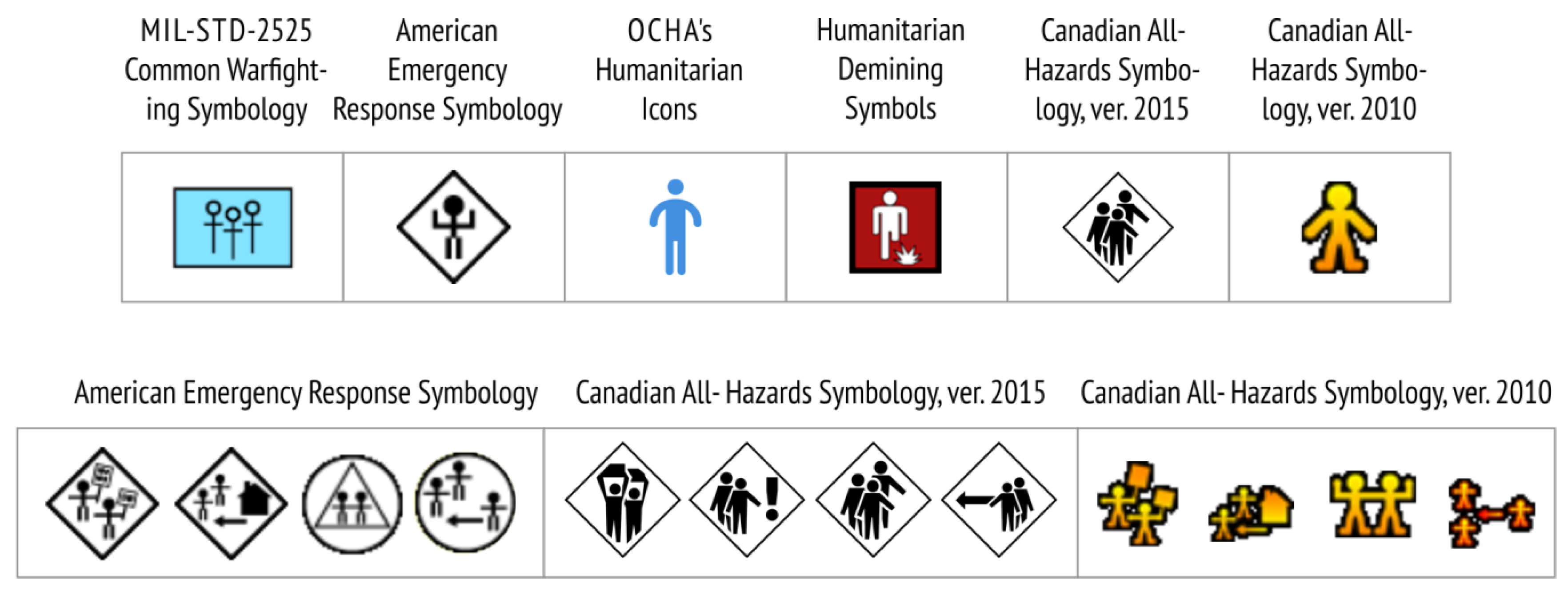
Cartographic symbols to depict civilians were selected and arranged from the simplest to the most detailed (Figure 7). In the first symbol, the person is represented by two lines and a circle. Not everyone will automatically associate this extreme simplification with a body and head. Some additional details such as lines indicating arms and legs may be necessary. On the other hand, too much detail can have the opposite effect. The examples in Figure 7 show that although an individual civilian symbol (from the old version of Canadian All-Hazards Symbology) works well on its own, a simpler pictogram like one from American Emergency Response Symbology works better for concepts like civil demonstrations, civilian displaced population, civil rioting and civilian evacuation.
3.2.6. Visibility of Cartographic Symbols
The visibility of a symbol refers to the ease with which it can be seen against the background [22]. In this research, we only analysed comparatively the contrast and prominence of pictograms against the colour inside the symbol (fill). Contrast of cartographic symbols against background maps should also be examined in the future research, to indicate how much the readability of each symbol locally decreases when it is presented on a specific colour background. A quantitative measure for colour contrast to be calculated between any map object and its background can be found in Reference [25].
Instructions for contrast ratings were obtained from previously calculated contrast differences between two colours, based on the light reflectancy readings in percentages for each of the two colours involved [26]. Good contrast can be achieved by using black and white [26]. Contrast in the form of a black pictogram on a white background was used for all symbols in American Emergency Response Symbology, Canadian All-Hazards Symbology, and some symbols in Australian All-Hazard Symbology and Humanitarian Demining Map Symbols (Figure 8).
In addition to light-dark contrast combinations [26], the following combinations of pictograms and backgrounds were deemed successful:
- black on yellow (symbols in MIL-STD-2525 Common Warfighting Symbology denoting the unknown affiliation category),
- red on white (certain symbols in Australian All-Hazard Symbology).
- blue on white and white on blue (all symbols in OCHA’s Humanitarian Icons, and certain symbols in Australian All-Hazard Symbology and Humanitarian Demining Map Symbols).
Slightly lower contrast and prominence was noted for cartographic symbols in MIL-STD-2525 Common Warfighting Symbology denoting friend, neutral, and hostile affiliation categories. In these cases, black pictograms were used on blue, green and red backgrounds (Figure 8).
3.2.7. Consistency of Cartographic Symbols
Consistency means the extent to which symbols form a visually uniform set [22]. Consistency was analysed as a quality of the symbol set rather than as a quality of the individual symbols.
In all the analysed sets, pictograms were framed by particular geometric shapes and filled with predefined colour hues. Thus, a certain degree of consistency in the depiction of point symbols was achieved. The exception was the set of point symbols in Humanitarian Demining Map Symbols, where frames and colour fills were arbitrarily applied.
Consistency in a cartographic symbol set can also be achieved by using similar stroke weights, arcs, circle sizes, and perspectives [22]. The highest consistency was achieved in the new version of OCHA’s Humanitarian Icons, where the new pictograms were drawn from scratch following predetermined standardized design rules. Thus, all the new icons looked similar in terms of visual complexity and appeared to belong to the same family.
More about the rules and guidelines for consistent and unified style and the visual appearance of cartographic symbols in the sets is discussed in Section 3.4.2 and Section 3.4.3.
3.3. Availability (Sharing, Dissemination, and Promulgation) of the Cartographic Symbols
All the cartographic symbol sets examined are publically available online on the websites of the institutions responsible for their development. American Emergency Response Symbology has been publicly available on the web pages of the Homeland Security Working Group of the Federal Geographic Data Committee [27] since 2004. The current (third) version of Canadian All-Hazards Symbology was publicly released by Government Operations Centre Geomatics (GOC) in the document [6] in 2015. It is currently available at [28], but a permanent host is required. In 2018, the second edition of Australian All Hazards Symbology was released. The symbol set, related documents and entire project history are available on the website of Emergency Management Spatial Information Australia [29]. The OCHA’s Humanitarian Icons set has been publicly available on the United Nations Office for the Coordination of Humanitarian Affairs (OCHA) website since 2012 [8]. The second edition was released in 2018. There has been a publicly available report [10] with a corresponding set of Humanitarian Demining Symbols on the website of the Geneva International Center [30] since 2015.
Detailed information for each cartographic symbol set (the responsible institution, the year it became publicly available, the last update, a chronology of addenda and/or new editions, the internet source, formats in which the symbols are available for download, and terms of use) is systematized in Table S1.
A comparative analysis showed that the most common formats in which symbols in the sets are shared are the raster PNG, and vector SVG format. Technical resources also include predefined style files for ESRI’s ArcGIS for all the analysed symbol sets and for QGIS (in the case of OCHA’s Humanitarian Icons and Australian All Hazards Symbology) that can be loaded into standard mapping software to promote easy sharing within and between organisations.
The OCHA’s Humanitarian Icons set is the only representative of cartographic symbols for crisis and humanitarian mapping within the Noun Project [31], a platform that offers a crowd-sourced collection of universally recognisable icons for visual communication.
Symbols from the Emergency Response Symbology set are built-in in Symbol Store, a visual-enabled, web-based interactive tool designed to help mapmakers share point symbols [32]. The initial idea behind Symbol Store was to allow users to browse symbols by keywords, category tags, and contributors and to facilitate the discovery, retrieval and sharing of map symbol sets between users. Symbol sets can be downloaded as ESRI Style Files so that they can easily be imported into new or current ArcGIS map projects.
Joint Military Symbology XML (JointMilSyML or JMSML) is an XML schema and associated instance data, designed to document the contents of MIL-STD 2525D and NATO STANAG APP-6(C). The Military Overlay is supplied as a project template for ArcGIS Pro and allows military standard symbols to be created quickly using and adapting existing feature templates, creating a military overlay with military standard symbols and sharing the overlay as either a static image or a web map [9]. It is hoped that future defence and intelligence systems will be engineered to take advantage of this technology, thus accelerating the delivery of new military symbology to war combatants, reflected in updates to these standards.
3.4. Standardisation (General and Repeated Use) of Cartographic Symbols
3.4.1. Standardisation of Map Symbology
At the moment, only one set of truly standardised emergency symbology exists. This is Emergency Response Symbology used in the United States and standardised by the American National Standards Institute [5].
After its public release, the cartographic symbols in Emergency Response Symbology triggered great interest among crisis management experts and emergency service workers. Various software producers wanted to include the cartographic symbols in their software, which would have increased their availability and consistent use on crisis management maps. However, since the symbols were adopted as a standard of the American National Standards Institute, their use involves the payment of a fee, which has put off many users who are still using the free version. The standardised set is used officially by emergency management and first responder communities at all levels of need (national, state, local and incident) in the United States [27].
MIL-STD-2525 Common Warfighting Symbology is the standard setting out rules and requirements for defining and displaying military operations, and all units of the US Department of Defense (DOD) have been obliged to implement it since 2008. It is also available to non-DOD entities (e.g. first responders, the United Nations, and multinational partners).
The equivalents of this standard are two NATO publications: Allied Procedural Publication APP-6A—Military Symbols for Land Based Systems and Allied Procedural Publication APP-6B—Joint Symbology (1998), in which graphic symbols for marking units, positions and control measures in tactical operations are defined. The content of NATO’s publications and U.S. Department of Defense’s MIL-STD-2525 standards are basically the same, but the latter has been developing faster, and therefore the analysis in this paper refers to that standard.
3.4.2. Standardisation of Usage
In Emergency Response Symbology it is stated that the symbols are intended for use on digital and paper maps at large and medium scales. It is not recommended to use the symbols on small-scale maps, but rather simplified versions or geometric shapes that indicate the symbol category [27]. In Australian All Hazard Symbology it is stated that the symbols are intended for use on paper and digital topographic maps and aerial images at small, medium and large scales. There was no more detailed standardisation of their use in the resources studied. However, a new element in the version released in 2018 is the inclusion of five scale-dependent symbols for facilities (Fire-Fighting Facility, Ambulance Facility, State Emergency Service Facility, Life-Saving Facility and Police Facility) for use at smaller scales. Also, for the new category Observations in which frame fills in different colour hues of the same intensity selectively outline information on damage caused, alternatives to the black and white variants of the symbols are also envisaged [29]. In Canadian All-Hazards Symbology it is stated that the symbols are primarily intended for desktop mapping, while still enabling effective web use [6]. The symbols in the OCHA’s Humanitarian Icons set are intended for use in a wide range of OCHA humanitarian community information products, including maps, written reports, infographics and websites, while the symbols in MIL-STD-2525 Common Warfighting Symbology are intended for use in paper military topographic maps, digital military information systems, “graphics” and “working maps” [9]. The symbols in the Humanitarian Demining Map Symbology set are intended for use in topographic maps and aerial images in digital and paper form, at large, medium and small scales, and are specially adapted for use in the mine action information set (Information Management System for Mine Action IMSMA) distributed by the Geneva International Humanitarian Demining Centre [30].
3.4.3. Extending Sets with New Symbols
The Homeland Security Working Group responsible for the development of American Emergency Response Symbology points out that the set does not include all the symbols required to represent objects, phenomena, and crisis-specific actions. If a need for new symbols arises, they will try to incorporate them in an existing set, depending on the resources and capabilities available [27]. However, guidelines for extending an existing set with new symbols are not publicly available.
The current version of the Australian All Hazard Symbology set does not include all the cartographic symbols needed to manage different crises. The existing symbols are limited to actions in certain types of crisis and provide a base that will be extended in the future to meet the wider needs of national security and crisis management [29]. The 2010 version contained a total of 83 symbols. Between 2011 and 2017, EMSINA continued to collect information for a new and/or improved Australian All Hazard Symbology. A dedicated symbology officer was elected in 2015. This person, in collaboration with a small EMSINA working group, revised the method for collecting and approving symbols in 2016. The latest version of the 2018 set contains a total of 127 symbols. However, there are no guidelines for extending the existing set with new symbols, that is, none have been published in the available resources. However, a workflow for new symbology proposals [29] has been clearly stated.
The OCHA’s Humanitarian Icons set is periodically extended with new symbols as necessary [8], and as other versions of the set have been released, major advances have been made to standardise guidelines for extension with new symbols. In 2018, OCHA released a completely revamped set of 295 symbols (and the number continues to increase) as the result of a long, meticulous redesign process. The first version in 2012 contained a total of 241 symbols. It grew organically as illustrations were developed to meet internal design needs, and the new series has been drawn from scratch following standardised design rules. The OCHA Graphics Stylebook [8] was also released, containing guidelines for establishing some rules for all designers, so that there is consistency across the icon family. Moreover, the original set has been extended to include new themes (for instance cash transfer) and individual icons have evolved to reflect changes that have occurred since 2012 (in technology, for example).
3.4.4. Assessment
Assessing the symbol design and recognisability in the American Emergency Response Symbology set was conducted in two ways, and the test methods and detailed results were published [2,27]. In the first case, the assessment of the appearance of each symbol was conducted by the Homeland Security Working Group during December 2003 and January 2004, in an on-line open-type survey in which various crisis management and emergency services volunteers participated. The survey results were published in a report on the website of the Homeland Security Working Group [27]. For each symbol in the set, the participants of the survey indicated whether they accepted or rejected its graphic design and short definition. Symbols that did not reach the 75% acceptance threshold were reviewed and redesigned (e.g. 11 symbols were not accepted in the category ‘incidents’, 7 in the category ‘natural events’, 4 in the category ‘activity’, and none in the category ‘infrastructure’). The symbols that met the threshold were accepted as standards of the American National Standardization Institute ANSI INCITS 415-2006 Homeland Security Mapping Standard—Point Symbology for Emergency Management. In the same period a recognition test was conducted of 15 randomly selected symbols from the category Incidents and 13 from the category Operations [2]. Since there are no clear guidelines or norms to test the recognition of cartographic symbols for a crisis, the standard recommendations ANSI Z535.3 National Standard for Criteria for Safety Symbols which prescribes general criteria for the assessment and use of safety symbols indicating specific hazards were adopted [2]. Fifty Californian fire-fighters participated in the testing, and it was found that only 6 of the 28 symbols rated achieved the 85% recognition level prescribed by the standard.
An assessment of the symbol design of Humanitarian Demining Map Symbols was conducted on the initial version. Professional pyro-technicians participated in the testing, and their comments and feedback were taken into account when adjusting the symbols in newer versions of the system [17].
There is no evidence that the design, effectiveness, or recognisability of the proposed cartographic symbols was assessed for other symbol sets covered by the existing literature and other available resources.
4. Discussion
Several recommendations may be made following the comparative analysis of cartographic symbol sets for crisis mapping presented in this paper.
4.1. Recommendations and Best Practices for the Taxonomy, Visual and Hierarchical Organisation of Cartographic Symbols
For a thorough understanding of a cartographic symbol set, that is, to achieve the optimal map function for communicating information in a crisis, symbols should be formed following the appropriate organisational structure or taxonomy. Although the data to be displayed on a map is sometimes already provided for the cartographer in a proper organisational structure, no such structure exists in the case of data for communication and acting in a crisis. However, the analysis of the sets showed that some similarities were found in the organisation of cartographic symbols in groups in Emergency Response Symbology, Canadian All-Hazards Symbology, Australian All Hazards Symbology and MIL-STD-2525 Common Warfighting Symbology.
The visual organisation of the symbols in the set should be such that crisis management participants (both cartographers and map users) notice it immediately [15]. This can be achieved by using the appropriate colour hues and different shapes for framing cartographic symbols, as in the sets in Emergency Response Symbology, Canadian All Hazard Symbology and MIL-STD-2525 Common Warfighting Symbology.
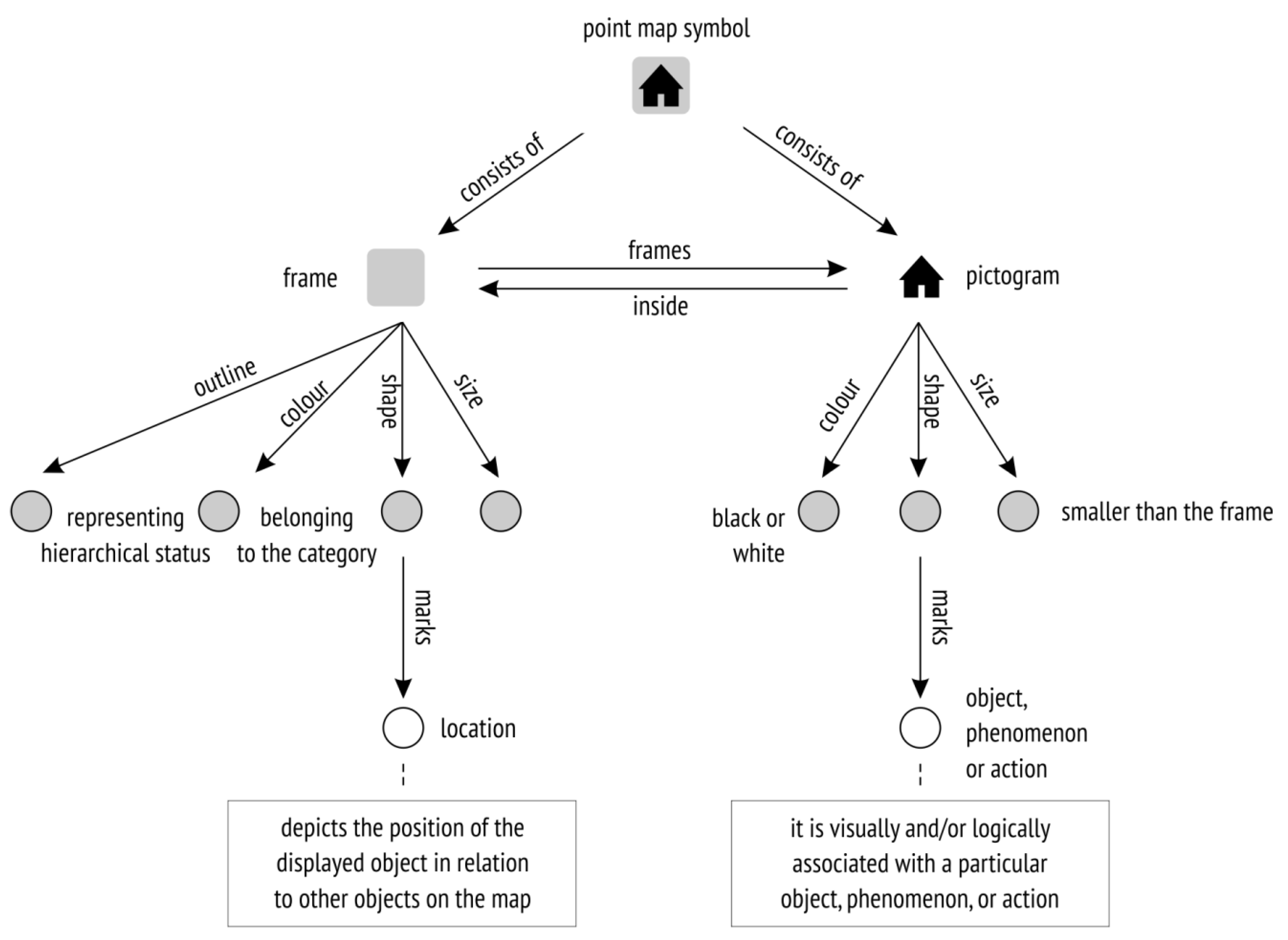
In Figure 9 we describe a possible cognitive scheme for interpretation of cartographic symbols in Emergency Response Symbology, Canadian All-Hazards Symbology, Australian All Hazards Symbology and MIL-STD-2525 Common Warfighting Symbology according to pattern we observed in the comparative analysis of their visual and hierarchical organisation. It was based on the similar example schema for interpretation of symbols on a National Park Service map and schema for interpreting U.S. Interstate Highway numbers presented in Reference [18].
The same model could be applied to the sets in OCHA’s Humanitarian Icons and Humanitarian Demining Map Symbols to customise them for crisis mapping. Following such a cognitive scheme, users apply logic in the interpretation of cartographic symbols on a crisis map, and this tells them that the graphic appearance of the symbol is divided into two parts: the frame, which is to a certain extent a constant part of the cognitive scheme (that is, it can take a finite number of geometric shapes and colour hues), and the pictogram (a variable part of the scheme that takes on a new form each time). Users visually and/or logically interpret various kinds of pictograms, where each shape is associated with a particular object, phenomenon or action. The frame around a pictogram may be a red square or a blue rectangle, and users subconsciously organise them into groups by applying the similarity principle—similar objects form a group. The frame location on the map indicates the position of the displayed object in relation to other objects on the map. Apart from quality, the objects identified can also be distinguished by their ordered properties. By analysing the existing cartographic symbol set, it was noted that ordered properties were not present in the first versions but were included in later editions of Australian All Hazards Symbology and Canadian All Hazards Symbology. As a result, for example, infrastructure objects were labelled as destroyed or undamaged, and roads as passable or obstructed.
4.2. Recommendations and Best Practices for the Design of Cartographic Symbols
Firstly, a quantitative assessment of existing symbols according to their dimensions indicated a lack of line and area symbols in Emergency Response Symbology, Canadian All Hazard Symbology, OCHA’s Humanitarian Icons, MIL-STD-2525 Common Warfighting Symbology and lack of line symbols in Humanitarian Demining Map Symbols. It was apparent from the analysis of existing crisis maps [33] that line and area symbols were crucial in representing objects, phenomena, and actions specific to acting in a crisis, even though they appeared in much smaller numbers than point symbols. For example, line symbols were used to show fire front progression or oil spills at sea, and to mark evacuation routes or priority roads and routes used during a crisis. Area symbols usually indicated areas affected by crises (for example, flooded areas, wildfire-burned areas, or areas affected by hazardous gas leaks), and danger zones.
We are aware that line and area symbols in the cartographic symbol sets for crisis mapping are mapped directly on the base map, and that the length of a line symbol or shape and size of an area symbol cannot be defined in advance, as with point symbols. However, we recommend that these symbols are included in existing sets, with graphic variables applied instead of dimensions. These variables are size, direction, and colour hue (Figure 10). Size variation of the line (thicknesses or width) should be applied when designing the (hierarchical) and quantitative properties of objects. Direction variation (changing a line into an arrow) should be used to represent motion, and variation of colour value to express the ordered properties of line objects. When designing area symbols, two graphic variables should be applied: colour hue and transparency of fill and/or texture (Figure 10). The corresponding point symbol is located within the polygon and indicates which phenomenon is represented by the area symbol.
Line colour hues and shape fills should be applied consistently, according to the principle of similarity with the actual situation in nature, or by adopting symbolism. To achieve selective properties in the depiction of the line symbols, the thickness or width of lines must be at least 0.5 mm or 2 pixels apart [34]. The transparency of the area symbol fill can vary from 15 to 30 %, depending on the type of base map. The visual variable texture is well suited to associate map symbolisation with natural phenomena (e.g. snowflakes for snow avalanches). When used, it can denote categorical or numerical differences (the higher the value, the denser the texture). Sequential colour schemes are suited for ordered data that progress from low to high [19,21] and are should be used to depict classes of increasing values (e.g. blue value scale for intensities of the flooded areas). Diverging schemes put equal emphasis on mid-range critical values and extremes at both ends of the data range [19,21] and should be used for data whose values are above or below a critical value (e.g. a scale of red and green values for selective highlighting of danger zones).
Secondly, understanding the different semantic and graphic qualities of symbols is important when a new set of symbols is designed or an existing set extended with new symbols.
The quantitative assessment of existing symbols by frequency of appearance showed that although pictorial symbols were present to a greater extent, there were many examples of abstract and geometric symbols. In military systems such as MIL-STD-2525 Common Warfighting Symbology this is acceptable, since the users who need to interpret them have undergone special training. However, users who encounter these unfamiliar symbols for the first time may face difficulties. Thoughtfully designed pictorial symbols will not only be understood more easily and intuitively by a wide range of crisis participants such as crisis management experts and emergency services workers, but also by civilians or the general public. Therefore, appropriate pictorial symbols should be preferred over alphanumeric, geometric and abstract symbols. This requirement was considered in the new version of Canadian All-Hazards Symbology, where only one alphanumeric symbol was found (the letter H for hospital), whereas the previous version contained nine.
In terms of graphic qualities, when designing the visual appearance of the symbol, preference should be given to economically stylized, concrete pictorial symbols, such as those in Emergency Response Symbology and OCHA’s Humanitarian Icons, compared to the more detailed ones in the old version of Canadian All-Hazards Symbology. However, extremely simple geometric abstract symbols, such as those in MIL-STD-2525 Common Warfighting Symbology, should be avoided.
The new version of OCHA’s Humanitarian Icons is a successful example of the application of graphic and semantic qualities. In this symbol set, the pictogram is not treated as a single solution, but as a series of pictograms, taking into account concreteness, semantic closeness, familiarity, acceptability, simplicity, visibility, consistency and homogeneity.
4.3. Recommendations and Best Practices for the Availability of Cartographic Symbols
It is obvious that tradition, homogeneity, uniformity, and standardisation, both in the graphic design of symbols and their application on crisis maps, are crucial when creating map symbols for crisis mapping. The standardisation of cartographic symbols for crisis mapping (in the sense of ensuring unambiguous, consistent application) would allow users to become familiar with their meanings and increase their usefulness on crisis maps.
Emergency Response Symbology is arguably the most globally recognised standardised approach to emergency management mapping symbology and is also formally recognised as an American National Standards Institute (ANSI) standard. Emergency Response Symbology was the pioneer symbology standard for emergency management, and later attempts, including the Canadian and Australian All-Hazards Symbology sets, were inspired by and build as much as possible on it.
In addition to the graphic design of cartographic symbols, crisis management participants (cartographers and users) must be provided with rules and guidelines for use on the map. In order to expand the system with new symbols, guidelines for the graphic design of cartographic symbols must be standardised. Such guidelines must specify the minimum size for legibility and predict the use of symbols on maps at different scales, since scale dictates the size of a cartographic symbol and the amount of detail that can be represented by a pictogram in a particular symbol. We are aware that guidelines for determining the visual appearance of a particular symbol can only be general in nature, like guidelines for obtaining good legibility. So, those who design new symbols should have some (basic) knowledge of how to apply the guidelines.
Apart from the ease of understanding and memorising them, the success of cartographic symbols lies in their availability and maximum ease of use on future crisis maps. Incorporating symbols in software (e.g. the symbols in American Emergency Response Symbology are available in ESRI’s ArcGIS software), and uploading them on platforms (e.g. the symbols in OCHA’s Humanitarian Icons are available on the Noun Project platform) may help the set to be recognised as the de facto standard in the crisis and humanitarian community.
4.4. Recommendations and Best Practices for the Standardisation (General ad Repeated Use) of Cartographic Symbols
Since the current methods for public online sharing mostly include sharing via the organisation’s website, future research in the field of crisis mapping should seek to develop additional resources (such as crowdsourced, open-source web-based repositories and platforms for accepting, storing and disseminating symbols) that would further encourage the sharing of symbol sets among organisations and promote standardisation with regard to ensuring unambiguousness and the general and repeated use of these symbols on crisis maps.
It is necessary to invest efforts in different forms of promotion, such as publishing, presentations, workshops, brochures, flyers, posters, conferences, and training activities. Sharing, promotion, dissemination and promulgation of cartographic symbols undoubtedly imply the costs of training, raising awareness, and changing standard practices and procedures. The establishment of funding mechanisms and a clear structure for the management of implementation activities should help mitigate these costs.
5. Conclusions
In this paper, a comparative analysis was conducted of six publicly available cartographic symbol sets that have been promoted since 2005 in the scientific cartographic and crisis management community. While future research could be extended to identify other existing symbol sets currently in use in professional and civilian crisis management, we believe that the limited number of six comparatively analysed cartographic symbol sets is justified in terms of making representative conclusions, mostly because of their wholeness, prominence and continuous history. A comprehensive analysis and parallel comparison of taxonomy, graphic design, availability (sharing, dissemination and promulgation) and standardisation (general and repeated use) of cartographic symbols resulted in an assessment of the current state of affairs, unresolved problems, and possible avenues of improvement regarding cartographic symbology for crisis mapping.
We recommend the inclusion of line and area symbols in existing sets, since they are often needed to depict evacuation routes during a crisis, or areas affected by the crisis. We propose a cognitive scheme with a recognised pattern of user thinking and behaviour in the interpretation of cartographic symbols for crisis mapping and advise the application of such a scheme to OCHA’s Humanitarian Icons and Humanitarian Demining Map Symbols in terms of customisation for crisis mapping. Since appropriate pictorial symbols should always be preferred over alphanumeric, geometric and abstract symbols, we recommend the replacement of symbols in existing cartographic symbol sets with pictograph alternatives whenever possible. OCHA’s Humanitarian Icons is a successful example of the application of consistency and homogeneity in symbol design. Following that example, we recommend that graphic and semantic qualities are considered in the design of cartographic symbols for crisis mapping. Regarding standardisation and efforts made in respect of the general and repeated use of cartographic symbols, we draw particular attention to American Emergency Response Symbology and OCHA’s Humanitarian Icons. The availability of the symbols in OCHA’s Humanitarian Icons within the Noun Project platform has undoubtedly helped this set to be recognised as the de facto standard in the crisis and humanitarian community.
Additionally, the comparative analysis showed that certain changes have been implemented in new, reviewed or extended editions of existing sets. Better visual organisation has been achieved in Canadian All Hazards Symbology, special symbols for expressing associative and selective properties have been added to Canadian and Australian All Hazards Symbology. Study and training materials such as demonstrations of using symbols on maps have been provided with Emergency Response Symbology and Canadian All-Hazards Symbology, and graphic guidelines have been produced for extending the OCHA’s Humanitarian Icons set.
We hope that the results of this comparative study of prominent cartographic symbols for crisis mapping will be of assistance in understanding less unified and coherent symbologies currently in use and in the production of future revisions or amplifications of existing systems. Good practices implemented in existing cartographic symbol sets for crisis mapping can also reduce duplicated efforts and encourage the adoption of existing symbol sets.
Although compliance with the guidelines, rules, and graphic requirements outlined in this comparative analysis can be used as criteria for assessing the appearance, effectiveness and visibility of the existing cartographic symbology for crisis mapping, such process will provide partly subjective and partly objective assessment of the symbol qualities. While some conditions, such as the assessment of the applied basic geometric and graphic variables, visibility, concreteness and symbol dimensions can be accurately measured, other conditions, such as the assessment of simplicity, familiarity and semantic closeness of cartographic symbols, will depend on the subjective impression, background, and abilities of the observer.
More research is needed with a focus on the empirical evaluation of the comprehension and usability of the existing symbology for crisis mapping. User-testing should include a heterogeneous audience of crisis map users. Perceptual aspects of map symbology on the various background maps (e.g. satellite and aerial imagery, topographic map, relief map, city map) should also be considered to better understand all user aspects of cartographic symbology for crisis mapping and the factors that influence them. Furthermore, eye-tracking methods can provide assistance for objective and quantitative evidence in cognitive research on cartography [35,36]. By recording real-time fixation, saccade, and duration data, and analyzing eye movement behavior they can provide more direct suggestions to users’ visual cognition of crisis maps and help in developing improved methods for crisis mapping.
Supplementary Materials
Table S1: Results of a comparative study of six publicly available cartographic symbol sets for crisis mapping, Repository R1: Digital repository of cartographic symbols covered by the analysis.
Author Contributions
Conceptualization, Ana Kuveždić Divjak; Funding acquisition, Boško Pribičević; Methodology, Ana Kuveždić Divjak; Visualization, Ana Kuveždić Divjak; Writing—original draft, Ana Kuveždić Divjak; Writing—review & editing, Ana Kuveždić Divjak,Almin Đapo and Boško Pribičević All authors have read and agreed to the published version of the manuscript.
Acknowledgments
This research was fully supported by the Croatian Science Foundation, project number IP-01-2018-8944.
Conflicts of Interest
The authors declare no conflict of interest.
References
- Bandrova, T.; Zlatanova, S.; Konecny, M. Geoinformation for Disaster and Risk Management, Examples and Best Practices; Joint Board of Geospatial Information Societies (JB GIS) and United Nations Office for Outer Space Affairs (UNOOSA): Copenhagen, Denmark, 2010; ISBN 978-87-90907-88-4. [Google Scholar]
- Akella, M.T. First Responders and Crisis Map Symbols: Clarifying Communication. Cartogr. Geogr. Inf. Sci. 2009, 36, 19–28. [Google Scholar] [CrossRef]
- Dymon, U.J. Mapping—The Missing Link in Reducing Risk under SARA III. Risk 1994, 5, 337. [Google Scholar]
- Konecny, M.; Bandrova, T.; Kubicek, P.; Marinova, S.; Stampach, R.; Stachon, Z.; Reznik, T. Digital Earth for Disaster Mitigation. In Manual of Digital Earth; Guo, H., Goodchild, M., Annoni, A., Eds.; Springer: Singapore, 2020. [Google Scholar] [CrossRef] [Green Version]
- ANSI INCITS-415 2006. Homeland Security Mapping Standard—Point Symbology for Emergency Management; American National Standard for Information Technology: Washington, DC, USA, 2006. [Google Scholar]
- Government of Canada’s Government Operations Centre: Canadian All-Hazards Symbology. Available online: https://www.publicsafety.gc.ca (accessed on 5 December 2019).
- Emergency Management Spatial Information Australia: Australian All Hazards Symbology Version 2—2018. Available online: https://www.emsina.org/allhazardssymbology (accessed on 5 December 2019).
- United Nations Office for the Coordination of Humanitarian Affairs. Humanitarian and Country Icons 2018. Available online: https://reliefweb.int/report/world/humanitarian-and-country-icons-2018 (accessed on 5 December 2019).
- Department of Defense. MIL-STD-2525D 10 June 2014, Interface Standard Joint Military Symbology; Department of Defense: Washington, DC, USA, 2014.
- Kostelnick, J. Cartographic Recommendations for Humanitarian Demining Map Symbols in the Information Management System for Mine Action (IMSMA); Geneva International Centre for Humanitarian Demining: Geneva, Switzerland, 2005. [Google Scholar]
- Marinova, S. New Map Symbol System for Disaster Management. Proc. Int. Cartogr. Assoc. 2018, 1, 74. [Google Scholar] [CrossRef] [Green Version]
- INDIGO Project Crisis Management Solutions. European Emergency Symbology Reference for 2D/3D Maps Developed within the INDIGO Project. Available online: http://indigo.diginext.fr (accessed on 5 December 2019).
- Cabinet Office with the Ministry of Defence and the Ordnance Survey. Civil Protection Common Map Symbology. Available online: https://www.ordnancesurvey.co.uk/support/symbols-for-emergencies.html (accessed on 5 December 2019).
- Kostelnick, J.C.; Hoeniges, L.C. Map Symbols for Crisis Mapping: Challenges and Prospects. Cartogr. J. 2019, 56, 59–72. [Google Scholar] [CrossRef]
- Bianchetti, R.A.; Wallgrün, J.O.; Yang, J.; Blanford, J.I.; Robinson, A.C.; Klippel, A. Free Classification of Canadian and American Emergency Management Map Symbol Standards. Cartogr. J. 2012, 49, 350–360. [Google Scholar] [CrossRef] [Green Version]
- Robinson, A.C.; Roth, R.E.; MacEachern, A.M. Challenges for map symbol standardization in crisis management. In Proceedings of the 7th International ISCRAM Conference, Seattle, WA, USA, 2–5 May 2010. [Google Scholar]
- Kostelnick, J.C.; Dobson, J.E.; Egbert, S.L.; Dunbar, M.D. Cartographic symbols for humanitarian demining. Cartogr. J. 2008, 45, 18–31. [Google Scholar] [CrossRef]
- MacEachren, A.M. How Maps Work: Representation, Visualization and Design; Guilford: New York, NY, USA, 1995; ISBN 978-15-72300-40-8. [Google Scholar]
- Bertin, J. Semiology of Graphics: Diagrams, Networks, Maps; University of Wisconsin Press: Madison, WI, USA, 2010; ISBN 978-15-89482-61-6. [Google Scholar]
- Roth, R. Visual Variables. In The International Encyclopedia of Geography; Richardson, D., Castree, N., Goodchild, M.F., Kobayashki, A., Liu, W., Marston, R.A., Eds.; Wiley: Hoboken, NJ, USA, 2017; pp. 1–11. ISBN 978-0-470-65963-2. [Google Scholar]
- Robinson, A.H.; Morrison, J.L.; Muehrcke, P.C.; Kimerling, A.J.; Guptill, S.C. Elements of Cartography, 6th ed.; John Wiley & Sons, Inc.: Hoboken, NJ, USA, 1995. [Google Scholar]
- Korpi, J.; Ahonen-Rainio, P. Cultural Constraints in the Design of Pictographic Symbols. Cartogr. J. 2010, 47, 351–359. [Google Scholar] [CrossRef]
- Mcdougall, S.J.P.; Curry, M.B.; de Bruijn, O. Measuring symbol and icon characteristics: Norms for concreteness, complexity, meaningfulness, familiarity, and semantic distance for 239 symbols. Behav. Res. Methods Instrum. Comput. 1999, 31, 487. [Google Scholar] [CrossRef] [PubMed] [Green Version]
- Forsythe, A.; Sheehy, N.; Sawey, M. Measuring icon complexity: An automated analysis. Behav. Res. Methods Instrum. Comput. 2003, 35, 334. [Google Scholar] [CrossRef] [PubMed] [Green Version]
- Lupa, M.; Szombara, S.; Chuchro, M.; Chrobak, T. Limits of Colour Perception in the Context of Minimum Dimensions in Digital Cartography. ISPRS Int. J. Geo-Inf. 2017, 6, 276. [Google Scholar] [CrossRef]
- Arthur, P.; Passini, R. Wayfinding-People, Signs, and Architecture; McGraw-Hill: New York, NY, USA, 1992. [Google Scholar]
- Homeland Security Working Group: Symbology Reference. Available online: https://www.fgdc.gov/HSWG/index.html (accessed on 5 December 2019).
- Canadian All-Hazards Symbology. Available online: http://216.254.169.195/CAHS_SCTR (accessed on 5 December 2019).
- Australasian All Hazards Symbology. Available online: https://www.emsina.org/allhazardssymbology (accessed on 5 December 2019).
- Geneva International Centre for Humanitarian Demining. Available online: https://www.gichd.org (accessed on 5 December 2019).
- The Noun Project. Available online: https://thenounproject.com/ (accessed on 5 December 2019).
- Robinson, A.C.; Pezanowski, S.; Troedson, S.; Bianchetti, R.A.; Blanford, J.I.; Stevens, J.; Guidero, E.; Roth, R.E.; MacEachren, A.M. Symbolstore: A Web-Based Platform for Sharing Map Symbols. Cartogr. Geogr. Inf. Sci. 2013, 40, 415–426. [Google Scholar] [CrossRef]
- Kuveždić Divjak, A.; Lapaine, M. Crisis Maps—Observed Shortcomings and Recommendations for Improvement. ISPRS Int. J. Geo-Inf. 2018, 7, 436. [Google Scholar] [CrossRef] [Green Version]
- Spiess, A.; Baumgartner, U.; Arn, S.; Vez, C. Topographic Maps—Map Graphic and Generalisation; Cartographic Publication Series No. 17; Swiss Society of Cartography: Zurich, Switzerland, 2002. [Google Scholar]
- Popelka, S.; Vondrakova, A.; Hujnakova, P. Eye-tracking Evaluation of Weather Web Maps. ISPRS Int. J. Geo-Inf. 2019, 8, 256. [Google Scholar] [CrossRef] [Green Version]
- Brychtova, A.; Coltekin, A. An Empirical User Study for Measuring the Influence of Colour Distance and Font Size in Map Reading Using Eye Tracking. Cartogr. J. 2016, 53, 202–212. [Google Scholar] [CrossRef] [Green Version]
Figure 1.
Examples of cartographic symbology for crisis mapping.

Figure 2.
Taxonomy, visual and hierarchical organisation of cartographic symbols in the analysed symbol sets.
Figure 2.
Taxonomy, visual and hierarchical organisation of cartographic symbols in the analysed symbol sets.

Figure 3.
Examples of line (top) and area (middle) symbols from Australian All Hazard Symbology, and area symbols from Humanitarian Demining Map Symbols (bottom).
Figure 3.
Examples of line (top) and area (middle) symbols from Australian All Hazard Symbology, and area symbols from Humanitarian Demining Map Symbols (bottom).

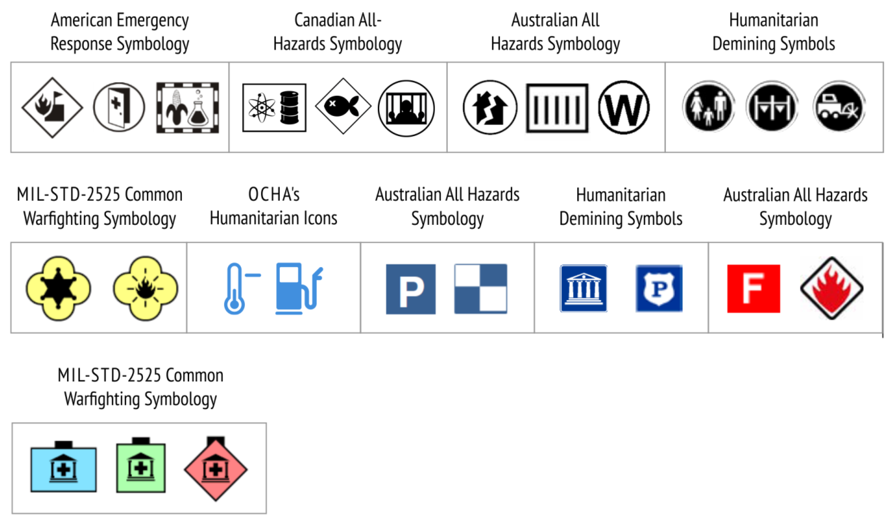
Figure 4.
Selected examples of associative (top), geometric (middle) and alphanumeric (bottom) symbols in the analysed symbol sets.
Figure 4.
Selected examples of associative (top), geometric (middle) and alphanumeric (bottom) symbols in the analysed symbol sets.

Figure 5.
Examples of different representation strategies in the analysed symbol sets: visual similarity (top), semantic association (middle) and arbitrary convention (bottom). The representation is semantically closest on the top symbols, and semantically farthest on the bottom symbols.
Figure 5.
Examples of different representation strategies in the analysed symbol sets: visual similarity (top), semantic association (middle) and arbitrary convention (bottom). The representation is semantically closest on the top symbols, and semantically farthest on the bottom symbols.

Figure 6.
Selected examples of cartographic symbols that have been used in almost unchanged or very similar forms over a long period of time.
Figure 6.
Selected examples of cartographic symbols that have been used in almost unchanged or very similar forms over a long period of time.

Figure 7.
Different levels of visual complexity of cartographic symbols within the analysed sets.

Figure 8.
Examples of the contrast and prominence of pictograms set against the colour hue inside the symbol (fill) in the analysed sets.
Figure 8.
Examples of the contrast and prominence of pictograms set against the colour hue inside the symbol (fill) in the analysed sets.

Figure 9.
Cognitive scheme describing possible pattern of thinking and behaviour of users in the interpretation of cartographic symbols for crisis mapping.
Figure 9.
Cognitive scheme describing possible pattern of thinking and behaviour of users in the interpretation of cartographic symbols for crisis mapping.

Figure 10.
Integral geometric and graphic variables for depicting line and area symbols on crisis maps.
Figure 10.
Integral geometric and graphic variables for depicting line and area symbols on crisis maps.

© 2020 by the authors. Licensee MDPI, Basel, Switzerland. This article is an open access article distributed under the terms and conditions of the Creative Commons Attribution (CC BY) license (http://creativecommons.org/licenses/by/4.0/).
Share and Cite
MDPI and ACS Style
Kuveždić Divjak, A.; Đapo, A.; Pribičević, B. Cartographic Symbology for Crisis Mapping: A Comparative Study. ISPRS Int. J. Geo-Inf. 2020, 9, 142. https://doi.org/10.3390/ijgi9030142
AMA Style
Kuveždić Divjak A, Đapo A, Pribičević B. Cartographic Symbology for Crisis Mapping: A Comparative Study. ISPRS International Journal of Geo-Information. 2020; 9(3):142. https://doi.org/10.3390/ijgi9030142
Chicago/Turabian StyleKuveždić Divjak, Ana, Almin Đapo, and Boško Pribičević. 2020. "Cartographic Symbology for Crisis Mapping: A Comparative Study" ISPRS International Journal of Geo-Information 9, no. 3: 142. https://doi.org/10.3390/ijgi9030142
Note that from the first issue of 2016, this journal uses article numbers instead of page numbers. See further details here.