
Do Different Map Types Support Map Reading Equally? Comparing Choropleth, Graduated Symbols, and Isoline Maps for Map Use Tasks


Abstract
:1. Introduction
- RQ1: Do different map types, presenting the same input data, facilitate users’ performance of various map use tasks equally?
- RQ2: Do users perceive more commonly applied map types as easier to use than map types encountered less frequently?
- RQ3: Does the subjective rating of the difficulty of tasks provided by users of different map types match the other performance metrics?
2. Background
2.1. Informationally Equivalent Visualizations
2.2. Comparing Map Types
2.3. Importance of Subjective Metrics
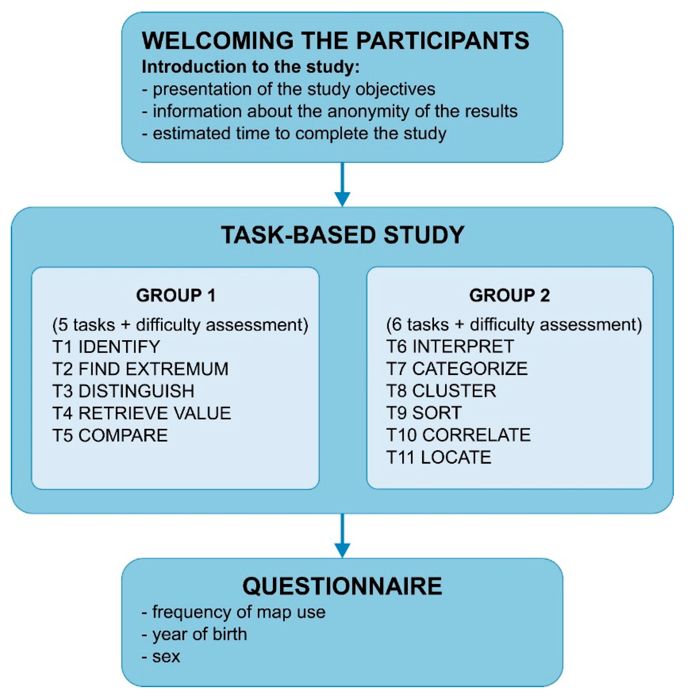
3. User Study
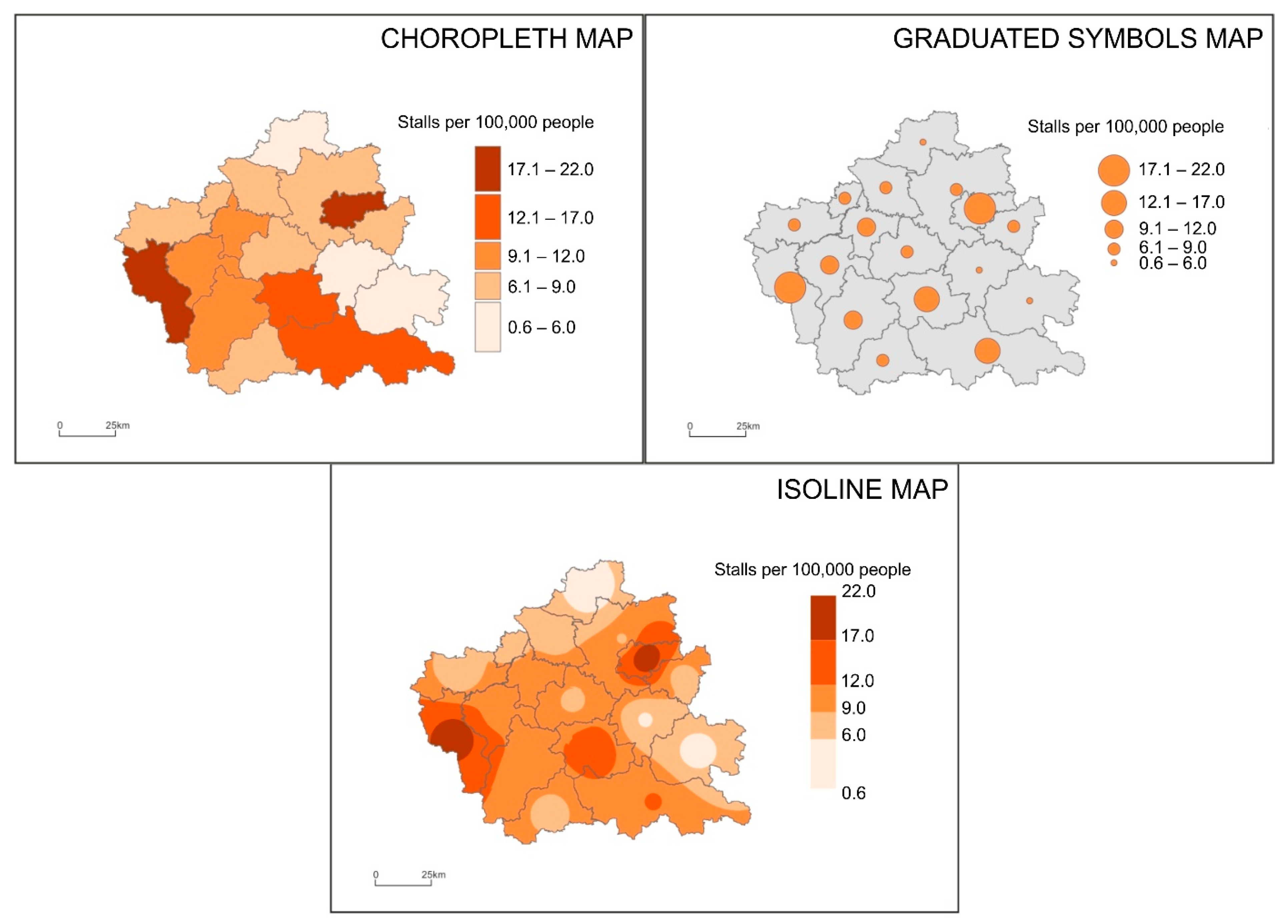
3.1. Study Material
3.2. Participants
3.3. Tasks and Procedures
3.4. Data Analysis
4. Results
4.1. The Correctness of the Answer
- CH-GS X2 (1, N = 1579) = 25.791, p = 0.000, Cramér’s V = 0.128, p = 0.000 (with statistically significant better accuracy among choropleth map users by 9 percent points)
- CH-IS X2 (1, N = 1611) = 67.634, p = 0.000, Cramér’s V = 0.205, p = 0.000 (with significantly better scores among choropleth map users by 16 percent points)
- GS-IS X2 (1, N = 1568) = 10.110 p = 0.001, Cramér’s V = 0.080, p = 0.001 (with better results for participants working with the graduated symbols map by 7 percent points).
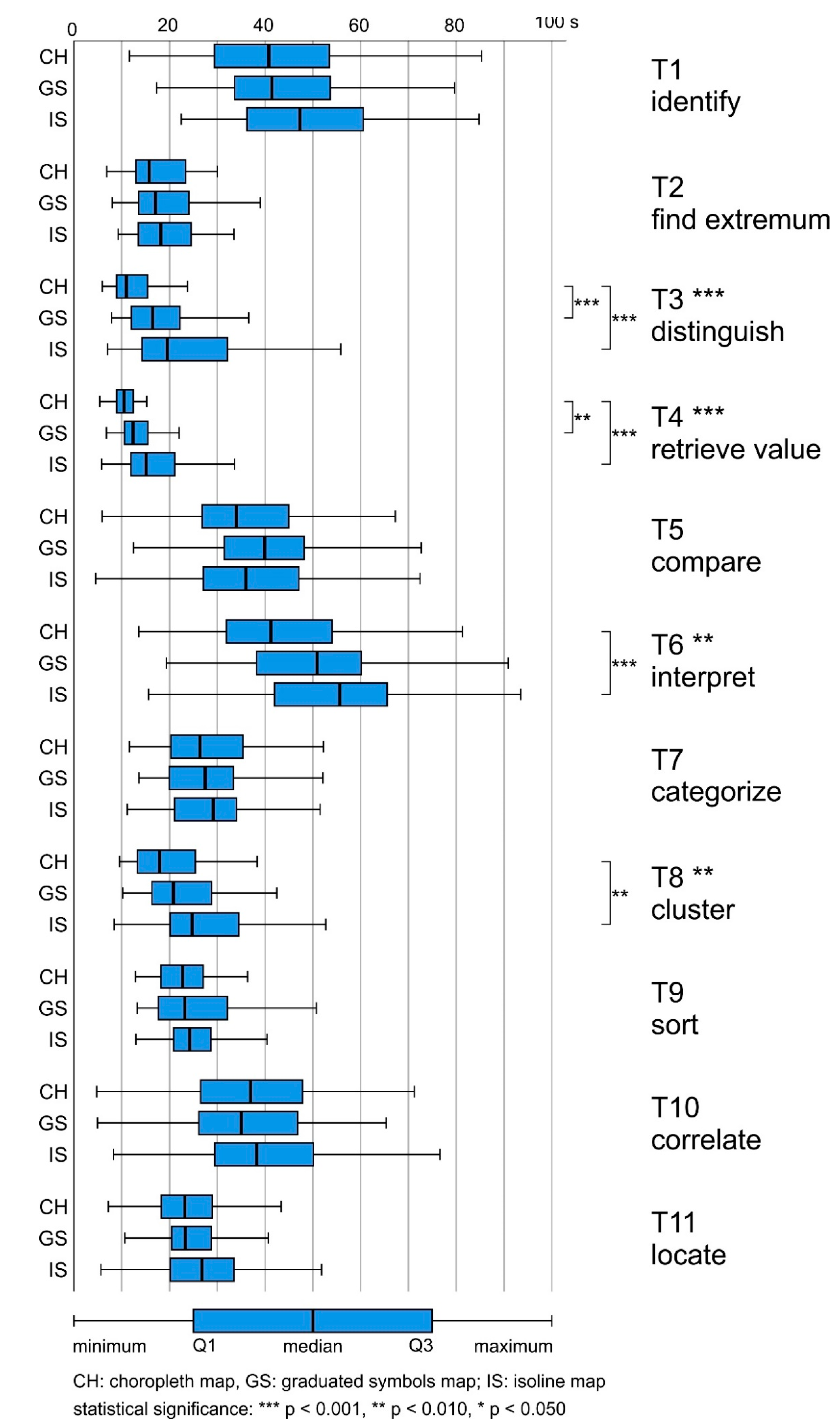
4.2. Answer Time
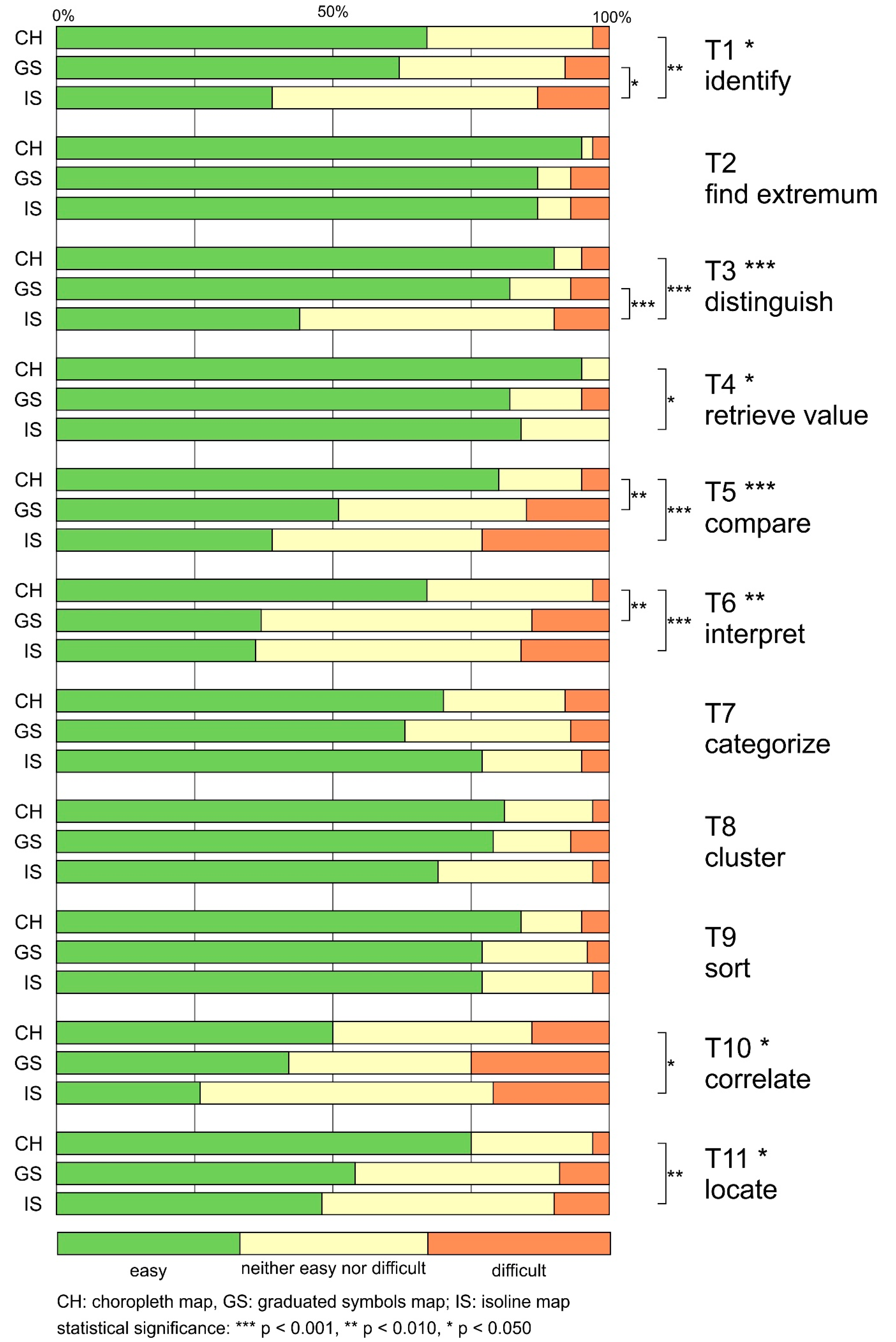
4.3. The Difficulty of the Task
- CH-GS X2 (2, N = 1579) = 30.420, p = 0.000, Cramér’s V = 0.139, p = 0.000 (with statistically significant lower difficulty of the choropleth map)
- CH-IS X2 (2, N = 1611) = 73.283, p = 0.000, Cramér’s V = 0.213, p = 0.000 (with statistically significant lower difficulty of the choropleth map)
- GS-IS X2 (2, N = 1568) = 13.595 p = 0.001, Cramér’s V = 0.093, p = 0.001 (with statistically significant lower difficulty of the graduated symbols map).
5. Discussion
- RQ1: Do different map types, presenting the same input data, facilitate users’ performance of various map use tasks equally?
- H1: Users differ in terms of performance when using informationally equivalent but differently designed thematic maps for various tasks.
- RQ2: Do users perceive more commonly applied map types as easier to use than map types encountered less frequently?
- H2: Map users perceive the most commonly applied map types as the easiest ones.
- RQ3: Does the subjective rating of the difficulty of tasks provided by users of different map types match the other performance metrics?
- H3: The subjective metric of difficulty mismatch the usability performance metrics of answer accuracy and answer time.
6. Conclusions
Supplementary Materials
Author Contributions
Funding
Institutional Review Board Statement
Informed Consent Statement
Data Availability Statement
Acknowledgments
Conflicts of Interest
References
- Robinson, A.H.; Morrison, J.L.; Muehrcke, P.C.; Kimerling, A.J.; Guptill, S.C. Elements of Cartography, 6th ed.; John Wiley & Sons: New York, NY, USA, 1995; ISBN 0-471-55579-7. [Google Scholar]
- Dent, B.D.; Torguson, J.S.; Hodler, T.W. Cartography, 6th ed.; McGraw-Hill Higher Education: Boston, MA, USA, 2009; ISBN 978-0-07-294382-5. [Google Scholar]
- Slocum, T.A. Thematic Cartography and Geovisualization, 3rd ed.; Prentice Hall Series in Geographic Information Science; Pearson Prentice Hall: Upper Saddle River, NJ, USA, 2010; ISBN 978-0-13-229834-6. [Google Scholar]
- Tyner, J.A. Principles of Map Design; Guilford Press: New York, NY, USA, 2010; ISBN 1-60623-544-3. [Google Scholar]
- Bertin, J. Semiology of Graphics, 1st ed.; ESRI Press: Redlands, CA, USA, 2010; ISBN 978-1-58948-261-6. [Google Scholar]
- MacEachren, A.M. How Maps Work; Guilford Press: New York, NY, USA, 1995; ISBN 0-89862-589-0. [Google Scholar]
- Hegarty, M. Cognition, Metacognition, and the Design of Maps. Curr. Dir. Psychol. Sci. 2013, 22, 3–9. [Google Scholar] [CrossRef]
- Havelková, L.; Hanus, M. The Impact of Map Type on the Level of Student Map Skills. Cartogr. Int. J. Geogr. Inf. Geovisualization 2018, 53, 149–170. [Google Scholar] [CrossRef]
- Larkin, J.H.; Simon, H.A. Why a Diagram Is (Sometimes) Worth Ten Thousand Words. Cogn. Sci. 1987, 11, 65–100. [Google Scholar] [CrossRef]
- Çöltekin, A.; Heil, B.; Garlandini, S.; Fabrikant, S.I. Evaluating the Effectiveness of Interactive Map Interface Designs: A Case Study Integrating Usability Metrics with Eye-Movement Analysis. Cartogr. Geogr. Inf. Sci. 2009, 36, 5–17. [Google Scholar] [CrossRef]
- Fabrikant, S.I.; Rebich-Hespanha, S.; Hegarty, M. Cognitively Inspired and Perceptually Salient Graphic Displays for Efficient Spatial Inference Making. Ann. Assoc. Am. Geogr. 2010, 100, 13–29. [Google Scholar] [CrossRef]
- Schnürer, R.; Ritzi, M.; Çöltekin, A.; Sieber, R. An Empirical Evaluation of Three-Dimensional Pie Charts with Individually Extruded Sectors in a Geovisualization Context. Inf. Vis. 2020, 19, 183–206. [Google Scholar] [CrossRef]
- Nusrat, S.; Alam, M.J.; Kobourov, S. Evaluating Cartogram Effectiveness. IEEE Trans. Vis. Comput. Graph. 2018, 24, 1077–1090. [Google Scholar] [CrossRef] [PubMed] [Green Version]
- Wielebski, Ł.; Medyńska-Gulij, B. Graphically Supported Evaluation of Mapping Techniques Used in Presenting Spatial Accessibility. Cartogr. Geogr. Inf. Sci. 2019, 46, 311–333. [Google Scholar] [CrossRef]
- Cybulski, P. Spatial Distance and Cartographic Background Complexity in Graduated Point Symbol Map-Reading Task. Cartogr. Geogr. Inf. Sci. 2020, 47, 244–260. [Google Scholar] [CrossRef]
- Dong, W.; Wang, S.; Chen, Y.; Meng, L. Using Eye Tracking to Evaluate the Usability of Flow Maps. ISPRS Int. J. Geo Inf. 2018, 7, 281. [Google Scholar] [CrossRef] [Green Version]
- Beitlova, M.; Popelka, S.; Vozenilek, V. Differences in Thematic Map Reading by Students and Their Geography Teacher. ISPRS Int. J. Geo Inf. 2020, 9, 492. [Google Scholar] [CrossRef]
- Roth, R.E.; Kelly, M.; Underwood, N.; Lally, N.; Vincent, K.; Sack, C. Interactive & Multiscale Thematic Maps: A Preliminary Study. Abstr. Int. Cartogr. Assoc. 2019, 1. [Google Scholar] [CrossRef] [Green Version]
- Roth, R.E.; Kelly, M.; Underwood, N.; Lally, N.; Liu, X.; Vincent, K.; Sack, C. Interactive & Multiscale Thematic Maps: Preliminary Results from an Empirical Study. Abstr. Int. Cartogr. Assoc. 2020, 1, 135. [Google Scholar]
- Roberts, J.C. State of the Art: Coordinated & Multiple Views in Exploratory Visualization; Andrienko, G., Roberts, J., Weaver, C., Eds.; IEEE Computer Society: Los Alamitos, CA, USA, 2007; pp. 61–71. [Google Scholar]
- Golebiowska, I.; Opach, T.; Rød, J.K. For Your Eyes Only? Evaluating a Coordinated and Multiple Views Tool with a Map, a Parallel Coordinated Plot and a Table Using an Eye-Tracking Approach. Int. J. Geogr. Inf. Sci. 2017, 31, 237–252. [Google Scholar] [CrossRef] [Green Version]
- Koua, E.L.; Maceachren, A.; Kraak, M.-J. Evaluating the Usability of Visualization Methods in an Exploratory Geovisualization Environment. Int. J. Geogr. Inf. Sci. 2006, 20, 425–448. [Google Scholar] [CrossRef]
- Edsall, R.M. Design and Usability of an Enhanced Geographic Information System for Exploration of Multivariate Health Statistics. Prof. Geogr. 2003, 55, 146–160. [Google Scholar]
- Hegarty, M.; Smallman, H.S.; Stull, A.T.; Canham, M.S. Naïve Cartography: How Intuitions about Display Configuration Can Hurt Performance. Cartogr. Int. J. Geogr. Inf. Geovisualization 2009, 44, 171–186. [Google Scholar] [CrossRef]
- Smallman, H.S.; John, M.S. Naive Realism: Misplaced Faith in Realistic Displays. Ergon. Des. 2005, 13, 6–13. [Google Scholar] [CrossRef]
- Pickle, L.W.; Herrmann, D.J.; Wilson, B.F. A Legendary Study of Statistical Map Reading: The Cognitive Effectiveness of Statistical Map Legends. In Cognitive Aspects of Statistical Mapping; Pickle, L.W., Herrmann, D.J., Eds.; National Centre for Health Statistics: Hyattsville, MD, USA, 1995; pp. 233–248. [Google Scholar]
- Gołębiowska, I. Legend Layouts for Thematic Maps. Cartogr. J. 2015, 52, 28–40. [Google Scholar] [CrossRef]
- Petchenik, B.B. A map maker’s perspective on map design research 1950–1980. In Graphic Communication and Design in Contemporary Cartography; Taylor, D.R.F., Ed.; Progress in Contemporary Cartography; John Wiley & Sons: Chichester, UK, 1983; pp. 37–68. ISBN 0-471-10316-0. [Google Scholar]
- Smallman, H.S.; Hegarty, M. Expertise, Spatial Ability and Intuition in the Use of Complex Visual Displays. In Proceedings of the Human Factors and Ergonomics Society Annual Meeting; SAGE Publications: Los Angeles, CA, USA, 2007; Volume 51, pp. 200–204. [Google Scholar] [CrossRef]
- Mendonça, A.L.A.; Delazari, L.S. What do People prefer and What is more effective for Maps: A Decision making Test. In Advances in Cartography and GIScience; Ruas, A., Ed.; Lecture Notes in Geoinformation and Cartography; Springer Berlin Heidelberg: Berlin/Heidelberg, Germany, 2011; Volume 29, pp. 163–181. ISBN 978-3-642-19142-8. [Google Scholar]
- Mendonça, A.; Delazari, L. Testing Subjective Preference and Map Use Performance: Use of Web Maps for Decision Making in the Public Health Sector. Cartogr. Int. J. Geogr. Inf. Geovisualization 2014, 49, 114–126. [Google Scholar] [CrossRef]
- Andrienko, N.; Andrienko, G.; Voss, H.; Bernardo, F.; Hipolito, J.; Kretchmer, U. Testing the Usability of Interactive Maps in CommonGIS. Cartogr. Geogr. Inf. Sci. 2002, 29, 325–342. [Google Scholar] [CrossRef]
- Korycka-Skorupa, J.; Gołębiowska, I. Numbers on Thematic Maps: Helpful Simplicity or Too Raw to Be Useful for Map Reading? ISPRS Int. J. Geo Inf. 2020, 9, 415. [Google Scholar] [CrossRef]
- Çöltekin, A.; Biland, J. Comparing the Terrain Reversal Effect in Satellite Images and in Shaded Relief Maps: An Examination of the Effects of Color and Texture on 3D Shape Perception from Shading. Int. J. Digit. Earth 2019, 12, 442–459. [Google Scholar] [CrossRef]
- Cybulski, P.; Wielebski, Ł. Effectiveness of Dynamic Point Symbols in Quantitative Mapping. Cartogr. J. 2019, 56, 146–160. [Google Scholar] [CrossRef]
- OpenStreetMap OpenStreetMap. Available online: https://www.openstreetmap.org/ (accessed on 7 December 2020).
- Główny Urząd Geodezji i Kartografii Geoportal Infrastruktury Informacji Przestrzennej. Available online: http://www.gugik.gov.pl/ (accessed on 7 December 2020).
- Statistics Poland—Local Data Bank. Available online: https://bdl.stat.gov.pl/BDL/start (accessed on 7 December 2020).
- Roth, R.E. Cartographic Interaction Primitives: Framework and Synthesis. Cartogr. J. 2012, 49, 376–395. [Google Scholar] [CrossRef]
- Foster, M. Statistical Mapping (Enumeration, Normalization, Classification). In The Geographic Information Science & Technology Body of Knowledge, 2nd ed.; Wilson, J.P., Ed.; 2019; Available online: https://gistbok.ucgis.org/bok-topics/statistical-mapping-enumeration-normalization-classification (accessed on 7 December 2020). [CrossRef]


| Group | Task Type | Task | Available Answers |
|---|---|---|---|
| 1 | T1 identify | Select the sentence that correctly describes area A. | a. It is located in the east of the presented area. b. It is one of the two areas with the lowest index value. c. There are over 6 discount stores per 100,000 people. d. There are 3 discount stores per 100,000 people. |
| T2 find extremum | From among the areas labelled with letters, indicate the one with the smallest number of supermarkets per 100,000 people. | A B C D | |
| T3 distinguish | Select the area that does not match the others in terms of the index value. | A B C D | |
| T4 retrieve value | How many discount stores per 100,000 people are located in area A? | a. 0.6–1.0 b. 1.1–2.0 c. 4.1–6.0 d. 6.1–8.0 | |
| T5 compare | Pick the sentence that correctly describes the areas where there are from 6.1 to 9.0 stalls per 100,000 people. | a. All these areas are north of the black line. b. More than half of these areas are south of the black line. c. All these areas are south of the black line. d. More than half of these areas lie to the north of the black line. | |
| 2 | T6 interpret | Cities are marked with black squares on the map. Select the correct sentence. | a. Cities are located in the three areas where the index has the highest values. b. Areas with cities are adjacent only to areas with lower index values. c. In areas with cities, the index ranges from 12.1 to 14.0. d. All areas with cities are located in the east of the analyzed area. |
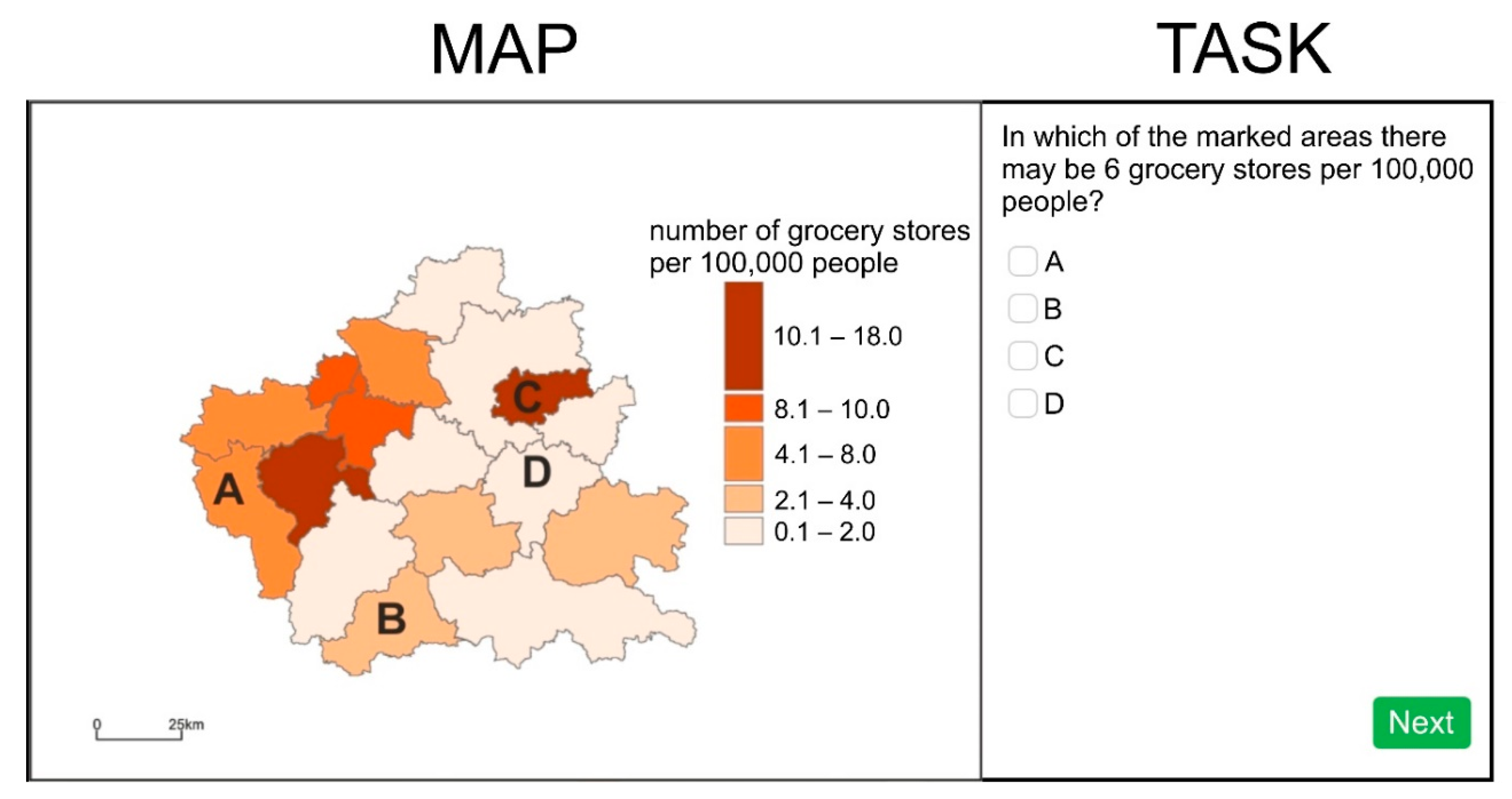
| T7 categorize | In which of the marked areas are there 6 grocery stores per 100,000 people? | A B C D | |
| T8 cluster | From among the marked areas, select two with an index value included in the same class. | a. C and B b. B and D c. A and C d. A and B | |
| T9 sort | Order the areas from the lowest to the highest value of the index. | (open-ended) | |
| T10 correlate | Indicate the sentence that correctly describes the relationship between the selected areas. | a. In areas A and B the index belongs to other classes from the legend. b. Areas A and B are located in the central part of the analyzed area. c. In one of the areas, A or B, the index shows the lowest value. d. Areas A and B are located in the south-western part of the analyzed area. | |
| T11 locate | Identify the sentence that correctly describes the location of the areas where the index has the highest value. | a. They are located on the border of the analyzed area. b. They are adjacent to each other. c. They are located in the central part of the analyzed area. d. They are located in the south of the analyzed area. |
| Map Type | Group 1 | Group 2 | ||
|---|---|---|---|---|
| Number of People | % | Number of People | % | |
| choropleth map | 61 | 33 | 64 | 35 |
| graduated symbols map | 61 | 33 | 57 | 31 |
| isoline map | 62 | 34 | 61 | 34 |
| total | 184 | 100.0 | 182 | 100.0 |
| Task | Chi-Square | p | Cramér’s V | p | Pairwise Comparison | Chi-Square | p | Cramér’s V | p |
|---|---|---|---|---|---|---|---|---|---|
| T1 identify | 16.628 | 0.000 | 0.301 | 0.000 | CH-GS | 0.957 | 0.328 | 0.089 | 0.328 |
| CH-IS | 13.989 | 0.000 | 0.337 | 0.000 | |||||
| GS-IS | 8.095 | 0.004 | 0.257 | 0.004 | |||||
| T2 find extremum | 5.685 | 0.058 | 0.176 | 0.058 | - | ||||
| T3 distinguish | 97.855 | 0.000 | 0.729 | 0.000 | CH-GS | 1.034 | 0.309 | 0.092 | 0.309 |
| CH-IS | 63.700 | 0.000 | 0.720 | 0.000 | |||||
| GS-IS | 58.814 | 0.000 | 0.680 | 0.000 | |||||
| T4 retrieve value | 1.592 | 0.451 | 0.093 | 0.451 | - | ||||
| T5 compare | 4.404 | 0.111 | 0.155 | 0.111 | - | ||||
| T6 interpret | 14.124 | 0.001 | 0.279 | 0.001 | CH-GS | 4.109 | 0.043 | 0.184 | 0.043 |
| CH-IS | 14.068 | 0.000 | 0.335 | 0.000 | |||||
| GS-IS | 3.085 | 0.079 | 0.162 | 0.079 | |||||
| T7 categorize | 0.943 | 0.624 | 0.072 | 0.624 | - | ||||
| T8 cluster | 0.021 | 0.989 | 0.011 | 0.989 | - | ||||
| T9 sort | 13.168 | 0.001 | 0.269 | 0.001 | CH-GS | 12.272 | 0.000 | 0.318 | 0.000 |
| CH-IS | 1.735 | 0.188 | 0.118 | 0.188 | |||||
| GS-IS | 5.038 | 0.025 | 0.207 | 0.025 | |||||
| T10 correlate | 12.489 | 0.002 | 0.262 | 0.002 | CH-GS | 11.070 | 0.001 | 0.302 | 0.001 |
| CH-IS | 8.081 | 0.004 | 0.254 | 0.004 | |||||
| GS-IS | 0.292 | 0.589 | 0.050 | 0.589 | |||||
| T11 locate | 4.431 | 0.109 | 0.156 | 0.109 | - | ||||
| Task | Kruskal–Wallis H | p | Map Type | M (s) | SD | Post Hoc Groups | Bonferroni Post Hoc | p |
|---|---|---|---|---|---|---|---|---|
| T1 identify | 3.796 | 0.150 | CH | 45.5 | 2.95 | - | ||
| GS | 44.7 | 2.25 | ||||||
| IS | 50.8 | 2.71 | ||||||
| T2 find extremum | 1.361 | 0.506 | CH | 18.6 | 1.10 | - | ||
| GS | 21.4 | 1.58 | ||||||
| IS | 21.6 | 1.73 | ||||||
| T3 distinguish | 34.241 | 0.000 | CH | 14.6 | 1.36 | CH-GS | 35.754 | 0.001 |
| GS | 18.9 | 1.28 | CH-IS | 55.485 | 0.000 | |||
| IS | 23.9 | 1.63 | GS-IS | 19.731 | 0.120 | |||
| T4 retrieve value | 34.047 | 0.000 | CH | 10.9 | 0.42 | CH-GS | 33.115 | 0.002 |
| GS | 13.7 | 0.61 | CH-IS | 55.764 | 0.000 | |||
| IS | 16.6 | 0.86 | GS-IS | 22.631 | 0.055 | |||
| T5 compare | 4.194 | 0.123 | CH | 37.8 | 2.14 | - | ||
| GS | 40.9 | 1.74 | ||||||
| IS | 39.1 | 2.47 | ||||||
| T6 interpret | 12.512 | 0.002 | CH | 45.0 | 2.51 | CH-GS | 19.492 | 0.127 |
| GS | 51.6 | 2.74 | CH-IS | 33.137 | 0.001 | |||
| IS | 57.7 | 3.23 | GS-IS | 13.646 | 0.479 | |||
| T7 categorize | 0.804 | 0.669 | CH | 29.0 | 1.40 | - | ||
| GS | 29.0 | 1.78 | ||||||
| IS | 29.3 | 1.32 | ||||||
| T8 cluster | 9.975 | 0.007 | CH | 22.0 | 1.47 | CH-GS | 10.061 | 0.883 |
| GS | 23.0 | 1.23 | CH-IS | 29.385 | 0.005 | |||
| IS | 28.6 | 1.96 | GS-IS | 19.324 | 0.139 | |||
| T9 sort | 1.455 | 0.483 | CH | 24.5 | 1.09 | - | ||
| GS | 25.7 | 1.23 | ||||||
| IS | 25.2 | 0.87 | ||||||
| T10 correlate | 1.338 | 0.512 | CH | 39.3 | 2.23 | - | ||
| GS | 37.3 | 1.99 | ||||||
| IS | 41.0 | 2.21 | ||||||
| T11 locate | 3.176 | 0.204 | CH | 24.6 | 1.31 | - | ||
| GS | 26.2 | 1.63 | ||||||
| IS | 28.0 | 1.51 | ||||||
| Task | chi-Square | p | CRAMÉR’S V | p | Pairwise Comparison | Chi-Square | p | Cramér’s V | p |
|---|---|---|---|---|---|---|---|---|---|
| T1 identify | 12.629 | 0.013 | 0.186 | 0.013 | CH-GS | 1.400 | 0.497 | 0.107 | 0.497 |
| CH-IS | 11.039 | 0.004 | 0.300 | 0.004 | |||||
| GS-IS | 6.846 | 0.033 | 0.236 | 0.033 | |||||
| T2 find extremum | 3.053 | 0.549 | 0.091 | 0.549 | - | ||||
| T3 distinguish | 41.146 | 0.000 | 0.334 | 0.000 | CH-GS | 1.981 | 0.371 | 0.127 | 0.371 |
| CH-IS | 31.680 | 0.000 | 0.508 | 0.000 | |||||
| GS-IS | 20.708 | 0.000 | 0.410 | 0.000 | |||||
| T4 retrieve value | 10.373 | 0.035 | 0.168 | 0.035 | CH-GS | 5.865 | 0.053 | 0.219 | 0.053 |
| CH-IS | 4.089 | 0.043 | 0.182 | 0.043 | |||||
| GS-IS | 3.254 | 0.197 | 0.163 | 0.197 | |||||
| T5 compare | 23.575 | 0.000 | 0.253 | 0.000 | CH-GS | 11.850 | 0.003 | 0.312 | 0.003 |
| CH-IS | 22.491 | 0.000 | 0.482 | 0.000 | |||||
| GS-IS | 2.170 | 0.338 | 0.133 | 0.338 | |||||
| T6 interpret | 17.472 | 0.002 | 0.219 | 0.002 | CH-GS | 12.523 | 0.002 | 0.322 | 0.002 |
| CH-IS | 14.137 | 0.001 | 0.336 | 0.001 | |||||
| GS-IS | 0.128 | 0.938 | 0.033 | 0.938 | |||||
| T7 categorize | 3.065 | 0.547 | 0.092 | 0.547 | - | ||||
| T8 cluster | 5.600 | 0.231 | 0.124 | 0.231 | - | ||||
| T9 sort | 2.305 | 0.680 | 0.080 | 0.680 | - | ||||
| T10 correlate | 9.578 | 0.048 | 0.162 | 0.048 | CH-GS | 2.213 | 0.331 | 0.135 | 0.331 |
| CH-IS | 7.466 | 0.024 | 0.244 | 0.024 | |||||
| GS-IS | 4.821 | 0.090 | 0.202 | 0.090 | |||||
| T11 locate | 10.875 | 0.028 | 0.173 | 0.028 | CH-GS | 5.959 | 0.051 | 0.222 | 0.051 |
| CH-IS | 10.222 | 0.006 | 0.286 | 0.006 | |||||
| GS-IS | 0.555 | 0.758 | 0.069 | 0.758 | |||||
Publisher’s Note: MDPI stays neutral with regard to jurisdictional claims in published maps and institutional affiliations. |
© 2021 by the authors. Licensee MDPI, Basel, Switzerland. This article is an open access article distributed under the terms and conditions of the Creative Commons Attribution (CC BY) license (http://creativecommons.org/licenses/by/4.0/).
Share and Cite
Słomska-Przech, K.; Gołębiowska, I.M. Do Different Map Types Support Map Reading Equally? Comparing Choropleth, Graduated Symbols, and Isoline Maps for Map Use Tasks. ISPRS Int. J. Geo-Inf. 2021, 10, 69. https://doi.org/10.3390/ijgi10020069
Słomska-Przech K, Gołębiowska IM. Do Different Map Types Support Map Reading Equally? Comparing Choropleth, Graduated Symbols, and Isoline Maps for Map Use Tasks. ISPRS International Journal of Geo-Information. 2021; 10(2):69. https://doi.org/10.3390/ijgi10020069
Chicago/Turabian StyleSłomska-Przech, Katarzyna, and Izabela Małgorzata Gołębiowska. 2021. "Do Different Map Types Support Map Reading Equally? Comparing Choropleth, Graduated Symbols, and Isoline Maps for Map Use Tasks" ISPRS International Journal of Geo-Information 10, no. 2: 69. https://doi.org/10.3390/ijgi10020069