
Studying the Utilization of a Map-Based Visualization with Vitality Datasets by Domain Experts


1
Department of Industrial Design, Eindhoven University of Technology, 5600 MB Eindhoven, The Netherlands
2
Institute of Computer Graphics, Johannes Kepler University Linz, 4040 Linz, Austria
3
School of Sport Studies, Fontys University of Applied Sciences, 5644 HZ Eindhoven, The Netherlands
*
Author to whom correspondence should be addressed.
Geographies 2022, 2(3), 379-396; https://doi.org/10.3390/geographies2030024
Submission received: 16 May 2022
/
Revised: 15 June 2022
/
Accepted: 27 June 2022
/
Published: 30 June 2022
(This article belongs to the Special Issue Geovisualization: Current Trends, Challenges, and Applications)
Abstract
:With the rapid growth of information technology and geographic information science, many map-based visualization applications for decision-making have been proposed. These applications are used in various contexts. Our study provides empirical evidence of how domain experts utilize map-based data visualization for generating insights into vitality with respect to health-related concepts. We conducted a study to understand domain experts’ knowledge, approach, and experience. Nine domain experts participated in the study, with three experts each from the fields of government, business, and research. The study followed a mixed-methods approach involving an online survey, open-ended tasks, and semi-structured interviews. For this purpose, a map-based data visualization application containing various vitality-related datasets was developed for the open-ended tasks. Our study confirms the importance of maps in this domain but also shows that vitality is strongly geographical. Furthermore, we found that map-based visualizations require multiple data sources and dimensions to enhance the utilization of them in the context of vitality. Therefore, our study suggests the necessity of a combination of multiple datasets as ‘vitality themes’ to efficiently communicate this particular subject to experts. As such, our results provide guidelines for designing map-based data visualizations that support the decision-making process across various domain experts in the field of vitality.
1. Introduction
Visualizations offer great potential for uncovering information in data and efficiently communicating complex quantitative information [1,2]. Offering cognitive support for understanding a large amount of information [1,3], visualizations are increasingly used to assist in decision-making processes [4]. As such, information visualization is used to solve real-world problems in a variety of different formats [5], such as defining sources of contamination [6], reducing crime [7], and improving pedestrian safety [8]. These real-world problems are often complicated due to the various data sources and people involved [5]. Consequently, it remains challenging to make visualization applications useful to such diverse audiences [9]. Another challenge is that a majority of the data available today contain geographic references, such as geographic coordinates and postal addresses, which brings diverse information but also complexity [10]. Therefore, the consideration of spatial data is important in visualization. Geographic visualizations (“geovisualizations” for short) have the potential to represent such complicated data, including location attributes [10].
There is also an increasing interest in human factors in visualization research [3]. Tory and Möller [3] indicate several human–computer-interaction (HCI) methods for designing and evaluating visualization systems such as User- and Task-Based Design, Perception- and Cognition-Based Design, and User-Centered Design. Among those HCI methods, our study considers “User- and Task-Based Design” to address users’ preferences, knowledge, experience, and processes in a map-based data visualization containing various vitality datasets through qualitative research. We use a map as the format of information visualization in this study, considering its accessibility for both technical and non-technical users, as discussed by several open-data studies, such as [11,12].
1.1. Aim of This Study
This study is a part of an ongoing project to promote vitality (e.g., physical health, mental health, and social cohesion) among urban citizens. Different domains, such as health and physical activity research, have covered the concept of vitality [13]. In the domain of industrial design, there is an increased interest in data-enabled applications using users’ behavioral data to improve people’s vitality [14]. In the field of geography, Sui [15] discussed the importance of Geographic Information Systems (GISs) in public health, and vice versa. In our case, we are specifically interested in how a map-based data visualization similar to a GIS conveys information about vitality, which constitutes a multi-dimensionality construct [16] for different domain experts. GIS utilizes multiple datasets from different sources yet communicates subject matters effectively [17]. Furthermore, Public Participation Geographic Information Systems (PPGISs) have targeted a variety of stakeholders [17], an aspect in line with the purpose of our study.
Given these backgrounds, our main research question for this study is “How does a map-based visualization containing various vitality data support the visual analysis process among different domain experts?” To answer this question, we investigated the following user-related points:
- Insight generation and approach of visual analysis by users;
- Relationship between the selection of vitality datasets and participants’ expertise;
- Amount, details, and kinds of data preferred;
- Preference and impression;
- Applicability of this type of visualization to domain experts’ projects in practice.
The goal of our study explores how domain experts utilize vitality-related datasets on a map-based data visualization. This study crosses different topics such as vitality, geovisualization, and human factors. Therefore, in the following subsection, we discuss related work by separating it into three subsections: vitality, map-based data visualization, and qualitative research in visualization.
1.2. Vitality
Vitality has its origins in vitalism: that living things have a life force to construct their organic processes [18]. With the advancement of science during the 19th century [13], the concept of vitalism became obsolete. However, in recent years, vitalism has once again garnered interest in many domains, such as in the humanities and social sciences [18]. Van Steenbergen et al. [19] define the three aspects of vitality as “energy”, “motivation”, and “resilience”. In a study to differentiate vitality, well-being, and quality of life, Guérin [20] defines vitality as a “psychological sense of aliveness, enthusiasm, or energy”. Several other articles discuss the phenomenological perspective of vitality, which individuals experience through their bodies [13,20,21]. Considering the aspect of phenomenology, physical activity is one of the key factors in vitality. According to the World Health Organization Global Observatory Data Repository 2011, about one-third of adults do not reach sufficient physical activity levels [22]. Physical inactivity can cause health disorders such as non-communicable diseases [23] and affect health-related quality of life [24]. Given this, there is growing interest in active and healthy lifestyles and vitality [25].
Not only physical activity but also the meaning of vitality can vary. Van Steenbergen et al. [19] discuss the mental aspects of vitality such as emotional well-being, in addition to physical aspects. Our previous study reported on the multi-dimensionality of vitality, which is perceived differently by individuals, including factors such as stamina, activeness, health, happiness, and social status [16]. This finding is in line with results from other studies that addressed (a) the multifactorial nature and the individuality of vitality [19,21] and (b) the influence of social contexts on vitality [19,26].
Furthermore, there is the concept of urban vitality, which considers how urban environments attract people and invite them to visit places in the city [27]. Urban vitality can be realized by many factors, such as the use of public green spaces [28] and walkability [29]. The study by Marquet and Miralles-Guasch [29] found that walkable environments increase physical activity levels among the elderly and that urban vitality is one important factor to promote public health. Including the case of urban vitality, the term vitality can be found in many diverse domains such as health sciences (including physiology and psychology), agriculture, and organizational studies [30]. Among those various aspects of vitality, we use vitality as a health-related concept, considering various data which could influence people’s health (e.g., sports participation, mental health, green space, and alcohol consumption).
1.3. Map-Based Data Visualization
The usage of maps has a long history. The earliest forms of data visualization include geometric diagrams of tables and maps found in the 10th century [31]. Maps are used not only by researchers and experts but also by individuals for their daily lives, as maps require minimum visualization literacy to understand the information on them, such as the distribution of events, phenomena, and objects [32]. Additionally, one of the other several benefits regarding the function of maps is problem-solving [32]. A remarkable example of this in history is a map created by Dr. John Snow in 1855, which successfully demonstrated the source of a cholera outbreak in the Broad Street area of London [6]. As such, modern computer-based geovisualizations are based on cartographic knowledge and techniques [33]. This study aims to promote vitality in a city through a map-based data visualization, which can be utilized by multiple parties such as government, business, and researchers. We explore those studies addressing urban issues using maps in the following section.
First, we reviewed several articles from the field of PPGIS. PPGIS uses GIS for policymaking by involving various parties, such as non-governmental organizations and local agencies. Policy-related information is visualized in map formats in a manner easy to consume, regardless of the volume and disparate sources of data [17]. Kahila-Tani et al. [34] conducted a study to analyze over 200 real-life planning cases that use PPGIS in multiple countries to investigate their outcomes in terms of public participation and societal and environmental benefits. Their study indicated several benefits and drawbacks of the use of PPGIS methodologies. Regardless of the aforementioned advantages of the maps, Kahila-Tani et al. [34] found the digital divide and technical challenges to be drawbacks. Importantly, those authors also discussed the context dependency of PPGIS; context influenced the benefits and drawbacks of PPGIS on a case by case basis. The study by Bugs [35] assessed the available online PPGIS tools and concluded that there is a limitation of these tools due to the usage gap between non-expert users (such as citizens) and expert users (such as planners). A study to evaluate a PPGIS tool was conducted by Rinner and Bird [36] through a case study with a citizens’ association in downtown Toronto, Canada, to understand their technical and engagement experience. The results showed the technical difficulties in using the PPGIS tool among users and the necessity of context for enhancing the engagement.
The studies mentioned above also recommend further studies to understand the usability of PPGIS among different types of users, considering the contexts. In terms of context, Gebre and Morales [37] highlight the importance of technical and social context for analyzing and understanding data. The San Francisco Municipal Transportation Agency developed a map-based data visualization system called TransBASE [8] to support identifying context-specific trends and evaluating pedestrian collision events for pedestrian safety improvement [38]. Crime mappings are another classic example of maps developed for a specific context and aimed to solve a specific social problem [7]. Psyllidis et al. [39] developed a platform called Social Glass, which focuses on the utilization of social data—data generated through users’ social contexts such as social networks, for urban planning and decision making. Sui and Holt [40] used health-related data, such as the percentage of obese adults in the United States, to investigate the cognitive and analytical aspects of cartograms to study their effectiveness in the context of public health.
Several aforementioned studies include evaluations of their application through user studies and interviews. Yet, evaluations in visualization research are still limited compared with the research in the field of human –computer interaction (HCI) [41]. Additionally, case-by-case evaluations may be required as visualizations are context-specific. The requirements and use of those visualizations by users likely differ depending on context, as addressed by Kahila-Tani et al. [34]. Therefore, we echo the necessity of evaluations of map-based visualization applications, especially through qualitative approaches such as performed by Brewer et al. [34] and Yang and Goodwin [42,43]. As such, we apply qualitative approaches in our study to holistically capture the contexts behind users’ analysis of visualizations [44]. In the following, we discuss qualitative research in visualization more closely.
1.4. Human-Centered Visualization
The evaluation of visualizations remains challenging [41,45]. Some scholars discuss these challenges because visualizations are used outside of laboratory environments and utilized by practitioners [9]. Visualizations are applied in the real world environment to support the decision-making process among a variety of users [5]. It is considered that high-level cognitive activities occur when users interact with visualizations [41]. Additionally, users in the real world have different backgrounds, which makes it difficult to design proper quantitative metrics in addition to performance indicators such as completion time and error [41]. Considering those factors for the evaluations of visualization, we mainly focus on a qualitative approach for our visualization study—i.e., interview studies with domain experts. Such interview studies with domain experts are common in visualization research, e.g., [42,43,46,47]. However, those studies are conducted with different visualization outputs, such as Geographically-Embedded Flow Data [43] (e.g., spatial movement data displayed in the context of a map) and Collaborative Geographic Visualization, which allows multiple users to manipulate visualizations simultaneously as well as to communicate among them [42]. Additionally, these studies used different methodologies to analyze data, such as card sorting [47] and the “what-why-how” framework [43].
In cartography including the field of PPGIS and geovisualization, the importance of a human-centered approach has been discussed by scholars such as Roth et al. [48], Haklay and Tobón [49], and Lloyd and Dykes [50]. Considering the usefulness of qualitative studies for the evaluation of user-centered systems [51], several studies, including the one by Lloyd and Dykes [50], implemented interviews to evaluate geovisualizations and PPGIS systems. Suchan [52] conducted an interview study with experts to explore what types of data and tools they currently use and the requirements for geovisualization tools to support their work. The study by Bąkowska-Waldmann and Kaczmarek [53] involved in-depth interviews with local authorities and officials and the analysis of planning documents to investigate the role of PPGIS tools in the decision-making process. Lloyd and Dykes [50] conducted a series of studies following the ISO standard 13407 [54] for the human-centered design process to design geovisualization applications. Their studies were designed to understand use and requirements and to evaluate prototypes by using a variety of methods including qualitative studies such as interviews and observations at experts’ workplaces.
Among the related studies, the following two studies are closest to ours. First, our study is in a similar stage as the one by Brewer et al. [42], who conducted a user task analysis to define guidelines for their future design of collaborative geographic visualization. However, our study differs from their study in that we are less focused on collaboration and more focused on the different requirements of domain experts in the specific context of vitality. Second, although our study is not as extensive as the study by Lloyd and Dykes [50], our study also aims (1) to understand the context of use and the requirements regarding a map-based visualization application in experts’ real work environments and (2) to evaluate the map-based visualization application through user studies by using a prototype for further development. In the following section, we discuss the materials and methods of our study.
2. Materials and Methods
Our study investigates how diverse domain experts utilize a map-based visualization containing various vitality-related data to analyze and generate insights. To address this research question, we conducted a mixed-methods study involving an online survey, open-ended tasks, and semi-structured interviews with nine domain experts from the fields of government, business, and research.
2.1. Material
A map-based data visualization application (shown in Figure 1), containing various vitality-related datasets, was developed for open-ended tasks conducted by domain experts (see Supplementary Materials). This application was built by the first author in Eindhoven, The Netherlands using the web application framework Angular (version 11.2.12) [55] with the integration of JavaScript libraries D3 (version 6) [56] and Leaflet (version 1.7.1) [56], which support the creation of interactive maps for web applications.
In our previous study [16], we established the potential of data visualization to support domain experts’ analysis on a data platform, as other open-data researchers such as [11,12] have discussed. Moreover, our focus is specifically on a map-based data visualization in this study. The advantages of maps have been addressed by the aforementioned open-data researchers, with the consideration of users with different backgrounds [11,12]. Some public health researchers such as Park et al. [57] also discuss the advantages of maps for the comparison and representation of multiple datasets. These advantages of maps addressed by scholars are in line with the concept of PPGIS, which includes a variety of stakeholders as target audiences and uses data from various sources [17]. Therefore, we applied the format of GIS for our particular use case and developed a map-based data visualization application, which enables spatial analysis by overlaying thematically different data (e.g., air quality, the percentage of smokers by neighborhood, bike paths) using different visual elements [58]—polygon (e.g., green area in the city), line (e.g., bike path), and point (e.g., locations of sports facilities)—to present spatial data.
Next to the potential of data visualization, our previous study [16] also found various perspectives on vitality, which include health (physical and mental), food, activities, loneliness, social status, and environment (e.g., air quality). We carefully selected datasets related to vitality covering those various aspects. In the map-based data visualization application, a total of nine base layers (e.g., the percentage of moderate exercise, smoker, and overweight population) are available for two different geographical boundaries: neighborhoods (116 entries) and districts (7 entries), as base boundary datasets. To create these boundary datasets, first, tabular data containing the aforementioned attributes was downloaded through CBS StatLine [59], the database of statistics in the Netherlands. Next, the tabular data were combined by using keys (the names of neighborhood in a city) and an open-source GIS application, QGIS [60], with neighborhood boundary polygon data (shapefile format) obtained through Eindhoven Open Data [61]—a local data portal. Afterward, the combined dataset was exported in GeoJSON [62] format, which is a JSON file with location attributes, enabling it to use in web applications. On top of these layers, there are fourteen overlay datasets, which consist of the polygon, line, and point data such as green area, running routes, sports facilities, public concerns, and air quality. Several data sources were used to obtain these overlay datasets, such as a local open data portal. Among these, one of the major data sources we used was OpenStreetMap (OSM)—a collaborative project to create an open license geographic database [63]. Since we could not find datasets that we considered as related to vitality from CBS StatLine and the local open data portal, we used the OSM’s points of interest (POIs) data and extracted each interesting attribute (e.g., sports facilities, parks and playgrounds, and medical facilities) by using QGIS and exported it to GeoJSON files. Table 1 shows the spatial data used on the map-based data visualization application.
In these overlay datasets, we also included specific data about a certain neighborhood to examine how users react to this type of context-specific information shown in Table 2 as “Local project (Bennekel)”. This data contains the results of a survey asking questions such as “What are barriers for sports and exercise?” for residents in this neighborhood. As mentioned before, each neighborhood contains some demographic information, such as population (total and ratio of men and women), age (ratio of kids, adults, and seniors), residents (ratio of native and immigrants), income and household, and the percentage of travel mode (foot, bicycle, auto, and transit). This demographic information was obtained through a local open data portal, Eindhoven in Cijfers [64], in tabular format and then converted to a JSON file for use in our online visualization application. Each dataset was implemented as spatial data layers in the map-based data visualization used for this study.
Besides the spatial data layers, we considered the levels of information provided in different steps similar to the study by Prieto et al. [65] in our map-based data visualization application. The application provides an initial overview of the vitality data (the default dataset is the percentage of moderate exercise by each neighborhood in a city represented as polygons) as shown in Figure 2a. The participants could switch between different base polygon layers, which we refer to as “base boundary datasets”, such as the percentage of healthy people, smokers, and loneliness. They could also add different types of polygon, line, or point data on top of the base boundary datasets as overlay datasets for their spatial analysis. Figure 2 shows the default base boundary datasets (polygon) and the example of overlay polygon, line, and point data used for our map-based data visualization.
Additionally, the details of data can be viewed using interactions. When the participant hovered on the spatial data (either polygon, line, or point), the application returned detailed information through pop-ups. The general information about each neighborhood, such as total population, income levels, and the percentage of seniors, is shown with a click on each neighborhood polygon.
2.2. Participants
We recruited nine participants, three each from the field of government, business, and research, as shown in Table 1, to investigate the difference among these experts in terms of their approach, requirements, and analysis regarding the map-based data visualization, which also resembles vitality-related projects in the real world. We checked the participants for color blindness when we asked them to confirm their participation by means of a consent form. The consent form also explained the procedure of the study as well as how the personal data collected for this study will be processed (e.g., what data will be collected and how we store their data in compliance with the European General Data Protection Regulation). Each participant received a digital voucher, worth 15 Euros, as compensation for participation in this study. Five out of nine participants had some level of geographical familiarity with the area used in the map-based data visualization. The other participants (B02, B03, R01, and R03) weren’t familiar with the geographical context. We obtained the participants’ expertise, demographics (age range and gender), background, and domain knowledge of vitality through an online questionnaire prior to conducting the free tasks and the interviews.
2.3. Study Setup
This study was structured along three steps: (1) an online survey, (2) open-ended tasks, and (3) semi-structured interviews. We asked the participants to complete the online survey prior to the open-ended tasks and interview to understand their background and professional experience and domain knowledge about vitality. The open-ended tasks and semi-structured interviews were conducted by the first author at the participants’ work environment remotely using an online meeting platform, Microsoft (MS) Teams, considering the COVID-19 pandemic during which this study took place.
After the introduction of the study, we sent a URL for the map-based data visualization, with which the participant conducted the open-ended tasks (exploring the visualization freely for 15 to 20 min for their analysis and insight generation) via the chat window on MS Teams. Open-ended tasks were implemented in this study to understand diverse experts’ approaches, such as search behaviors, in the context close to the participants’ real work [66,67]. We used open-ended tasks, with consideration of complexity in the real work environment, particularly in the field of vitality. As aforementioned, vitality is a multidimensional concept. Therefore, we consider that vitality-related issues likely have a variety of aspects, which results in complexity. To solve complex issues, high-level thinking and open-ended approaches are usually required [68]. Although domain-specific knowledge and general problem-solving skills are needed for open-ended tasks [69], we consider open-ended tasks to be appropriate for our study because all our participants are familiar with the subject matter of vitality due to their professional experience [70], as shown in Table 2.
During the open-ended tasks, the participants were asked to leave notes of their findings and insights in the chat window. The participants could ask the author when they encountered any problems or had questions during the open-ended tasks. The participants’ behavioral data, specifically click events, were collected using Google Analytics [71] to understand which datasets in the map-based data visualization the participants used during the open-ended tasks.
Following the open-ended tasks, semi-structured interviews were conducted to address the domain experts’ preferences (including requirements), knowledge, experience, and process (analysis and insight generation) with respect to the map-based data visualization. We applied one of the Human Factors Research approaches indicated by Tory and Möller [3], “User and Task-Based Design”, to gain insights into designing a practical map-based data visualization application utilized by different domain experts in the context of vitality. Particularly, our interests were the domain experts’ insights, visual analysis approach, data preference and requirements, overall impressions, required features, and work practice (applicability of our application to their work) regarding the map-based data visualization. Interview questions were prepared by referring to the scenarios of “understanding environments and work practice”, “evaluating visual data analysis and reasoning”, and “evaluating user experience” from the seven evaluation scenarios of information visualizations proposed by Lam et al. The interviews were video recorded for the case of discussions when participants pointed out some objects or elements on the visualization. The participants were asked to turn off their cameras before starting the video recording in order to not collect unnecessary personal data. Each interview lasted on average 30 min.
2.4. Analysis
The video recordings of the interviews were transcribed. The transcribed data was analyzed together with the notes the participants left in the chat window during the open-ended tasks. We implemented a deductive coding approach to guide the analysis based on the researchers’ theoretical and analytical interests [72]. The first author created codes to address our research question, which are “insight”, “approach”, “data (amount)”, “data (levels of detail)”, “data (required)”, “data (irrelevant)”, “impression”, “applicability”, and “features.” While familiarizing with the data by looking through transcriptions, mentions related to collaboration stood out. Therefore, we added the code “collaboration” to the set of codes. The transcriptions were coded based on the set of predefined codes.
The quantitative data (participants’ click events) obtained through Google Analytics were analyzed by summary statistics to assess if there are any differences among participants and between domain groups (government, business, and research). Only the summary statistic was applied for the investigation due to the small sample size. Following this, participants’ click events were visualized to investigate which datasets they used during the open-ended tasks and to see if there were any differences between the domain groups regarding click counts and the variety of datasets used.
3. Results
In this section, we present the results of the qualitative content analysis of the interview data and the analysis of the click events data described in the previous section; we indicate each participant as G = government, B = business, and R = research, based on the sector they are from.
3.1. Interview Data
The transcribed interview data and the participants’ notes were coded using the aforementioned predefined codes. The summary of each coded theme is discussed below.
Insight. The majority of the participants (seven out of nine) mentioned the benefits of combining the datasets on the map. Four participants gained insights into how different vitality datasets are correlated and also uncorrelated by conducting spatial analysis with the combination of the spatial data on the map. For instance, “They would rather run on a big road or next to a big road than in the forest” (B02) and “…doesn’t seem to be a correlation between green areas and health” (G01). In addition, the color-coded base polygon datasets provided quick insight for some participants, such as “In the city center, which has a really high level of moderate exercise, and also in some of the neighborhoods in the southwestern part of the city” (R02).
However, we did not obtain as much insight from the participants as we expected. This may be due to the nature of open-ended tasks (no specific tasks were assigned), so that the participants tended to explore instead of searching for particular information. Additionally, four out of nine participants were not familiar with the geographical context used in this study. We did not gain any insights from three out of these four participants. Therefore, the geographical knowledge of the city is important as it has likely affected the insight generation process.
Approach. There were mainly two types of approaches found, which can be interpreted as a top-down and a bottom-up approaches. Five participants took the top-down approach, and three other participants took the bottom-up approach. We could not find a clear approach from one participant (R03).
Participants who took the top-down approach first explored the application and what was possible with it. Then, they started performing certain actions, such as clicking the base boundary datasets, overlay datasets, or neighborhoods on the map. Instead, the bottom-up approach was initiated by actions such as clicking through the overlay datasets and the neighborhood polygon data to get a grasp of the visualization almost by trial and error for their exploration and perhaps the analysis process at the same time. We did not find any patterns or orders in terms of the clicks on the base boundary, overlay datasets, and neighborhood on the map, and it was rather different for each participant.
Data (amount). We asked the participants if the amount of data used in the map-based application was appropriate. As discussed in Section 3.1, there were two different geographical boundaries used in the map, which are neighborhoods (116 entries) and districts (7 entries), and fourteen overlay datasets on top of these. Four out of nine participants found it was the right amount (two of them mentioned it could also have been more). Two participants clearly stated they expected more datasets. We were surprised by the fact that none of the participants was overwhelmed by the number of datasets. This may be partially because of the advantage of maps to present multiple datasets from different data sources effectively [17]. Seven participants showed their preference for the format of maps with comments such as “if you would have it in numbers or text, it is much harder to get a feel of the data…this makes it a lot easier to get a feel of the data I think” (R03).
Data (levels of detail). The level of detail of the data was investigated to understand if the domain experts appreciate the dimensions of the datasets (e.g., showing the detailed data about the neighborhood when the participants click). Generally, the participants liked to have the level of detail of data for the reason that this prevents the overload of information at the first picture and users can access more information only when needed [73]. The detailed data are likely necessary when users need to conduct further and in-depth analysis. There were also mentions of the participants’ preference over the neighborhood level or district level for the base polygon data. Four participants clearly mentioned they preferred the neighborhood level for their analysis, and the district level was not useful for that purpose. This is likely because the planning often happens at neighborhood levels, which was mentioned by two participants during the interview. Other than the neighborhood or district levels, one participant (B03) preferred even the zip code level, which was expected to have more data entries than the neighborhood level.
Data (irrelevant). As we implemented a wide variety of datasets related to vitality, and also because the participants had diverse backgrounds, we assumed not all datasets were relevant to each participant. Therefore, we asked the participants if there were any irrelevant datasets. We investigated the participants’ thoughts on and how they dealt with those datasets. The majority of the participants (seven) answered there were some datasets that they were not interested in or that were not relevant to their expertise. However, those participants also showed an understanding of the presence of the irrelevant datasets as beneficial for the other domain experts, considering the multi-functional nature of vitality [16]. Interestingly, one participant (B02) mentioned that the participant had a chance to take a look at those datasets regardless of the irrelevancy. Similarly, another participant (R01) pointed out that those irrelevant datasets may have an opportunity to provide different perspectives not originally considered.
Data (required). With this coding theme, we addressed which data domain experts required the map-based data visualization. We learned that domain experts were looking for very specific datasets to support their work, such as data showing “what kind of (sports) programs are running in a certain neighborhood”(B02) and “the impact of sports facilities on the health of people” (G03). Two participants showed high interest in data from citizens in addition to those specific datasets.
Impression. The map-based data visualization developed for this study generally elicited a positive impression from the participants. This positive impression likely benefitted from the format of the map, as mentioned in such comments from the participants as “Visualization like the map itself is helpful” (R02), “Combining different overlays is really insightful” (R02), and “I like the options of the layers of the map that you can switch off and on easily” (G02). We found some concerns from the participants as well. However, they were mostly related to the datasets themselves (e.g., quality and content) and not to the design and functions of the map-based data visualization.
Applicability. We intend to assess the applicability of our application to the domain experts’ own work practice. Unlike the overall impressions of the application, many participants (seven out of nine) were not fully positive about the applicability. The main reason for this was that domain experts’ projects are often very specific, and the application was still too broad for this purpose, regardless of the focus on the context of vitality. A few participants explained the necessity of designing this type of application with a clear connection with a certain policy, such as “vitality in public space”, which may be interpreted as themes or frames the domain experts work on during their analysis and insight generation process. Some specific datasets are also likely required for this purpose. At the same time, we had the impression that this type of application would still be useful for the domain experts when they define (vitality) issues in a city and also communicate them to their partners and citizens. We realized the gap between the general usability of a map-based data visualization and its use in practice in various domain experts’ environments.
Features. There were several features suggested by the participants, such as “time-series data”, “real-time data”, “filtering”, “data comparison by separate windows”, “creation of reports”, and ”3D mapping”. One participant (B03) was interested in obtaining other data by using an Application Programming Interface (API). The same participant also showed interest in a monitoring function using real-time data (or data updated automatically) to see the performance (e.g., if a certain neighborhood reaches the set goal of the percentage of moderate exercise). Two participants (B01 and G01) indicated a preference for a customized dashboard. Among them, one participant (G01) explained the dashboard as a vital dashboard showing a vitality indicator aggregated by different parameters (e.g., mental, physical, and social). One participant (B02) showed interest in an annotation feature, which could be used to exchange ideas with other users as a part of a collaborative process.
Collaborations. Lastly, collaborative aspects of this type of visualization application were investigated due to the frequent mentions related to collaboration throughout the interviews. This appears very understandable, as vitality contains multiple perspectives. Thus, experts from many different domains (e.g., sports, health, and environment) work in the context of vitality with different goals. Six out of nine participants made mentions that likely related to collaboration, including the annotation feature discussed above. In particular, the participants from the field of research (R01 and R03; both work in public health) clearly stated, regarding their collaborative work with other partners and also residents, that “together we did that with the concept mapping session with professionals and residents” and “we have quite a large research consortium with a lot of different expertise.”
3.2. Click Event Data
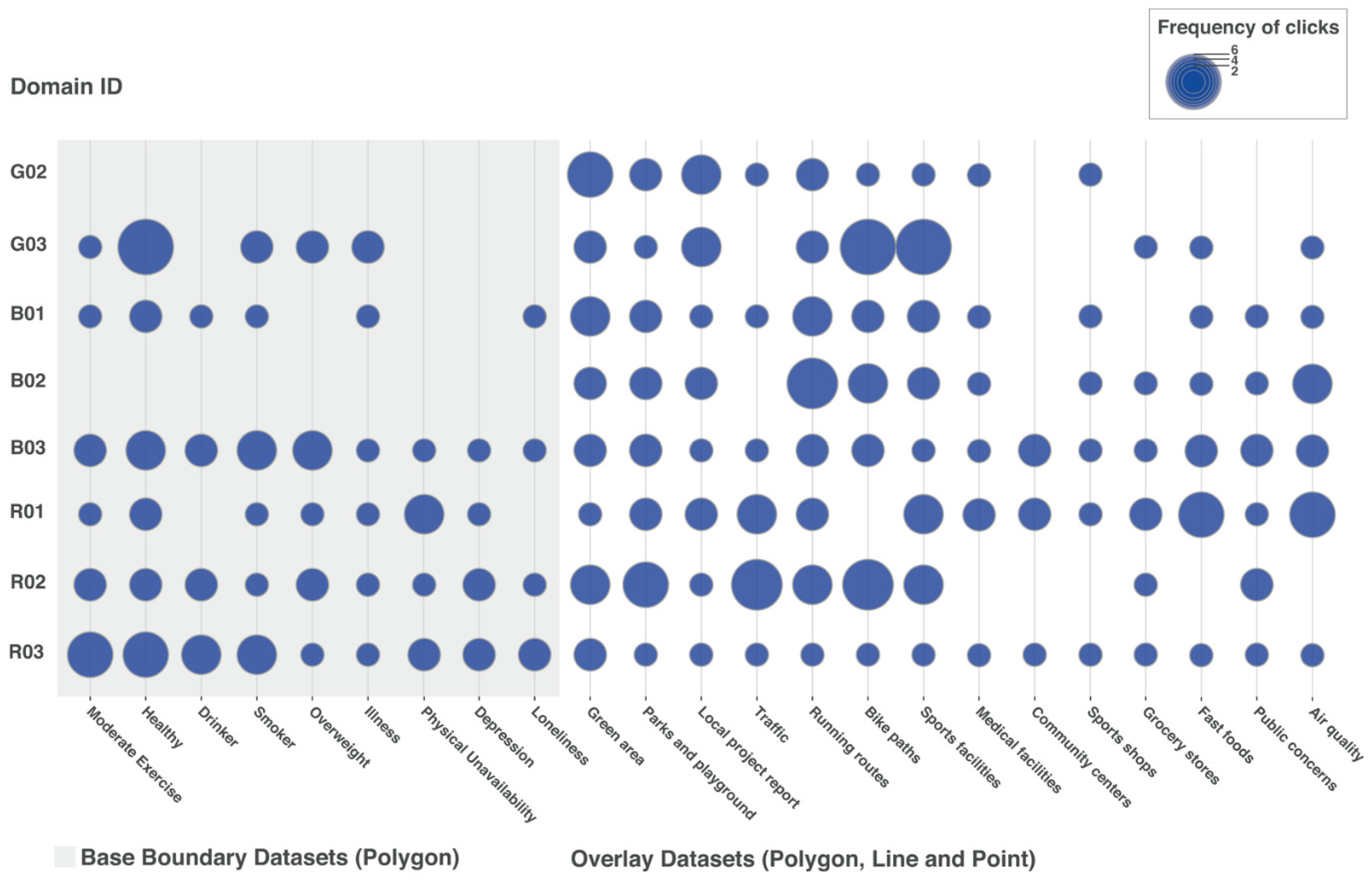
We looked at the summary statistics of the click events obtained through Google Analytics (Table 3) to grasp if there are any differences between the participants and also between the domain groups in terms of their approach (click counts and the datasets they used). Due to the low sample size, no statistical analysis was performed. We couldn’t collect the click events data from one participant (G01) due to a technical difficulty. The participants’ click events were also visualized for conducting visual analysis to better understand the distribution of the datasets used by each participant and domain group as well as the frequency of clicks on each dataset to understand which datasets the participants were more or less interested in.
As shown in Table 3, the domain experts from the field of research clicked the datasets the most (both in terms of times and variety). In contrast, the domain experts from the government had the least clicks. It is important to note that two domain experts from research were not familiar with the geography presented in the map used for this study. Instead, both experts from the government work for the municipality that was shown on the map. The difference in background knowledge might have affected their click actions in terms of the necessity for exploration for learning.
Figure 3 shows the clicked datasets by all participants, with the frequency of clicks on each dataset. Except for the base boundary datasets by the participants G02 and B02, all datasets were used by all participants. Although participant R03 explained her approach to focus on a particular area and the datasets on the map-based data visualization, she clicked through all the available datasets. One participant (B02) stated during the interview regarding irrelevant datasets that “sports facilities is one that I would always use, whereas medical facilities… but…could be of interest later on” and “it’s good that it’s there and then to see whether it would help you find a solution for the problem…”. We see that the participants tended to explore different datasets regardless of their focus or interests. These results may be partially due to the nature of the open-ended tasks that we used for this study. However, as the comments above show, the majority of the participants were at least positive about having various datasets on the map-based data visualization in the context of vitality.
4. Discussion
Our study investigated how domain experts utilize a map-based visualization containing various vitality data for their analysis and insight generation. We conducted a mixed-methods study consisting of an online survey, open-ended tasks, and semi-structured interviews with nine domain experts from the field of government, business, and research. Both qualitative data (the participants’ notes during the open-ended tasks and the interviews) and quantitative data (click events data during the open-ended tasks) were obtained and analyzed to answer our research question: “How does a map-based visualization containing various vitality data support the visual analysis process among different domain experts?” We particularly investigated the participants’ overall impression, insights and visual analysis approach, preference on datasets depending on their expertise, amount and types of data preferred in general, and applicability of this to their real projects.
Our study confirmed several benefits of map-based data visualization targeting diverse domain experts in the context of vitality. First of all, the majority of interview participants expressed a positive impression of the map-based visualization in the sense that it can contain many datasets without getting cluttered with information. Secondly, we also found the participants appreciated the data layers they could choose on the map to conduct spatial analysis for their insight generation. Seven out of nine participants made comments that showed their preference in this regard. There was only one participant (B03) who did not appreciate the map-based visualization. This participant also mentioned using data tables for discussions and decision-making processes with other agencies. We also learned that map-based data visualizations are not necessary for all kinds of domain experts. However, we believe they still have substantial benefits for users with different levels of related literacies (e.g., computer, visual, and data), as participants made statements such as “it’s really useful to show it on maps because everybody kind of knows how to look for the place you are talking about” (R01) and “if you want you can get more in-depth information, but if you don’t, you can just quickly see what you have” (R02). We understood from those comments that the map-based data visualization could be used by novice users to gain quick insights but also by intermediate or perhaps even advanced users for further analysis. This more in-depth analysis is usually triggered by interactions like one participant (G02) mentioned: “… because it’s interactive. So you can play with it and get a better understanding of the information you’re looking at.” The preference for interactions in data visualizations was also addressed by a recent interview study conducted by Park et al. [57], which assessed the requirements for data visualizations among public health professionals. Interactions are important to enhance these analyses [74]. They have to be considered further in future research.
Considering the use and availability of interactions, no participant was overwhelmed by the datasets we used in our study, and four out of nine participants thought they could consume more datasets. Seven out of nine participants mentioned that the map-based visualization application contained datasets that the participants were not interested in. However, the participants understood that the datasets irrelevant to them were included in the application to consider the diverse aspects of vitality. We also learned that experts were looking for specific datasets related to their own projects, such as “the location and information of sports programs in a city” in addition to the vitality datasets we used in this study (e.g., Table 1).
In addition to its benefits, the map-based data visualization presented different challenges. The main challenge we found through this study was the specific contexts of domain experts’ projects in the real world. Several participants provided insights into this issue through interviews. They stated that the map-based data visualization should have some themes, such as “vitality in public space”, which one participant defined as a conceptual frame and others as the connection with certain policies. This could be realized by the design of the map-based data visualization, which supports users in finding vitality themes (likely presented by the combinations of several datasets) on which they would like to focus. One participant (B02) suggested a filter function that allows users to focus the interface on a neighborhood that users would like to analyze. In addition, one participant (R02) suggested grouping the overlay datasets by topics (e.g., bike paths, running routes, and roads as “traffic”). We think such functions may support creating or finding themes for each domain expert in order to slightly adjust to various experts’ needs individually, similar to the concept of adaptive information visualization [75].
Throughout the study, we also recognized the domain experts’ practice of collaborating with other partners and citizens. One participant discussed the difficulty of having in-person meetings with partners and citizens during the lockdown caused by the COVID-19 pandemic. Experiencing this challenge, there may be more demands on collaborative features on map-based data visualizations.
5. Limitations
This study also has some limitations that warrant discussion. First of all, this study is highly case-specific and limited to a specific city in the Netherlands, with a smaller number of participants who are all experts in the field of vitality. This limits the generalizability in some way. We had small samples due to experts’ limited availabilities [41], for which reason we did not conduct a statistical analysis of the quantitative data. Furthermore, click events data likely limits the understanding of participants’ behavior in depth. It may be necessary to consider collecting mouse movement data such as done by Krassanakis and Kesidis [76] and eye movement data as done in the study by Cybulski and Horbiński [77] in order to obtain richer quantitative data for the further analysis. The selection of the open-ended tasks for this study may have prevented generating specific insights among the interview participants, since we were not able to analyze the data systemically. For instance, we could not analyze which vitality-related datasets were useful as well as compare rigorously the differences in utilized datasets for specific tasks. Nevertheless, we could still obtain rich and interesting insights from this mixed-methods study, especially with the respect to the domain experts’ practices on map-based data visualization in the real-word. This empirical evidence also provides insights into designing map-based data visualizations targeting domain experts in the information visualization and GIS research community.
6. Conclusions and Future Work
In this paper, we presented the results of a mixed-methods study to address how a map-based visualization containing various vitality data supports the visual analysis process among different domain experts. Our study confirmed the favoring of map-based data visualizations among those domain experts as well as several benefits, such as the efficiency of the data presentation and the ease of spatial analysis. However, we also found challenges when it was applied to domain experts’ projects in the real world due to in-depth and specific requirements. Although the adaptability of map-based data visualization for diverse target audiences has already been considered, further considerations are necessary to support domain experts’ work in practice. The provision of themes created by the combination of several datasets and shown together in map-based data visualizations might help cover each specific use case among various domain experts, which can be realized by interaction and feature designs that consider these adaptions.
Our future plan is to design a map-based data visualization that adapts to the various domain experts’ projects based on the insights we obtained through this study. As we found collaboration was common practice in their projects, we also consider this an important factor for the adaption of our map-based data visualization.
As there has been growing interest and efforts to research the effective and efficient visualization of geospatial data for insight generation, information sharing, and decision-making in the cartographic and geographic information science community [78], more studies that investigate users’ utilization in specific contexts in the real world are required. Our study contributes to the particular area of geovisualizations by providing new empirical evidence.
Supplementary Materials
The map-based data visualization application used for the study is available at: https://experiment1-tue.herokuapp.com.
Author Contributions
Conceptualization, K.W., G.W. and S.V.; methodology, K.W., G.W. and S.V.; software, K.W.; formal analysis, K.W.; investigation, K.W., G.W. and S.V.; data curation, K.W.; writing—original draft preparation, K.W.; writing—review and editing, K.W., G.W. and S.V.; visualization, K.W. All authors have read and agreed to the published version of the manuscript.
Funding
This research was funded by Vitality Living Lab, financed by Operational Program EFRO 2014–2020 South-Netherlands.
Data Availability Statement
The data are not publicly available due to the participants’ privacy. Ethical approval applied only to the internal usage of the collected data.
Acknowledgments
We would like to thank all the participants who supported our research by participating in the study.
Conflicts of Interest
The authors declare no conflict of interest.
References
- Few, S. Data Visualization for Human Perception. In The Encyclopedia of Human-Computer Interaction; Soegaard, M., Dam, R.F., Eds.; The Interaction Design Foundation: Aarhus, Denmark, 2013. [Google Scholar]
- Tufte, E.R. The Visual Display of Quantitative Information, 2nd ed.; Graphics Press: Cheshire, CT, USA, 2001. [Google Scholar]
- Tory, M.; Möller, T. Human Factors in Visualization Research. IEEE Trans. Vis. Comput. Graph. 2004, 10, 72–84. [Google Scholar] [CrossRef] [PubMed]
- Zulkifli, H.; Kadir, R.A.; Nayan, N.M. Initial User Requirement Analysis for Waterbodies Data Visualization. In Advances in Visual Informatics; Zaman, H.B., Robinson, P., Smeaton, A.F., Shih, T.K., Velastin, S., Jaafar, A., Ali, N.M., Eds.; Springer: Cham, Switerland, 2015; Volume 9429, pp. 89–98. [Google Scholar] [CrossRef]
- Gershon, N.; Eick, S.G. Information Visualization. IEEE Comput. Graph. Appl. 1997, 17, 29–31. [Google Scholar] [CrossRef]
- Gilbert, E.W. Pioneer Maps of Health and Disease in England. Geogr. J. 1958, 124, 172–183. [Google Scholar] [CrossRef]
- Fitterer, J.; Nelson, T.A.; Nathoo, F. Predictive Crime Mapping. Police Pract. Res. 2015, 16, 121–135. [Google Scholar] [CrossRef]
- TransBASE. Available online: https://transbase.sfgov.org/dashboard/dashboard.php (accessed on 21 October 2021).
- Plaisant, C. The Challenge of Information Visualization Evaluation. In Proceedings of the Workshop on Advanced Visual Interfaces AVI, Gallipoli, Italy, 25–28 May 2004. [Google Scholar]
- MacEachren, A.M.; Kraak, M.-J. Research Challenges in Geovisualization. Cartogr. Geogr. Inf. Sci. 2001, 28, 3–12. [Google Scholar] [CrossRef]
- Ruijer, E.; Grimmelikhuijsen, S.; Hogan, M.; Enzerink, S.; Ojo, A.; Meijer, A. Connecting Societal Issues, Users and Data. Scenario-Based Design of Open Data Platforms. Gov. Inf. Q. 2017, 34, 470–480. [Google Scholar] [CrossRef] [Green Version]
- Osagie, E.; Waqar, M.; Adebayo, S.; Stasiewicz, A.; Porwol, L.; Ojo, A. Usability Evaluation of an Open Data Platform. In Proceedings of the 18th Annual International Conference on Digital Government Research (dg.o ’17), Staten Island, NY, USA, 7–9 June 2017. [Google Scholar]
- Smith, S.J.; Lloyd, R.J. Promoting Vitality in Health and Physical Education. Qual. Health Res. 2006, 16, 249–267. [Google Scholar] [CrossRef]
- Ren, X.; Wang, Z.; Nast, C.; Ettema, D.; Brombacher, A. Integrating Industrial Design and Geoscience: A Survey on Data-Driven Research to Promote Public Health and Vitality. In Proceedings of the 9th International Conference on Digital Public Health (DPH2019), Marseille, France, 20–23 November 2019. [Google Scholar]
- Sui, D.Z. Geographic Information Systems and Medical Geography: Toward a New Synergy. Geogr. Compass 2007, 1, 556–582. [Google Scholar] [CrossRef]
- Wada, K.; Van Renswouw, L.; Wallner, G.; Lévy, P.; Vos, S. Studying Requirements for Designing a Vitality Data Sharing Platform from a Multi-Stakeholder Perspective. In Proceedings of the 8th International Conference on Kansei Engineering and Emotion Research, Tokyo, Japan, 7–9 September 2020. [Google Scholar]
- Sieber, R. Public Participation Geographic Information Systems: A Literature Review and Framework. Ann. Assoc. Am. Geogr. 2006, 96, 491–507. [Google Scholar] [CrossRef]
- Osborne, T. Vitalism as Pathos. Biosemiotics 2016, 9, 185–205. [Google Scholar] [CrossRef] [Green Version]
- Van Steenbergen, E.; Van Dongen, J.M.; Wendel-Vos, G.C.W.; Hildebrandt, V.H.; Strijk, J.E. Insights into the Concept of Vitality: Associations with Participation and Societal Costs. Eur. J. Public Health 2016, 26, 354–359. [Google Scholar] [CrossRef] [PubMed] [Green Version]
- Guérin, E. Disentangling Vitality, Well-Being, and Quality of Life: A Conceptual Examination Emphasizing Their Similarities and Differences with Special Application in the Physical Activity Domain. J. Phys. Act. Health 2012, 9, 896–908. [Google Scholar] [CrossRef] [PubMed]
- Ryan, R.M.; Frederick, C. On Energy, Personality, and Health: Subjective Vitality as a Dynamic Reflection of Well-Being. J. Personal. 1997, 65, 529–565. [Google Scholar] [CrossRef] [PubMed]
- Hallal, P.C.; Andersen, L.B.; Bull, F.C.; Guthold, R.; Haskell, W.; Ekelund, U.; Alkandari, J.R.; Bauman, A.E.; Blair, S.N.; Brownson, R.C.; et al. Global Physical Activity Levels: Surveillance Progress, Pitfalls, and Prospects. Lancet 2012, 380, 247–257. [Google Scholar] [CrossRef]
- I-Min, L.; Shiroma, E.; Lobelo, F.; Puska, P.; Blair, S.; Katzmarzyk, P. Impact of Physical Inactivity on the World’s Major Non- Communicable Diseases. Lancet 2012, 380, 219–229. [Google Scholar] [CrossRef]
- Kohl, H.W.; Craig, C.L.; Lambert, E.V.; Inoue, S.; Alkandari Ramadan, J.; Leetongin, G.; Kahlmeier, S. The Pandemic of Physical Inactivity: Global Action for Public Health. Lancet 2012, 380, 294–305. [Google Scholar] [CrossRef] [Green Version]
- Janssen, M.; van den Heuvel, R.; Megens, C.; Levy, P.; Vos, S. Analysis of the Design and Engineering-Process towards a First Prototype in the Field of Sports and Vitality. In Proceedings of the 12th Conference of the International Sports Engineering Association, Brisbane, Australia, 26–28 March 2018. [Google Scholar]
- Penninx, B.W.J.H.; Guralnik, J.M.; Bandeen-Roche, K.; Kasper, J.D.; Simonsick, E.M.; Ferrucci, L.; Fried, L.P. The Protective Effect of Emotional Vitality on Adverse Health Outcomes in Disabled Older Women. J. Am. Geriatr. Soc. 2000, 48, 1359–1366. [Google Scholar] [CrossRef]
- Montgomery, J. Urban Vitality and the Culture of Cities. Plan. Pract. Res. 1995, 10, 101–110. [Google Scholar] [CrossRef]
- Lopes, M.N.; Camanho, A.S. Public Green Space Use and Consequences on Urban Vitality: An Assessment of European Cities. Soc. Indic. Res. 2013, 113, 751–767. [Google Scholar] [CrossRef]
- Marquet, O.; Miralles-Guasch, C. Neighbourhood Vitality and Physical Activity among the Elderly: THE Role of Walkable Environments on Active Ageing in Barcelona, Spain. Soc. Sci. Med. 2015, 135, 24–30. [Google Scholar] [CrossRef]
- Lavrusheva, O. The Concept of Vitality. Review of the Vitality-Related Research Domain. New Ideas Psychol. 2020, 56, 100752. [Google Scholar] [CrossRef]
- Friendly, M. A Brief History of Data Visualization. In Handbook of Data Visualization; Chen, C., Härdle, W.K., Unwin, A., Eds.; Springer: Berlin/Heidelberg, Germany, 2008; pp. 15–56. [Google Scholar]
- Koç, H. Developing Valid and Reliable Map Literacy Scale. Rev. Int. Geogr. Educ. Online 2014, 4, 120–137. [Google Scholar]
- Nöllenburg, M. Geographic Visualization. In Human-Centered Visualization Environments. Lecture Notes in Computer Science; Kerren, A., Ebert, A., Meyer, J., Eds.; Springer: Berlin/Heidelberg, Germany, 2007; Volume 4417, pp. 257–258. [Google Scholar]
- Kahila-Tani, M.; Kytta, M.; Geertman, S. Does Mapping Improve Public Participation? Exploring the Pros and Cons of Using Public Participation GIS in Urban Planning Practices. Landsc. Urban Plan. 2019, 186, 45–55. [Google Scholar] [CrossRef]
- Bugs, G. Assessment of Online PPGIS Study Cases in Urban Planning. Lect. Notes Comput. Sci. 2012, 7333, 477–490. [Google Scholar] [CrossRef]
- Rinner, C.; Bird, M. Evaluating Community Engagement through Argumentation Maps—A Public Participation GIS Case Study. Environ. Plan. B Plan. Des. 2009, 36, 588–601. [Google Scholar] [CrossRef]
- Gebre, E.H.; Morales, E. How “Accessible” Is Open Data?: Analysis of Context-Related Information and Users’ Comments in Open Datasets. Inf. Learn. Sci. 2020, 121, 19–36. [Google Scholar] [CrossRef]
- Kronenberg, C.; Woodward, L.; Dubose, B.; Weissman, D. Achieving Vision Zero: Data-Driven Investment Strategy to Eliminate Pedestrian Fatalities on a Citywide Level. Transp. Res. Rec. 2015, 2519, 146–156. [Google Scholar] [CrossRef]
- Psyllidis, A.; Bozzon, A. A Platform for Urban Analytics and Semantic Data Integration in City Planning. In Computer-Aided Architectural Design Futures. The Next City—New Technologies and the Future of the Built Environment. CAAD Futures 2015. Communications in Computer and Information Science; Celani, G., Sperling, D.M., Franco, J.M.S., Eds.; Springer: Berlin/Heidelberg, Germany, 2015; Volume 527, pp. 21–36. [Google Scholar] [CrossRef]
- Sui, D.Z.; Holt, J.B. Visualizing and Analysing Public-Health Data Using Value-by-Area Cartograms: Toward a New Synthetic Framework. Cartographica 2008, 43, 3–20. [Google Scholar] [CrossRef]
- Elmqvist, N.; Yi, J.S. Patterns for Visualization Evaluation. Inf. Vis. 2015, 14, 250–269. [Google Scholar] [CrossRef]
- Brewer, I.; MacEachren, A.M.; Abdo, H.; Gundrum, J.; Otto, G. Collaborative Geographic Visualization: Enabling Shared Understanding of Environmental Processes. In Proceedings of the IEEE Symposium on Information Visualization, Salt Lake City, UT, USA, 9–10 October 2000; pp. 137–141. [Google Scholar] [CrossRef] [Green Version]
- Yang, Y.; Goodwin, S. What-Why Analysis of Expert Interviews: Analysing Geographically-Embedded Flow Data. In Proceedings of the IEEE Pacific Visualization Symposium, Bangkok, Thailand, 23–26 April 2019; pp. 122–126. [Google Scholar] [CrossRef] [Green Version]
- Carpendale, S. Evaluating Information Visualizations; Kerren, A., Stasko, J.T., Fekete, J.-D., North, C., Eds.; Springer: Berlin/Heidelberg, Germany, 2008; Volume 4950. [Google Scholar] [CrossRef]
- Lam, H.; Bertini, E.; Isenberg, P.; Plaisant, C.; Carpendale, S. Empirical Studies in Information Visualization: Seven Scenarios. IEEE Trans. Vis. Comput. Graph. 2012, 18, 1520–1536. [Google Scholar] [CrossRef] [Green Version]
- Kandel, S.; Paepcke, A.; Hellerstein, J.M.; Heer, J. Enterprise Data Analysis and Visualization: An Interview Study. IEEE Trans. Vis. Comput. Graph. 2012, 18, 2917–2926. [Google Scholar] [CrossRef] [PubMed] [Green Version]
- Roth, R.E. An Empirically-Derived Taxonomy of Interaction Primitives for Interactive Cartography and Geovisualization. IEEE Trans. Vis. Comput. Graph. 2013, 19, 2356–2365. [Google Scholar] [CrossRef] [PubMed]
- Roth, R.E.; Çöltekin, A.; Delazari, L.; Filho, H.F.; Griffin, A.; Hall, A.; Korpi, J.; Lokka, I.; Mendonça, A.; Ooms, K.; et al. User Studies in Cartography: Opportunities for Empirical Research on Interactive Maps and Visualizations. Int. J. Cartogr. 2017, 3, 61–89. [Google Scholar] [CrossRef]
- Haklay, M.; Tobón, C. Usability Evaluation and PPGIS: Towards a User-Centred Design Approach. Int. J. Geogr. Inf. Sci. 2003, 17, 577–592. [Google Scholar] [CrossRef]
- Lloyd, D.; Dykes, J. Human-Centered Approaches in Geovisualization Design: Investigating Multiple Methods through a Long-Term Case Study. IEEE Trans. Vis. Comput. Graph. 2011, 17, 2489–2507. [Google Scholar] [CrossRef] [Green Version]
- Mazza, R.; Berrè, A. Focus Group Methodology for Evaluating Information Visualization Techniques and Tools. In Proceedings of the International Conference on Information Visualisation (IV ’07), Washington, DC, USA, 4–6 July 2007. [Google Scholar]
- Suchan, T.A. Usability Studies of Geovisualization Software in the Workplace. In Proceedings of the 2002 annual national conference on Digital government research (dg.o ’02), Los Angeles, CA, USA, 19–22 May 2022. [Google Scholar]
- Bąkowska-Waldmann, E.; Kaczmarek, T. The Use of PPGIS: Towards Reaching a Meaningful Public Participation in Spatial Planning. ISPRS Int. J. Geo-Inf. 2021, 10, 581. [Google Scholar] [CrossRef]
- Maguire, M. Methods to Support Human-Centred Design. Int. J. Hum. Comput. Stud. 2001, 55, 587–634. [Google Scholar] [CrossRef]
- Angular. Available online: https://angular.io/ (accessed on 27 February 2022).
- D3. Available online: https://d3js.org/ (accessed on 27 February 2022).
- Park, S.; Bekemeier, B.; Flaxman, A.D. Understanding Data Use and Preference of Data Visualization for Public Health Professionals: A Qualitative Study. Public Health Nurs. 2021, 38, 531–541. [Google Scholar] [CrossRef]
- Bolstad, P. GIS Fundamentals: A First Text on Geographic Information Systems, 4th ed.; Eider Press: White Bear Lake, MN, USA, 2012. [Google Scholar]
- CBS StatLine. Available online: https://opendata.cbs.nl/ (accessed on 28 February 2022).
- QGIS. Available online: https://qgis.org/ (accessed on 28 February 2022).
- Eindhoven Open Data. Available online: https://data.eindhoven.nl/ (accessed on 30 March 2022).
- GeoJSON. Available online: https://geojson.org/ (accessed on 28 February 2022).
- Zacharopoulou, D.; Skopeliti, A.; Nakos, B. Assessment and Visualization of Osm Consistency for European Cities. ISPRS Int. J. Geo-Inf. 2021, 10, 361. [Google Scholar] [CrossRef]
- Eindhoven in Cijfers. Available online: https://eindhoven.incijfers.nl/ (accessed on 30 March 2022).
- Prieto, D.F.; Hagen, E.; Engel, D.; Bayer, D.; Hernandez, J.T.; Garth, C.; Scheler, I. Visual Exploration of Location-Based Social Networks Data in Urban Planning. In Proceedings of the IEEE Pacific Visualization Symposium, Hangzhou, China, 14–17 April 2015; pp. 123–127. [Google Scholar] [CrossRef]
- Nesbitt, L.M.; Cliff, W.H. How the Story Unfolds: Exploring Ways Faculty Develop Open-Ended and Closed-Ended Case Designs. Am. J. Physiol.-Adv. Physiol. Educ. 2008, 32, 279–285. [Google Scholar] [CrossRef] [Green Version]
- Wildemuth, B.M.; Freund, L. Assigning Search Tasks Designed to Elicit Exploratory Search Behaviors. In Proceedings of the Symposium on Human-Computer Interaction and Information Retrieval (HCIR ’12), Cambridge, CA, USA, 4 October 2012. [Google Scholar]
- Albers, M.J. Analysis for Complex Information: Focus on User Goals, Information Needs, and Information Relationships. In Proceedings of the First International Workshop on Coping with Complexity, Bath, UK, 16–17 September 2004. [Google Scholar]
- Terry, M.; Mynatt, E.D. Side Views: Persistent, On-Demand Previews for Open-Ended Tasks. In Proceedings of the 15th Annual ACM symposium on User Interface Software and Technology, Paris, France, 27–30 October 2002. [Google Scholar]
- Ahmed, A.; Hurwitz, D.; Gestson, S.; Brown, S. Differences between Professionals and Students in Their Visual Attention on Multiple Representation Types While Solving an Open-Ended Engineering Design Problem. J. Civ. Eng. Educ. 2021, 147, 04021005. [Google Scholar] [CrossRef]
- Hasan, L.; Morris, A.; Probets, S. Using Google Analytics to Evaluate the Usability of E-Commerce Sites. In Human Centered Design. HCD 2009. Lecture Notes in Computer Science; Kurosu, M., Ed.; Springer: Berlin/Heidelberg, Germany, 2009; Volume 5619, pp. 697–706. [Google Scholar] [CrossRef] [Green Version]
- Braun, V.; Clarke, V. Using Thematic Analysis in Psychology. Qual. Res. Psychol. 2006, 3, 77–101. [Google Scholar] [CrossRef] [Green Version]
- Shneiderman, B. Eyes Have It: A Task by Data Type Taxonomy for Information Visualizations. In Proceedings of the 1996 IEEE Symposium on Visual Languages, Boulder, CO, USA, 3–6 September 1996. [Google Scholar]
- Lu, M.; Liang, J.; Zhang, Y.; Li, G.; Chen, S.; Li, Z.; Yuan, X. Interaction+: Interaction Enhancement for Web-Based Visualizations. In Proceedings of the IEEE Pacific Visualization Symposium, Seoul, Korea, 18–21 April 2017; pp. 61–70. [Google Scholar] [CrossRef]
- Carenini, G.; Conati, C.; Hoque, E.; Steichen, B.; Toker, D.; Enns, J. Highlighting Interventions and User Differences. In Proceedings of the CHI’ 14: SIGCHI Conference on Human Factors in Computing Systems, Toronto, ON, Canada, 26 April–1 May 2014. [Google Scholar]
- Krassanakis, V.; Kesidis, A.L. MatMouse: A Mouse Movements Tracking and Analysis Toolbox for Visual Search Experiments. Multimodal Technol. Interact. 2020, 4, 83. [Google Scholar] [CrossRef]
- Cybulski, P.; Horbiński, T. User Experience in Using Graphical User Interfaces of Web Maps. Int. J. Geo-Inf. 2020, 9, 412. [Google Scholar] [CrossRef]
- Jiang, B.; Li, Z. Geovisualization: Design, Enhanced Visual Tools and Applications. Cartogr. J. 2005, 42, 3–4. [Google Scholar] [CrossRef] [Green Version]
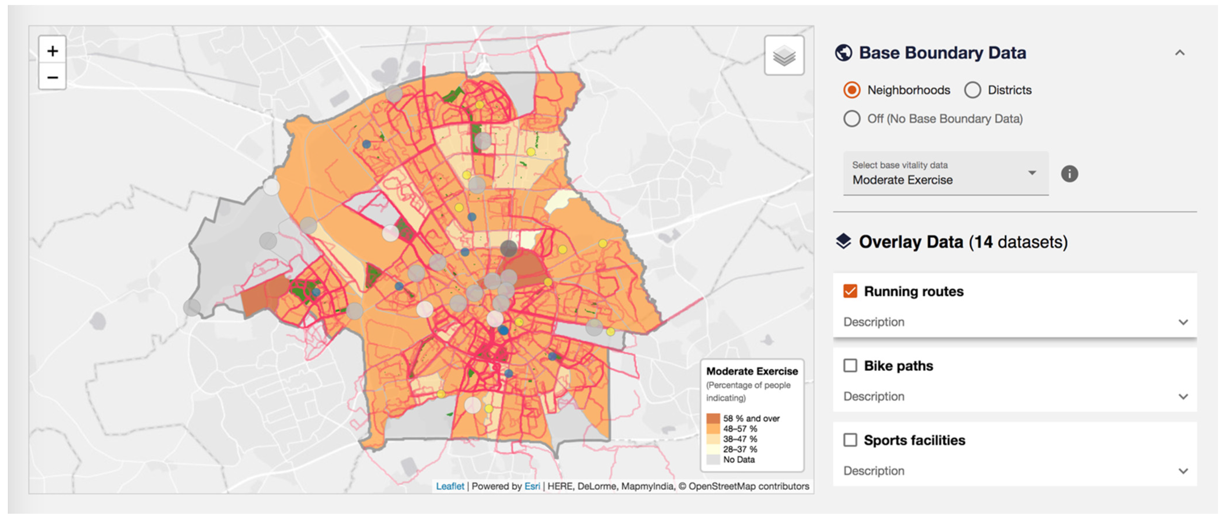
Figure 1.
A screenshot of the map-based data visualization application with various vitality-related datasets used for our study to explore how domain experts utilize this type of information visualization for their visual analysis and insight generation.
Figure 1.
A screenshot of the map-based data visualization application with various vitality-related datasets used for our study to explore how domain experts utilize this type of information visualization for their visual analysis and insight generation.

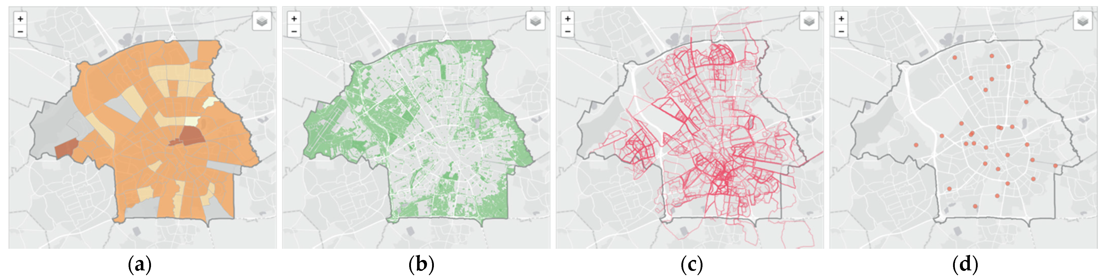
Figure 2.
Example of spatial data layers used for this study. (a) Default base polygon layer showing sports participation rate by neighborhood; (b) Polygon data showing green areas; (c) line data showing various runners’ running routes; (d) Point data showing the location of sports facilities.
Figure 2.
Example of spatial data layers used for this study. (a) Default base polygon layer showing sports participation rate by neighborhood; (b) Polygon data showing green areas; (c) line data showing various runners’ running routes; (d) Point data showing the location of sports facilities.

Figure 3.
The participants’ click events and frequency with the base boundary datasets (polygon) and overlay datasets (polygon, line, and point).
Figure 3.
The participants’ click events and frequency with the base boundary datasets (polygon) and overlay datasets (polygon, line, and point).


Table 1.
Spatial data used on the map-based visualization application.
| Type * | Name | Visual Element | Description | Source |
|---|---|---|---|---|
| Base | Moderate Exercise | Polygon | Percentage of people who exercise at least 150 min per week | CBS StatLine |
| Base | Healthy | Polygon | Percentage of people who indicate good or very good general health status | CBS StatLine |
| Base | Drinker | Polygon | Percentage of people who drink alcohol a maximum one glass per day | CBS StatLine |
| Base | Smoker | Polygon | Percentage of people who smoke | CBS StatLine |
| Base | Overweight | Polygon | Percentage of people whose body mass index is 25 kg/m2 or above | CBS StatLine |
| Base | Illness | Polygon | Percentage of people who have one or more long-term (6 months or longer) illness or disorder | CBS StatLine |
| Base | Physical Unavailability | Polygon | Percentage of people who have physical difficulty or inability (e.g., not being able to carry an object of 5 kg for 10 m) | CBS StatLine |
| Base | Depression | Polygon | Percentage of people who have a high risk of anxiety or depression | CBS StatLine |
| Base | Loneliness | Polygon | Percentage of people who experience severe loneliness (emotional and social) | CBS StatLine |
| Overlay | Parks and playgrounds | Polygon | Parks and playgrounds extracted from point of interest data | OSM |
| Overlay | Local project (Bennekel) | Polygon | The results of a vitality related survey (e.g., barriers for sports and exercise) from a local project in a specific neighborhood (Bennekel) | Local project in Bennekel |
| Overlay | Traffic | Line | Traffic (with speed limit) extracted from the point of interest data | OSM |
| Overlay | Running routes | Line | Anonymized running route data extracted from a running application (N = 500) | Hardlopen met Evy app |
| Overlay | Bike paths | Line | Bike path data | Eindhoven Open Data |
| Overlay | Sports facilities | Point | Sports facilities (e.g., sports center, swimming pool, and pitch) extracted from the point of interest data | OSM |
| Overlay | Medical facilities | Point | Medical facilities (doctors) extracted from the point of interest data | OSM |
| Overlay | Community centers | Point | Community centers extracted from the point of interest data | OSM |
| Overlay | Sports shops | Point | Sports shops (e.g., bicycle, outdoor shops) extracted from the point of interest data | OSM |
| Overlay | Grocery stores | Point | Grocery stores (supermarkets and butchers) extracted from the point of interest data provided | OSM |
| Overlay | Fast foods | Point | Fast foods extracted from the point of interest data | OSM |
| Overlay | Public concerns | Point | Public concerns data (e.g., noise, odor, and traffic) | Eindhoven Open Data |
| Overlay | Air quality | Point | The data of particulate matter (PM)1, PM2.5, and PM10 | Eindhoven Open Data |
* In the type column, “Base” refers to the base polygon layer showing information (e.g., sports participation rate by neighborhood) using a choropleth map. “Overlay” refers to layers, which can be either polygon, line, or point datasets (e.g., area of parks and playgrounds, running routes, and location of sports facilities), added on top of the base polygon layers.
Table 2.
Participants’ expertise, demographics, background, and domain knowledge of vitality.
| Domain ID | Current Position | Gender | Age Range | Years of Experience | Knowledge of Vitality |
|---|---|---|---|---|---|
| G01 | Area manager of a municipal park | Male | 35–44 years | 6 to 10 years | High |
| G02 | Innovation manager at a municipality | Male | 35–44 years | 11 to 20 years | High |
| G03 | Policy advisor for sports and active living at a municipality | Female | 45–54 years | 21 to 30 years | High |
| B01 | Executive director at an innovation center for sports and vitality | Male | 45–54 years | 21 to 30 years | High |
| B02 | Program manager at an independent non-profit foundation | Male | 35–44 years | 11 to 20 years | High |
| B03 | Coordinator, neighborhood coach, and chairman a a local service | Male | 45–54 years | 21 to 30 years | High |
| R01 | Teacher and researcher in the Public Health department of a university | Female | 25–34 years | 6 to 10 years | High |
| R02 | Researcher about sports, society, and public health at a research institute | Female | 25–34 years | 6 to 10 years | High |
| R03 | Project coordinator at the Public Health department of a university | Female | 35–44 years | 11 to 20 years | Moderate |
Table 3.
Summary statistics of the participants’ click events during the free task.
| Domain ID | Number of Datasets | Total Clicks | Number of Datasets * | Total Clicks * |
|---|---|---|---|---|
| G02 | 9 | 16 | 12 | 26 |
| G03 | 14 | 36 | ||
| B01 | 18 | 26 | 18 | 30 |
| B02 | 12 | 24 | ||
| B03 | 23 | 39 | ||
| R01 | 20 | 39 | 20 | 39 |
| R02 | 18 | 41 | ||
| R03 | 23 | 37 |
* Domain group average.
Publisher’s Note: MDPI stays neutral with regard to jurisdictional claims in published maps and institutional affiliations. |
© 2022 by the authors. Licensee MDPI, Basel, Switzerland. This article is an open access article distributed under the terms and conditions of the Creative Commons Attribution (CC BY) license (https://creativecommons.org/licenses/by/4.0/).
Share and Cite
MDPI and ACS Style
Wada, K.; Wallner, G.; Vos, S. Studying the Utilization of a Map-Based Visualization with Vitality Datasets by Domain Experts. Geographies 2022, 2, 379-396. https://doi.org/10.3390/geographies2030024
AMA Style
Wada K, Wallner G, Vos S. Studying the Utilization of a Map-Based Visualization with Vitality Datasets by Domain Experts. Geographies. 2022; 2(3):379-396. https://doi.org/10.3390/geographies2030024
Chicago/Turabian StyleWada, Kenji, Günter Wallner, and Steven Vos. 2022. "Studying the Utilization of a Map-Based Visualization with Vitality Datasets by Domain Experts" Geographies 2, no. 3: 379-396. https://doi.org/10.3390/geographies2030024